Salud
Client
Salud
Services
Branding, Website, Motion
Client
Salud
Services
Branding, Website, Motion
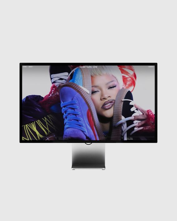
Salud is a digital magazine for modern reflection, a place where stories unfold slowly and with intention. Inspired by the tactile world of printed newspapers, we designed a visual identity & website that translates analog warmth into a contemporary web experience. The goal was not to replicate the past, but to borrow its texture: off-whites instead of whites, washed-out blacks instead of true black, and a rich typographic system that makes reading feel like a ritual. It’s a space that breathes, invites, and never rushes. A digital publication that feels human.
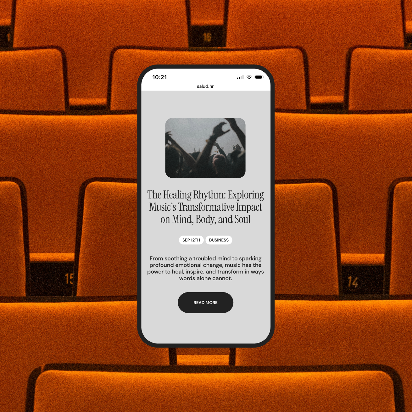
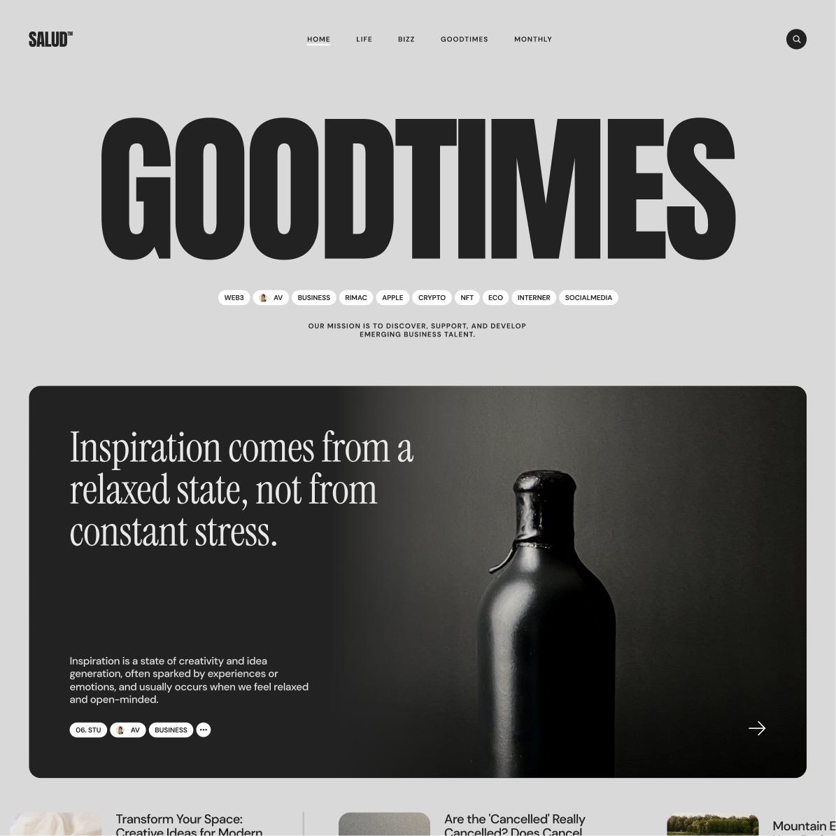
The color palette is a nod to analog paper. Black is never fully black. White is always off-white, like a page under sunlight. In a sea of sharp digital interfaces, this brings a sense of warmth that sets Salud apart from most digital magazines.
Typography
UI
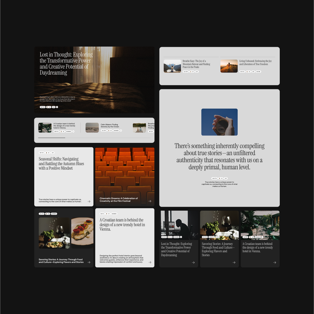
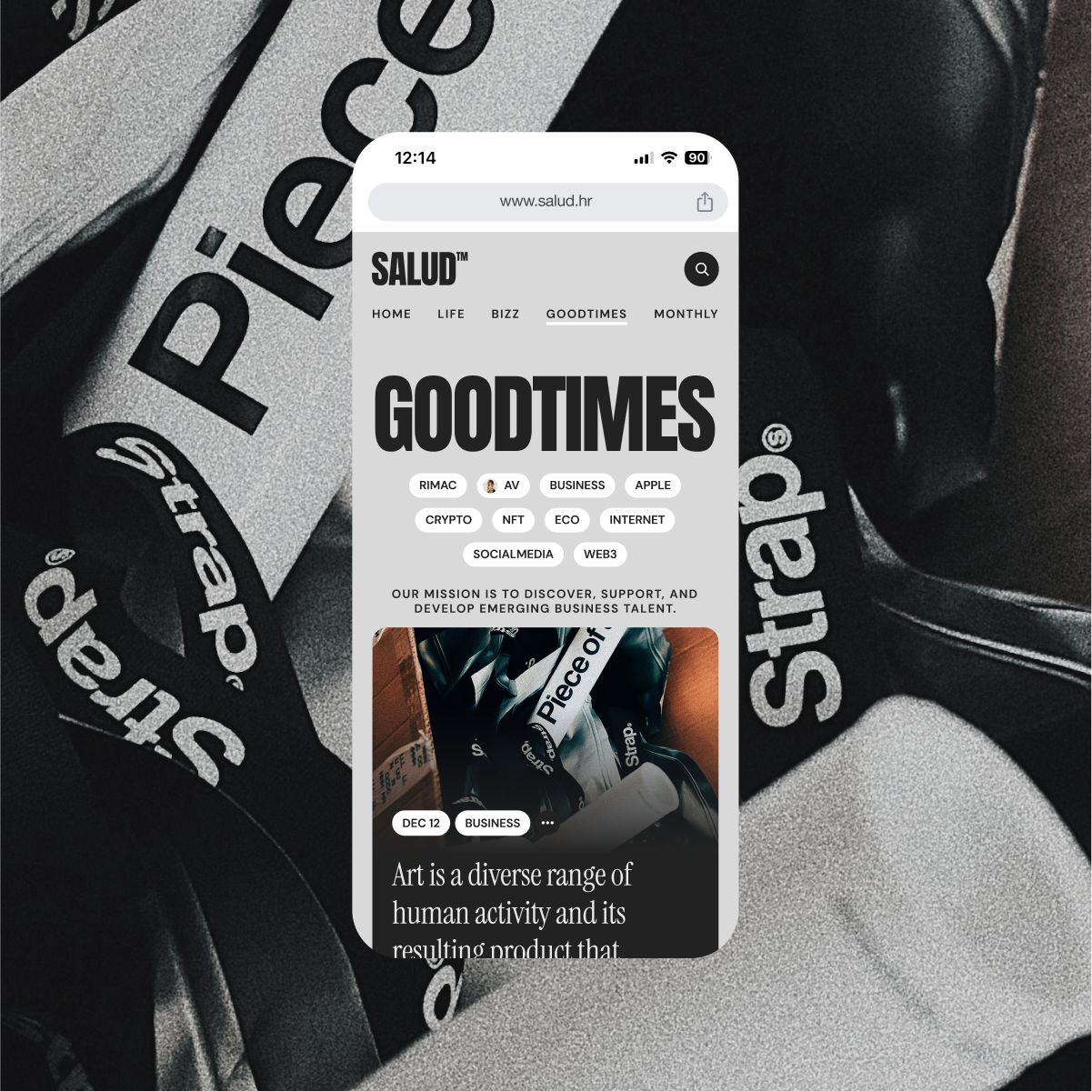
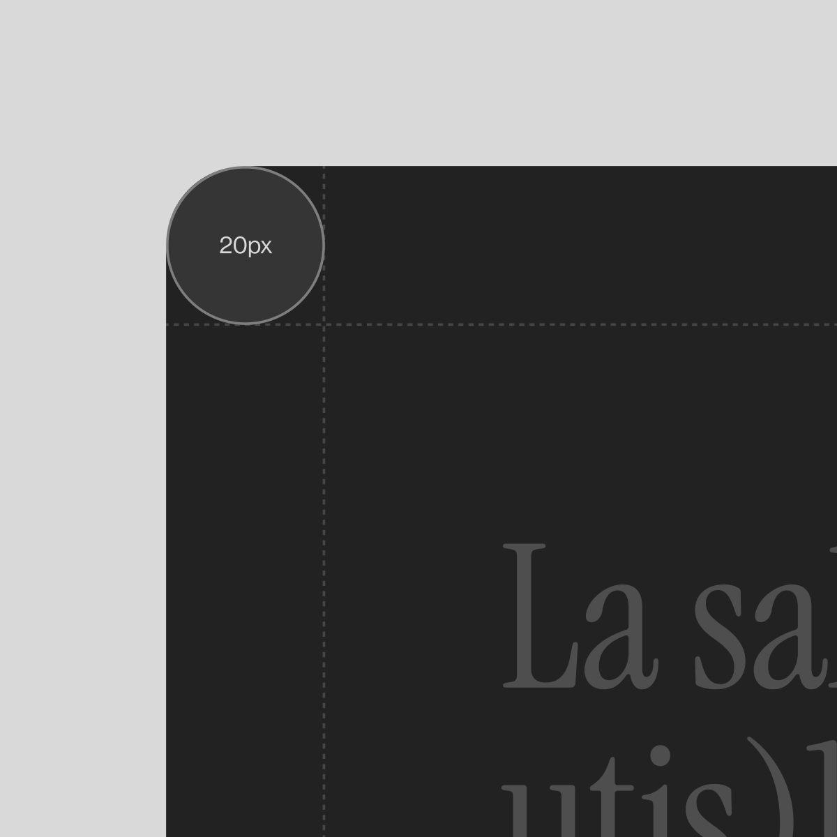
The UI bridges analog motifs and digital function. Structured around a familiar 12-column grid, the layout bends just enough to breathe. Oversized components, rounded corners and spacious breaks create a rhythm that feels curated, not coded.
Tags are more than simple descriptors. They form a subtle navigation layer, turning the magazine into a network of thoughts. Readers are encouraged to wander, to loop, to connect articles by theme or mood. The tag system becomes both map and invitation.