Emilie Aubry
Director's cut
Client
Solfeggio
Brnding, Motion
Client
Solfeggio
Services
Branding, Motion
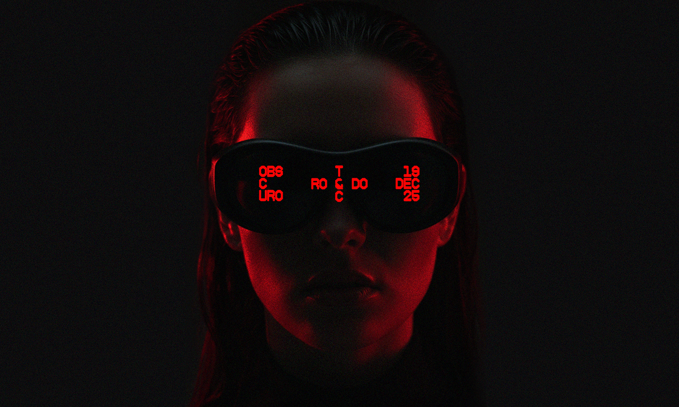
Solfeggio Obscuro is an underground music event with a distinct visual identity built around atmosphere and restraint. For its second edition, we took the aesthetic further. Darker, rawer, more reduced. Inspired by the word “obscure” itself, something primitive and unrefined, yet still intriguing. With custom typography and color as the only core elements, the minimalism holds back just enough to draw you in.