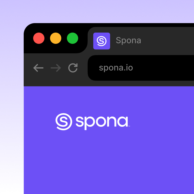
Spona
Client
Spona
Services
Naming, Branding, Motion
Client
Spona
Services
Naming, Branding, Motion
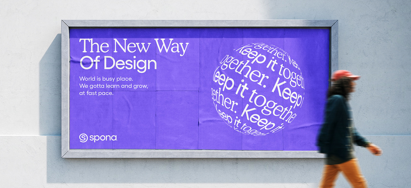
Spona is a digital platform where agencies and clients connect, manage projects, and collaborate. Studio Size developed the full rebrand, including naming, verbal identity, visual identity, and motion branding. Our approach was to create a system that works on both a practical and an emotional level with a name rooted in connection, a visual language that is simple and distinctive, and motion elements that translate complexity into calm, fluid forms.
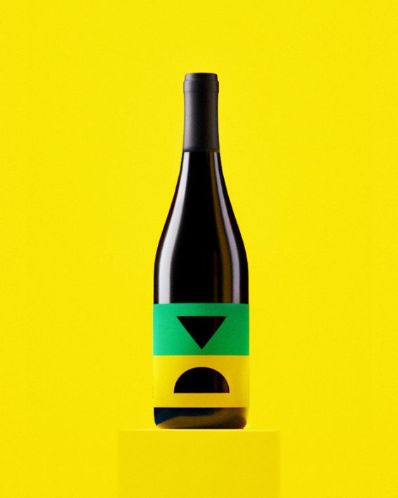
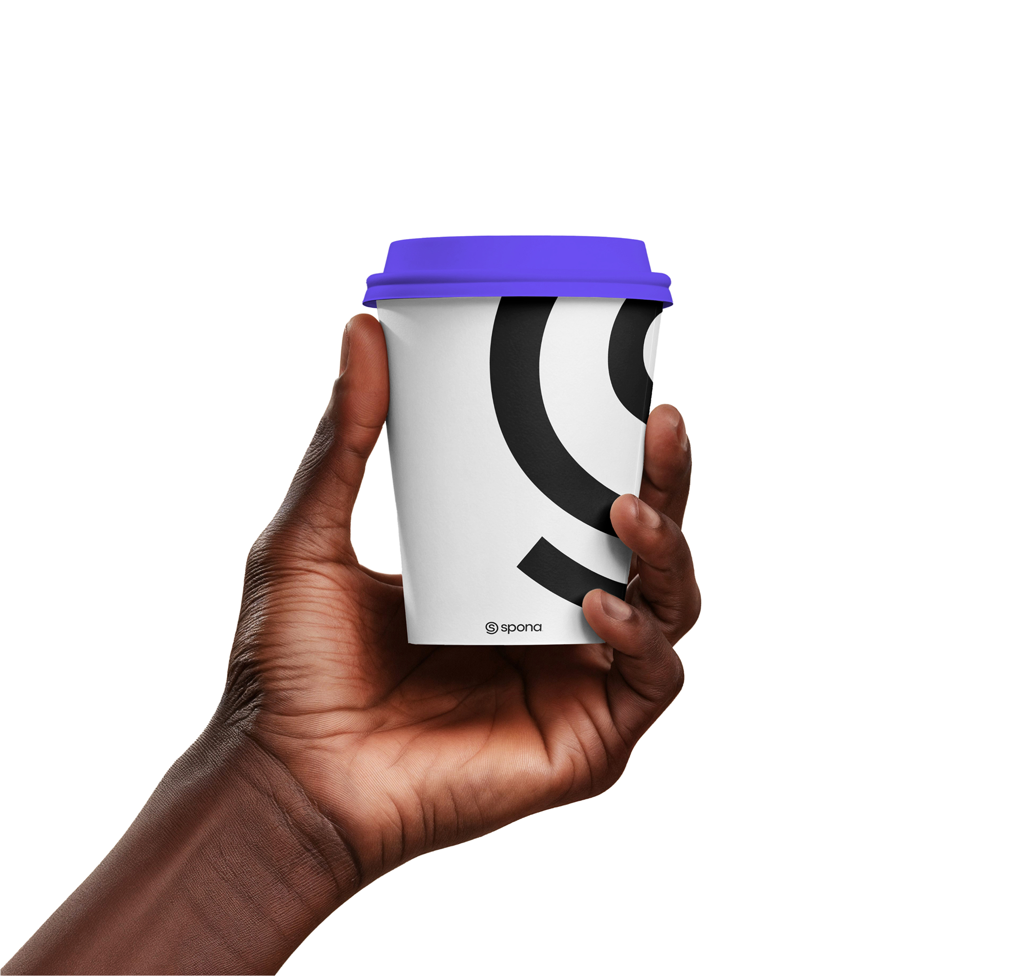
Logomark
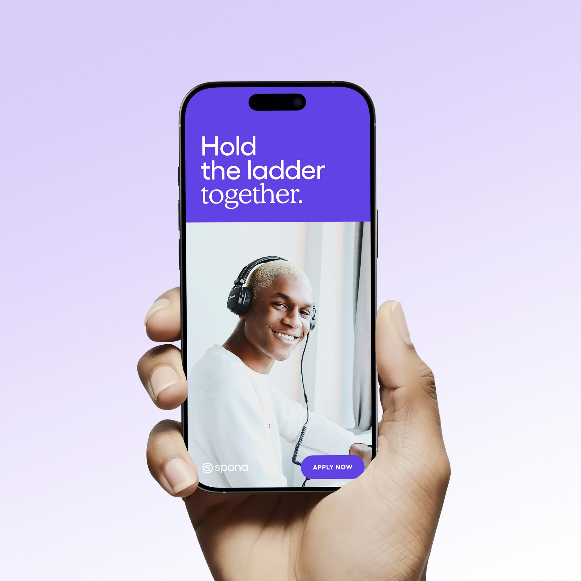
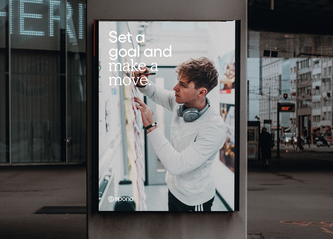
Photography direction is calm and human, using balanced light to reflect teamwork made easier and clearer through Spona.

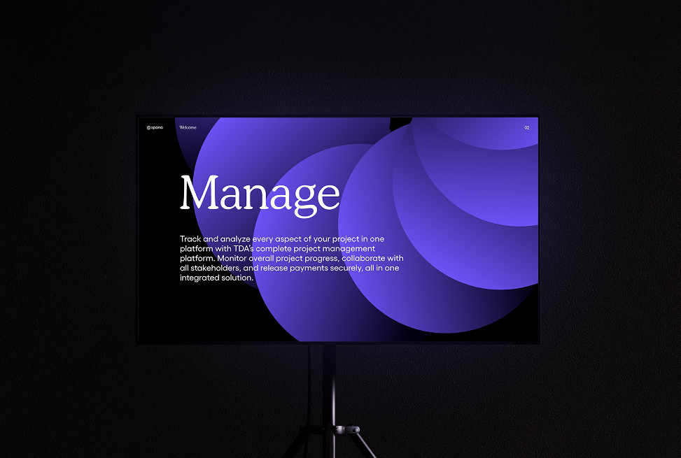
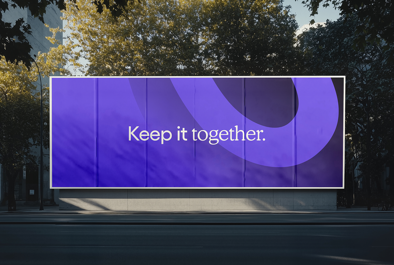
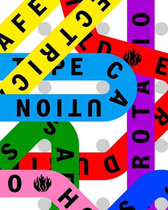
The graphic system moves in soft, fluid sequences that turn complexity into something calm and approachable, reflecting Spona’s role in guiding collaboration.
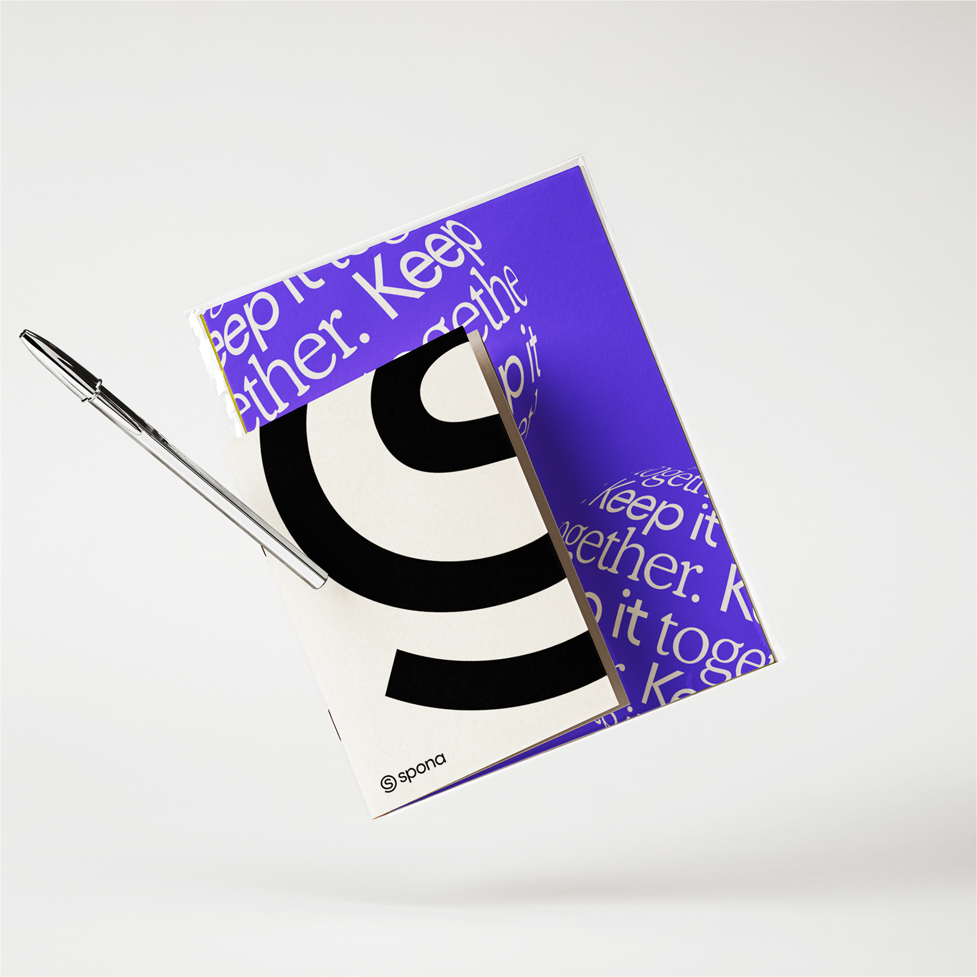
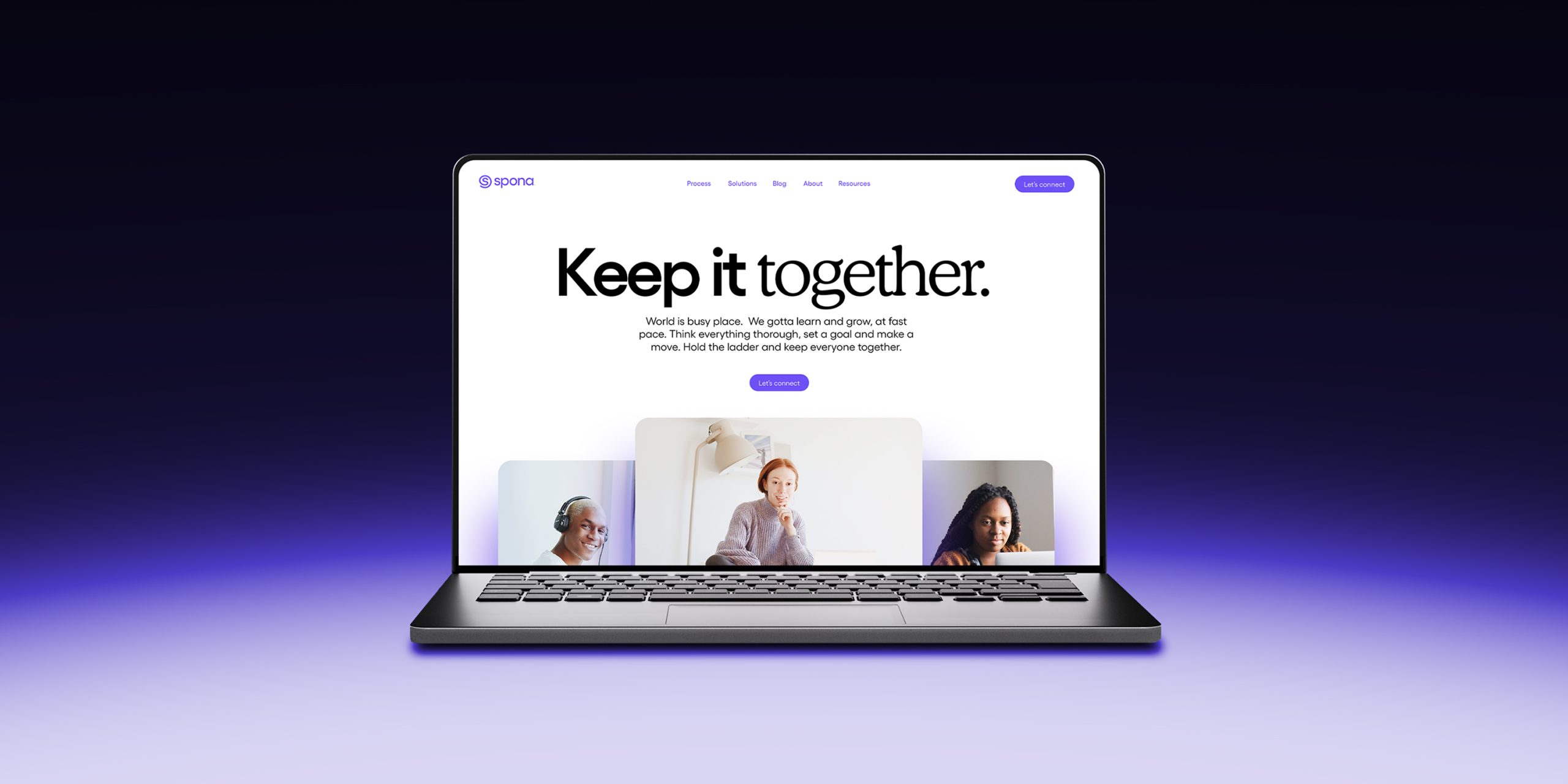
“Keep it together” expresses Spona’s role in linking clients and agencies and relieving project stress.