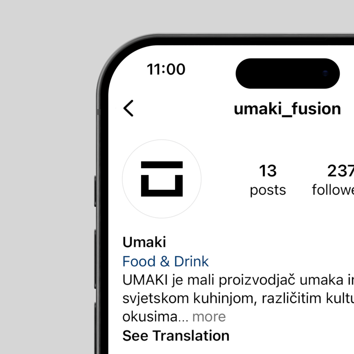
Umaki
Client
Umaki
Services
Branding, Packaging, Motion
Client
Umaki
Services
Branding, Packaging, Motion
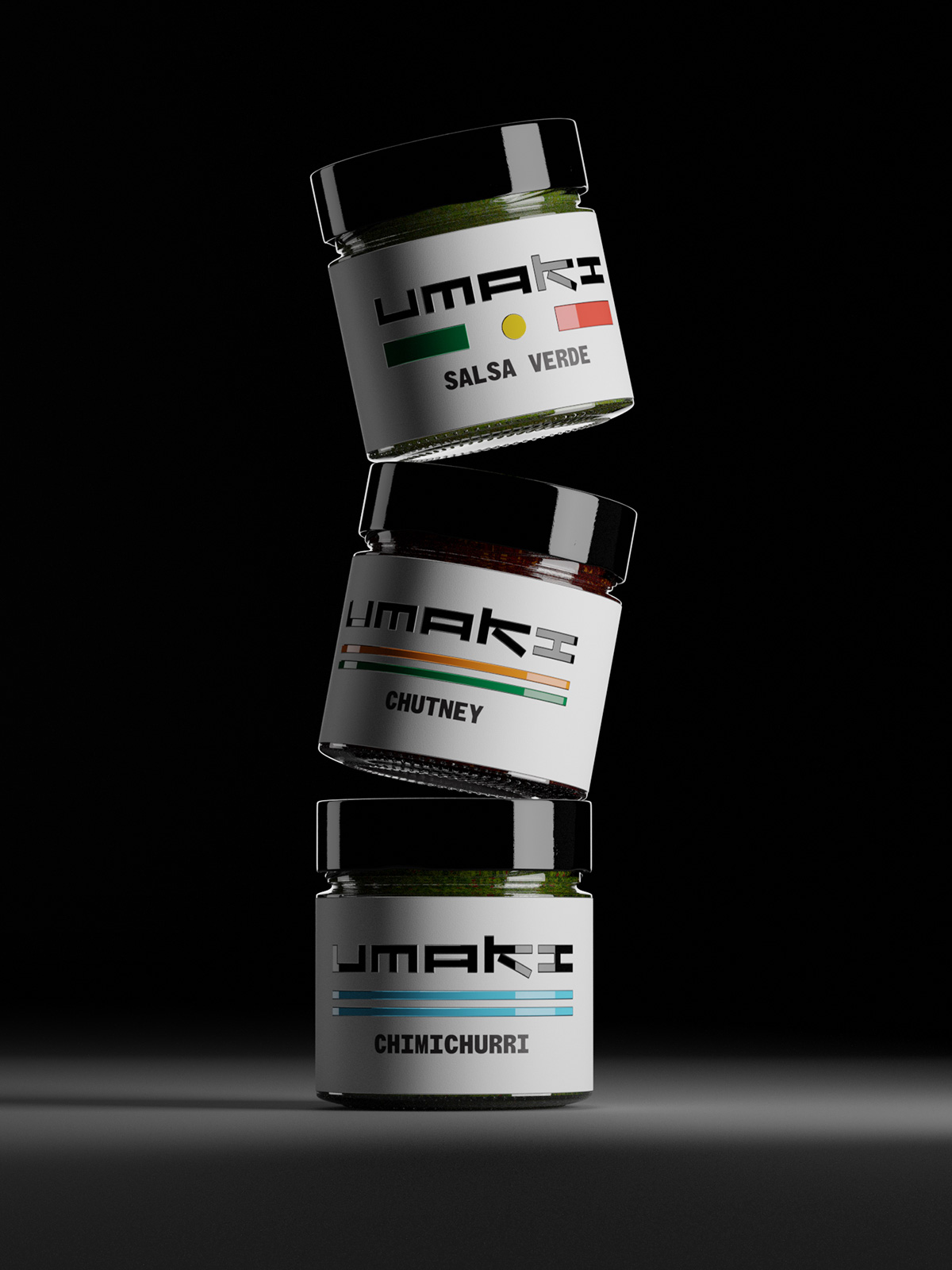
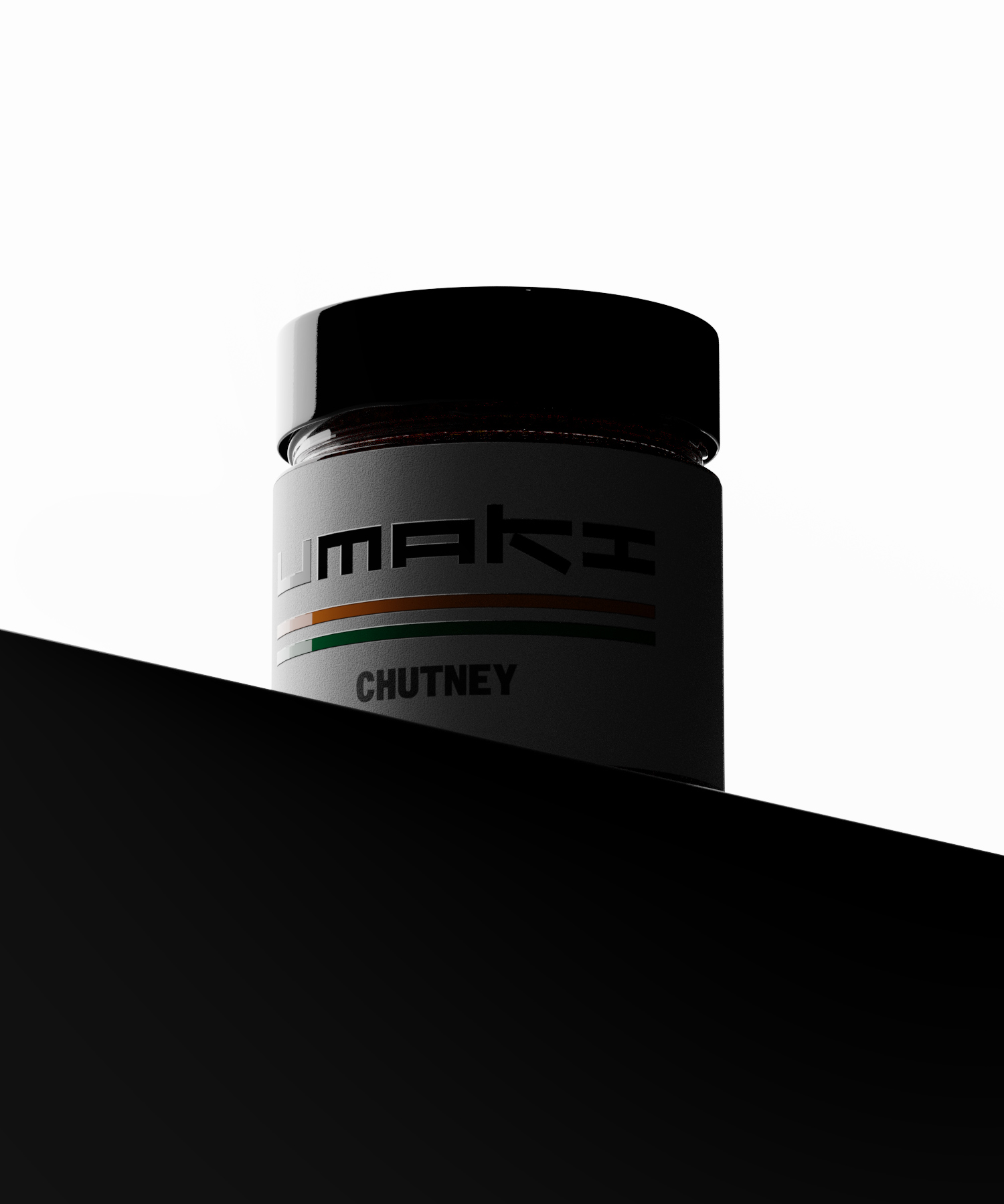
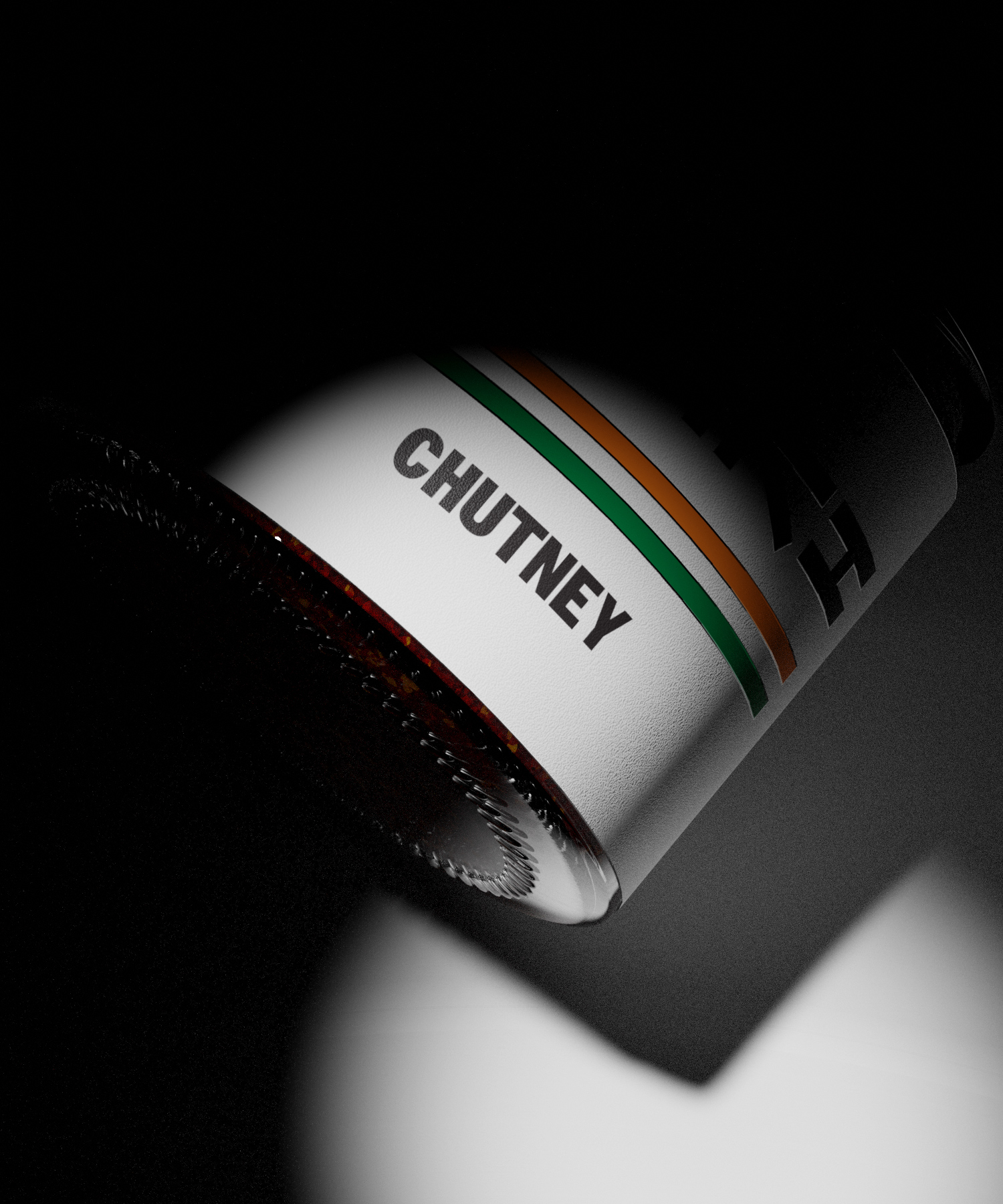
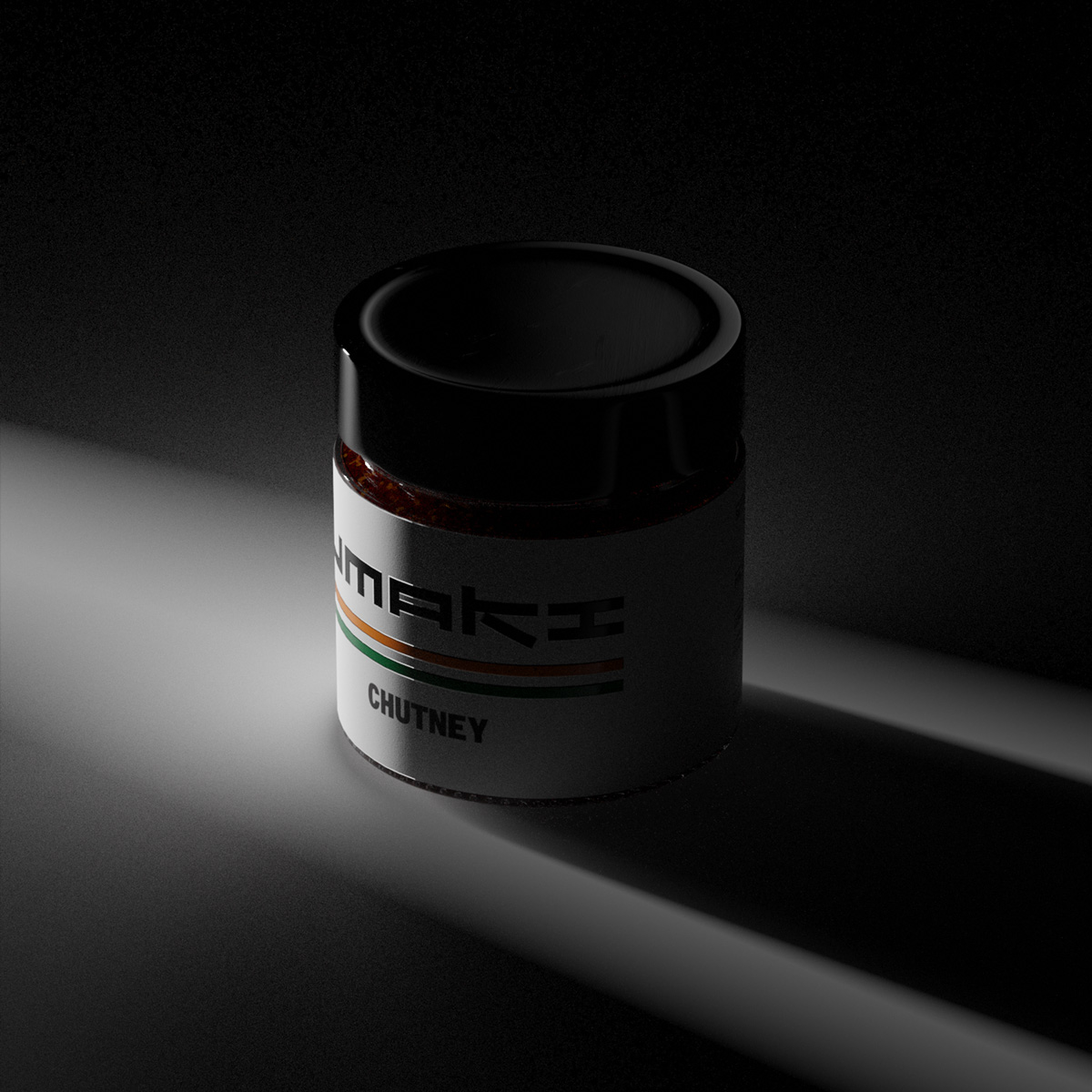
We coined the name ‘Umaki’ by combining ‘umami’, the Japanese concept of savory deliciousness, with ‘umak’, the Croatian term for sauce. Umaki offers a range of raw sauces inspired by global culinary traditions, emphasizing umami flavors to elevate dishes to an international culinary standard. The logo draws from the Japanese origin of “umami,” while the label design incorporates stylized national flags, hinting at each sauce’s unique flavor and origin. This approach not only helps consumers select their preferred sauce but also celebrates the diversity of global tastes and cultures, making them feel like travelers and taste tourists.
Logotype


Typography and colors
Stroy Mono is a local typeface from the Hot Type foundry, while the color palette draws inspiration from national flags across the globe.

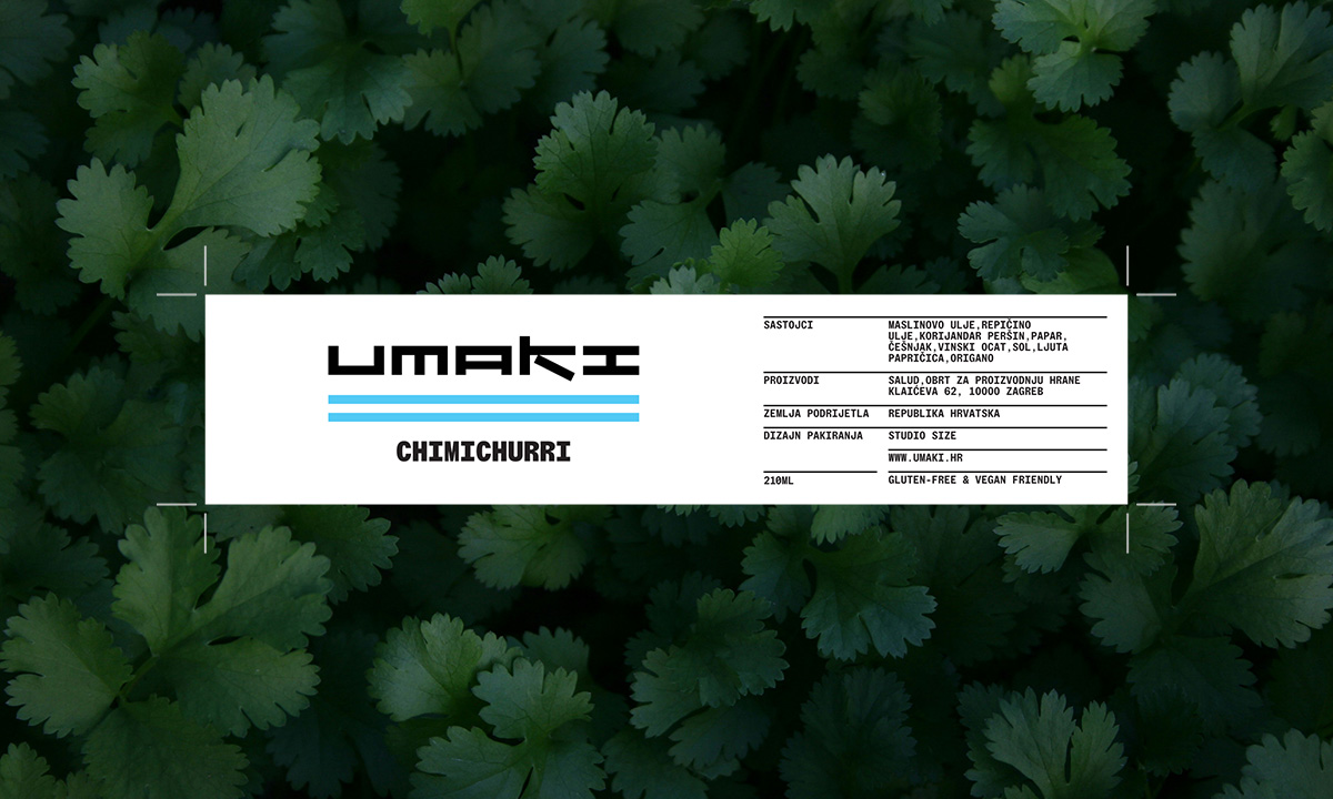
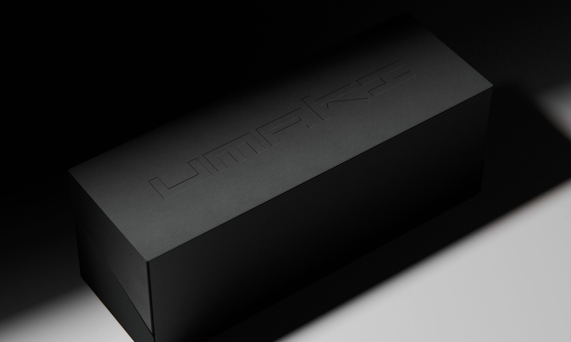
Packaging
The scope included selecting the appropriate glass jars and caps, managing the label printing, and producing multiproduct gift boxes
Share the bite
We created a range of social media assets to spread Umaki’s message of local ingredients and global flavors.