Bronza
Client
Bronza
Services
Branding, Packaging
Client
Bronza
Services
Branding, Packaging
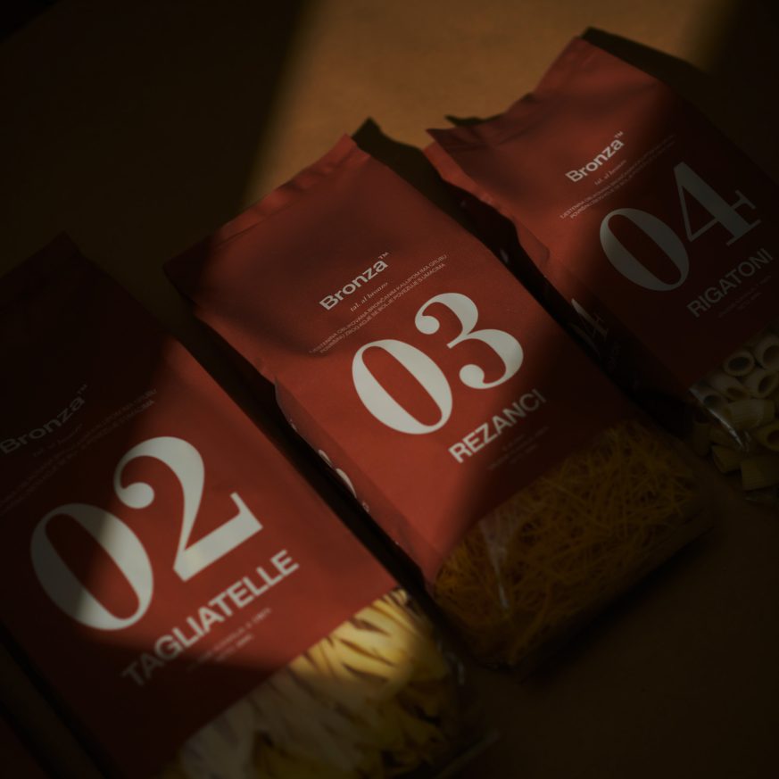
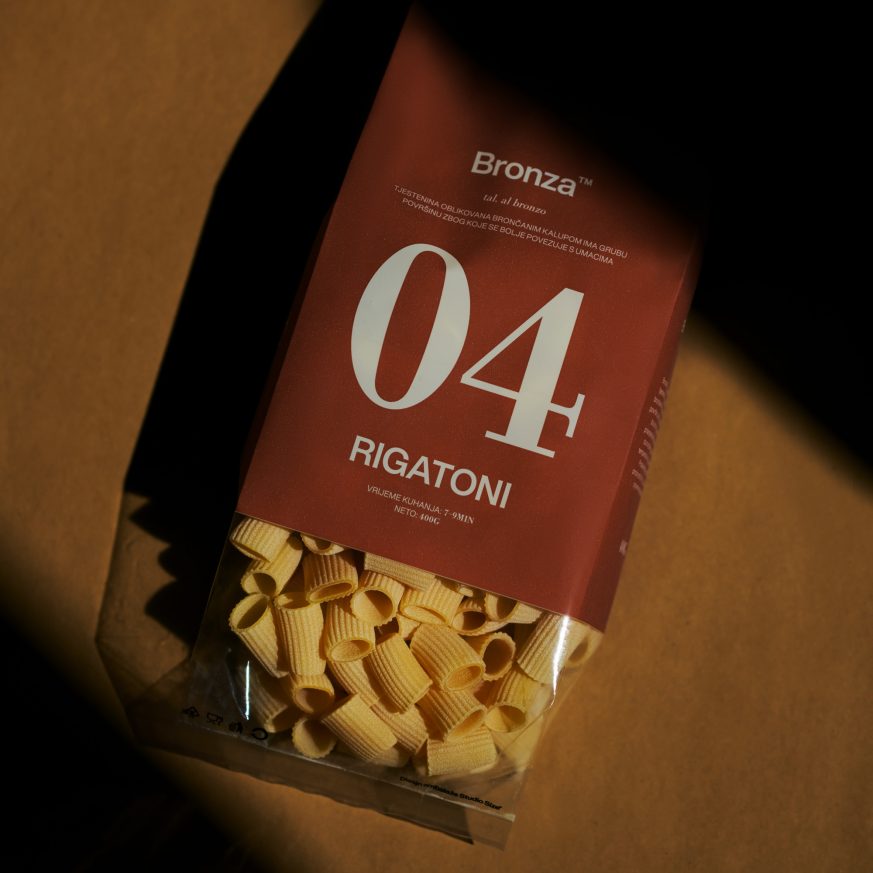
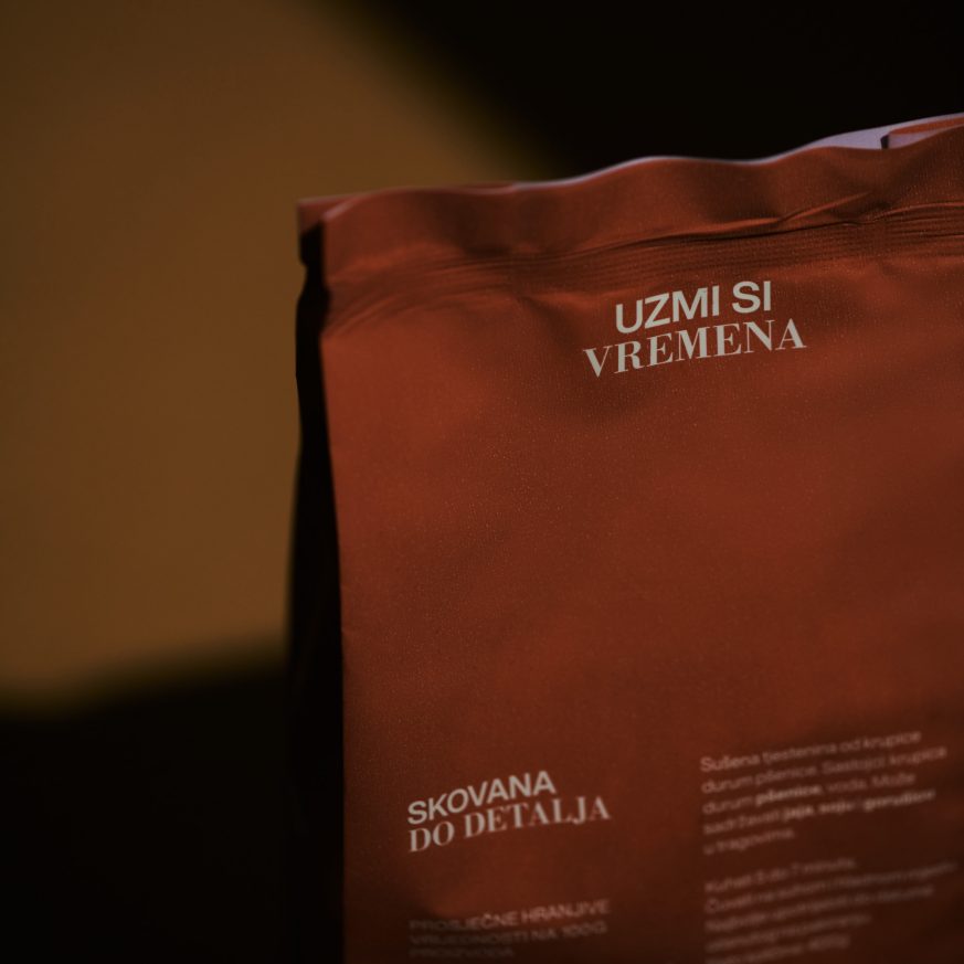
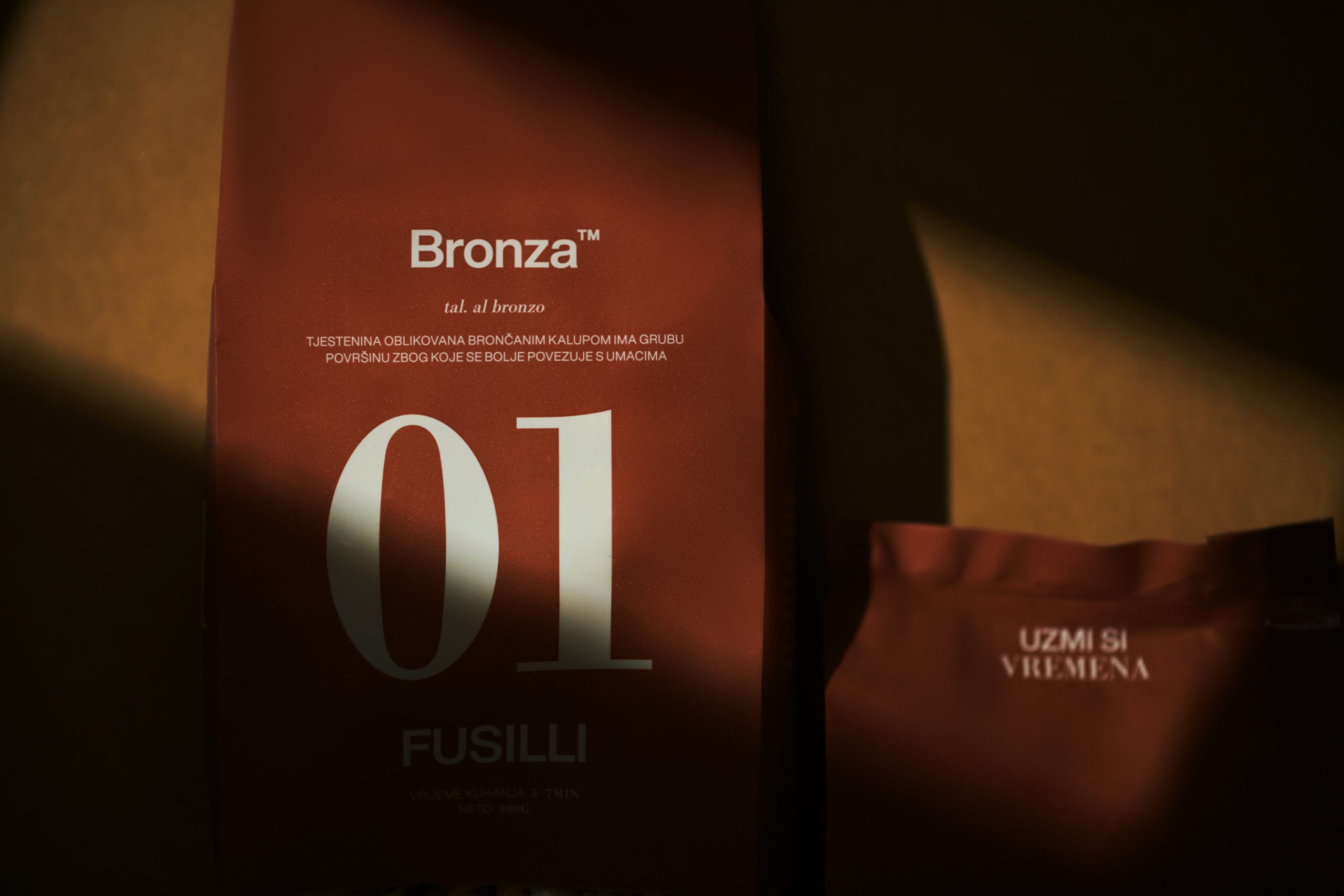
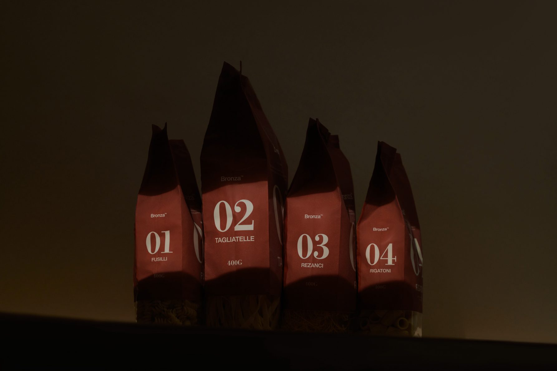
Studio Size created the brand name, visual identity, and packaging design for Bronza—a gourmet pasta brand that uses a unique manufacturing process with bronze dies. This technique imparts a rougher texture to the pasta, improving sauce adhesion and consequently enhancing the dish’s overall taste. The brand’s identity resonates with this unique attribute, as embodied in its name, design, and the subtly textured surface of its packaging.

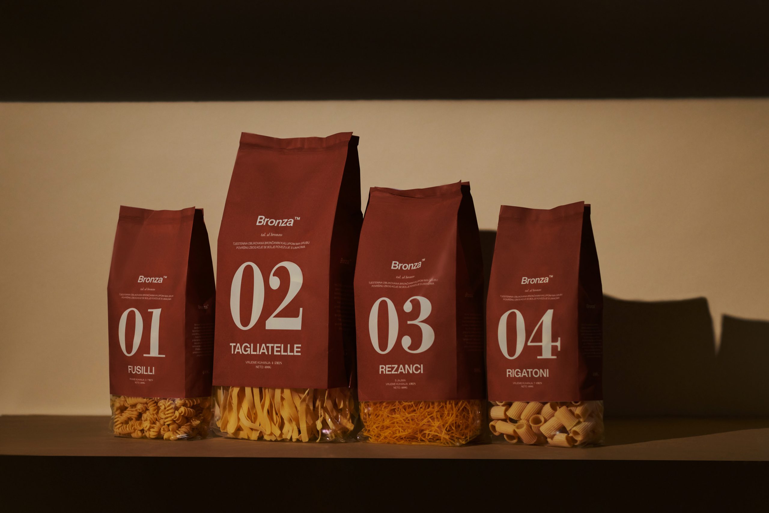
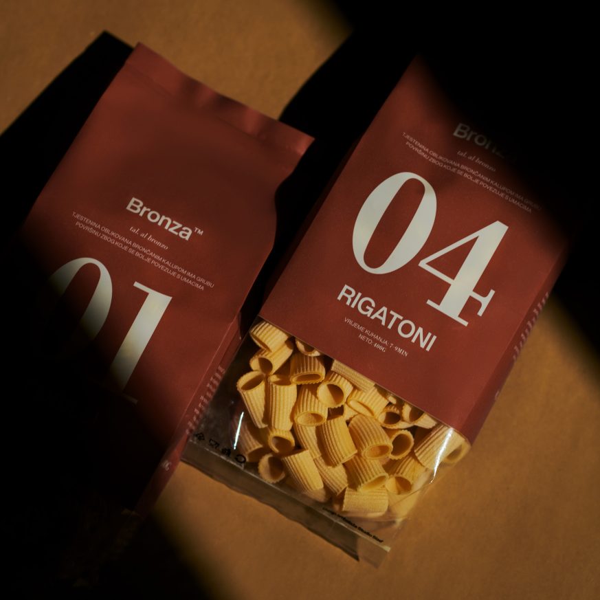
Products are assigned numerical codes to enable customers to swiftly identify their preferred type of pasta.
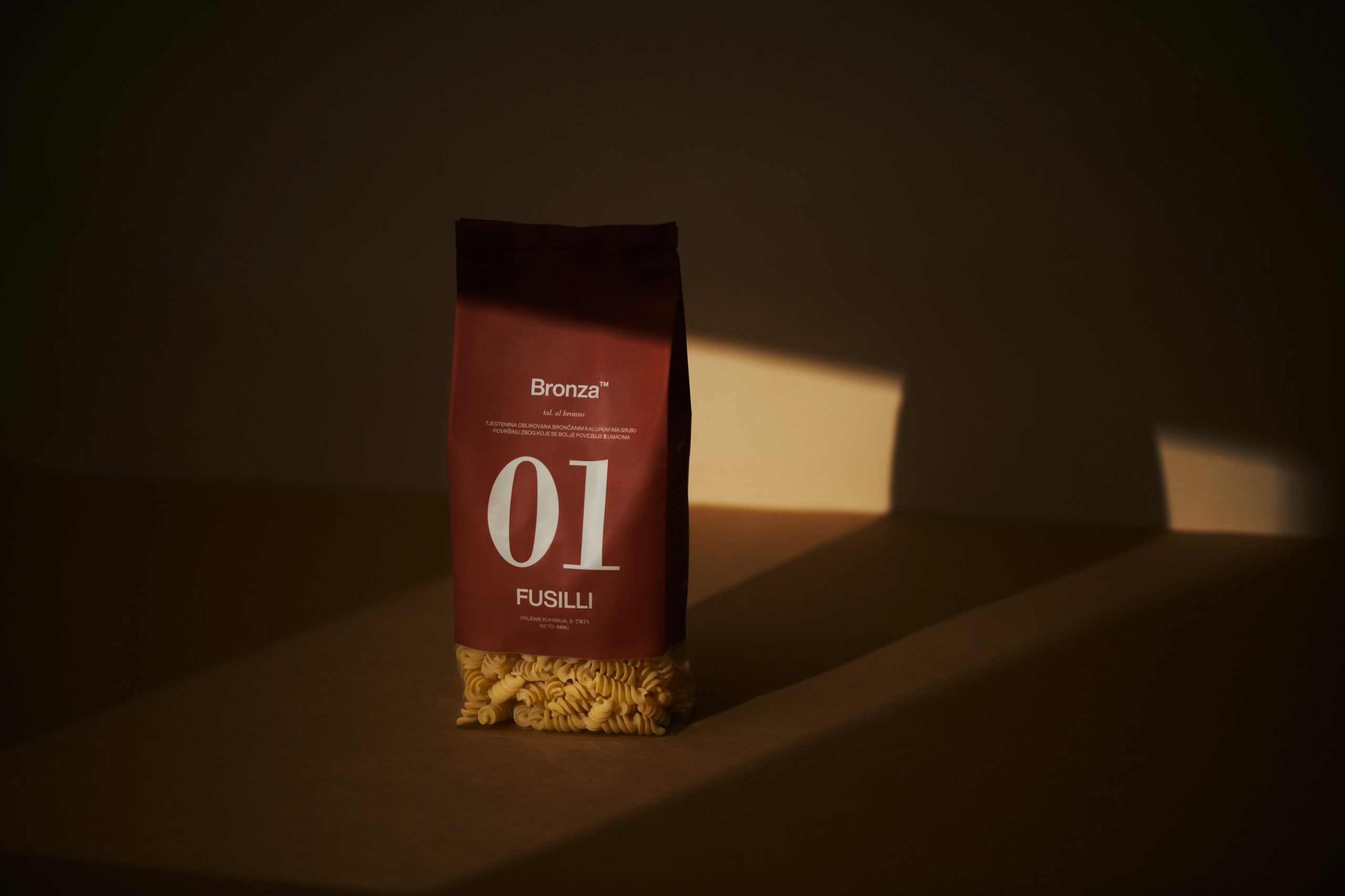
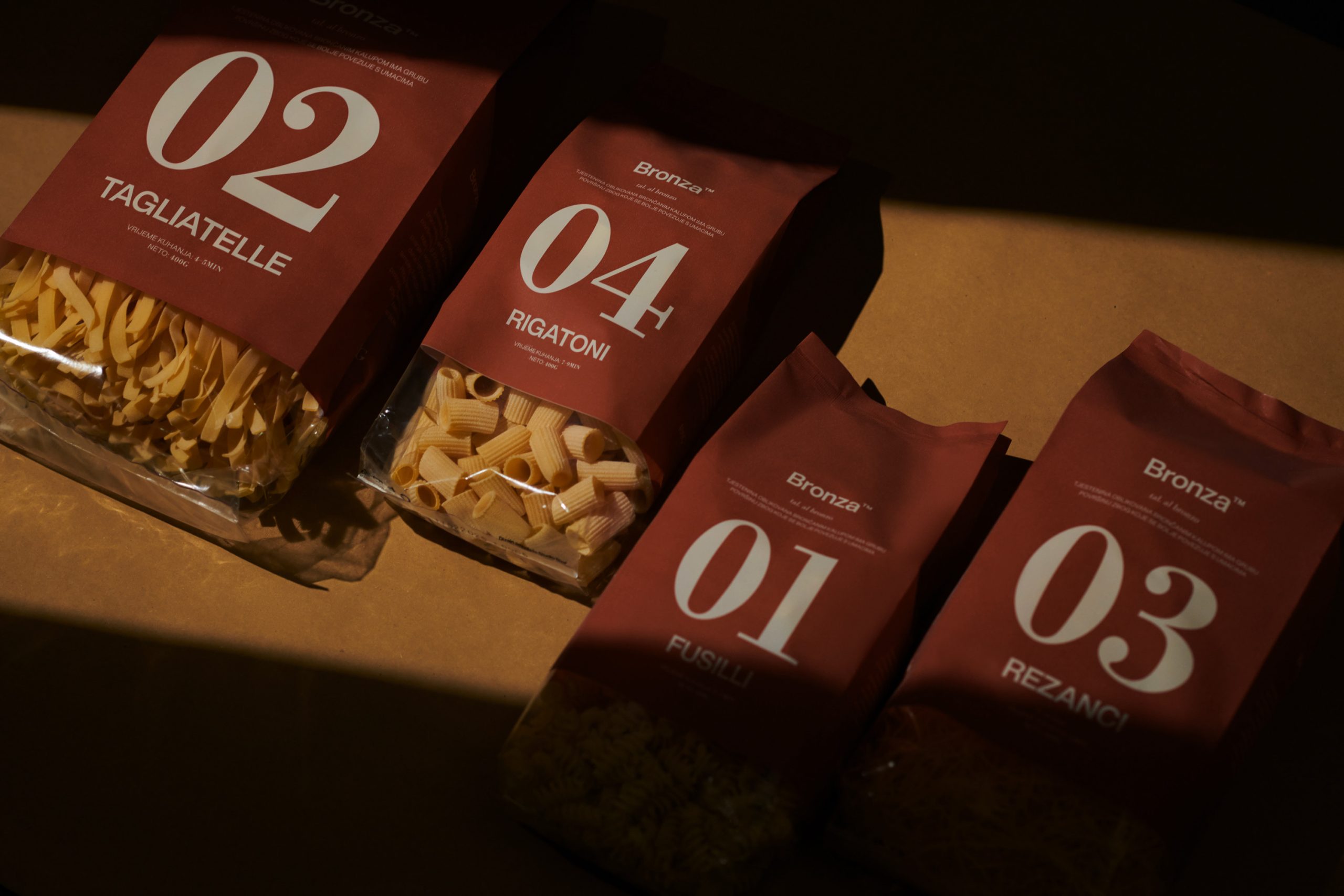

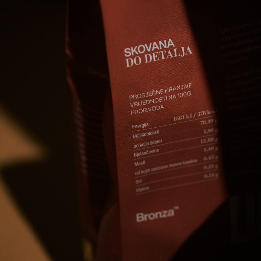
Helvetica Now is the primary typeface, while the secondary typeface, Bodoni, adds a touch of style and serif contrast.