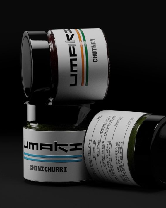
Exat
Modernism in motion
Client
Vino i gitare
Services
Packaging, Photography
Client
Vino i gitare
Services
Packaging, Photography
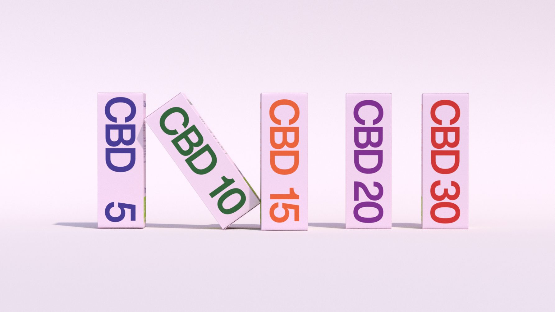
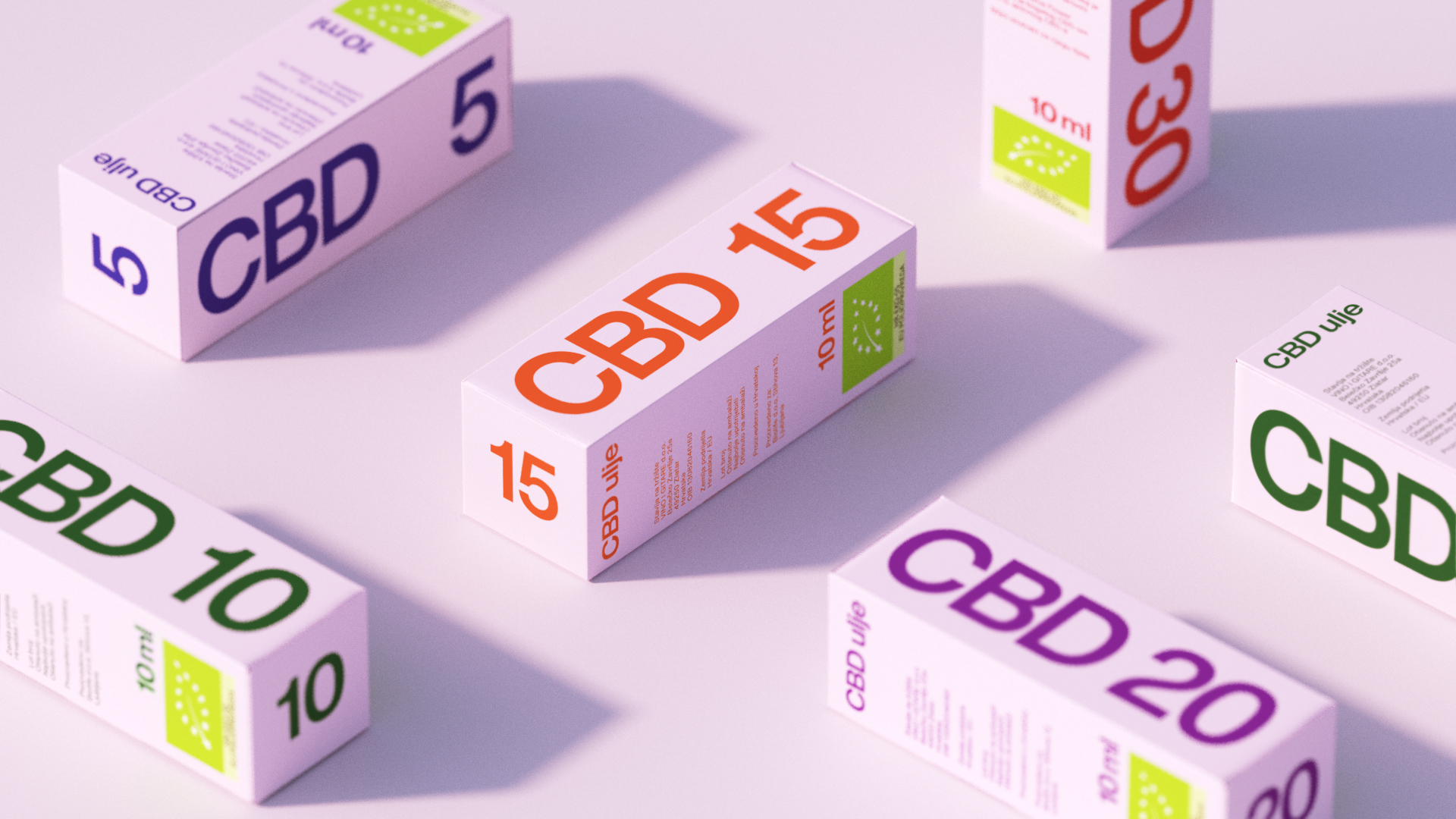
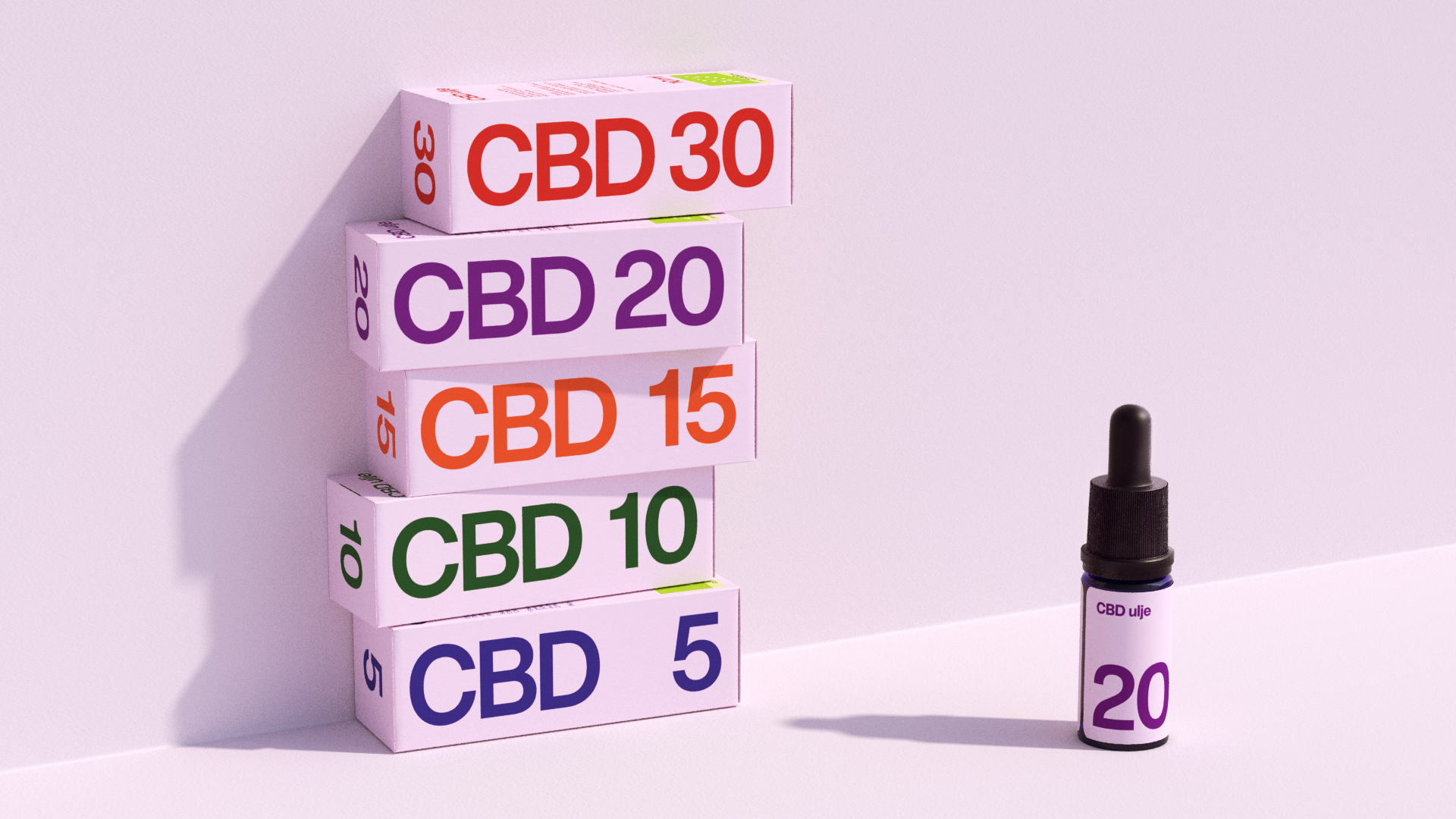
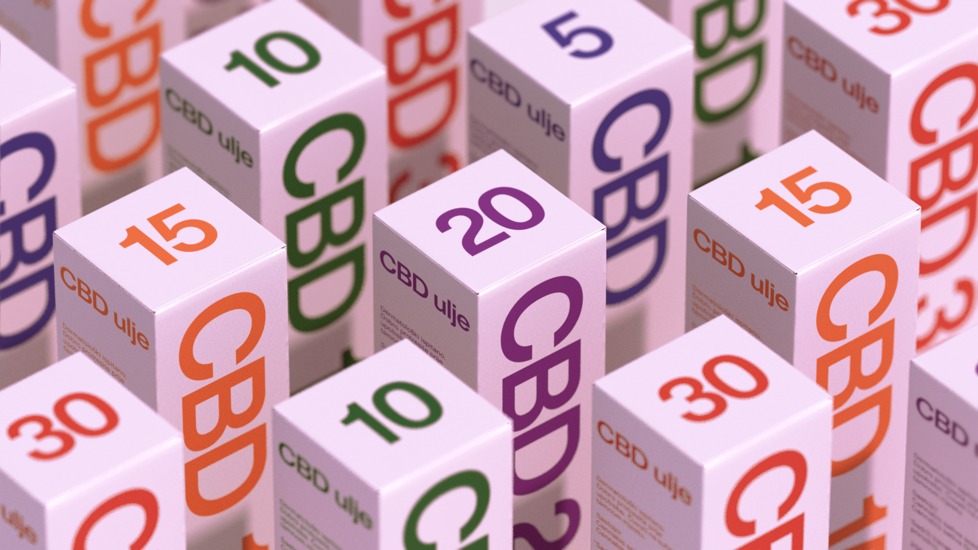
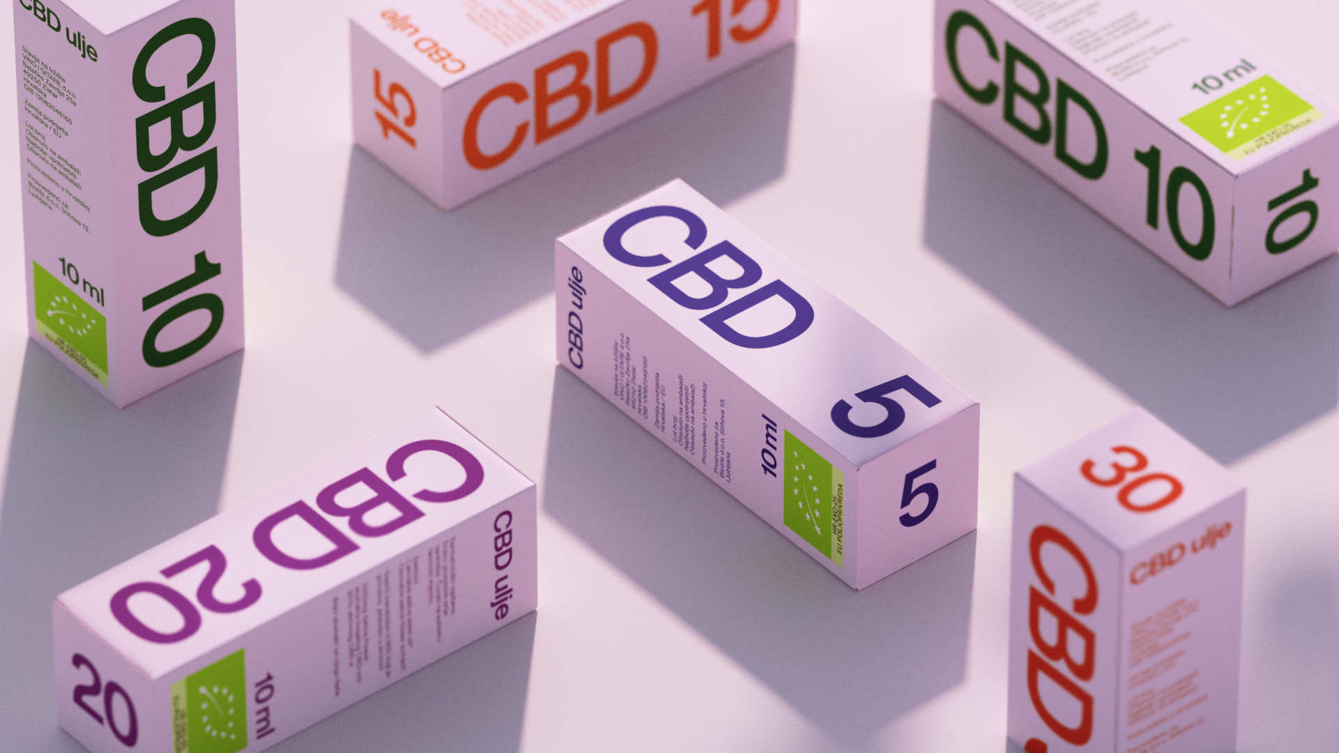
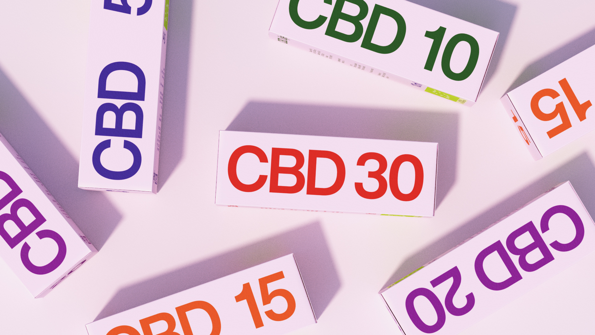
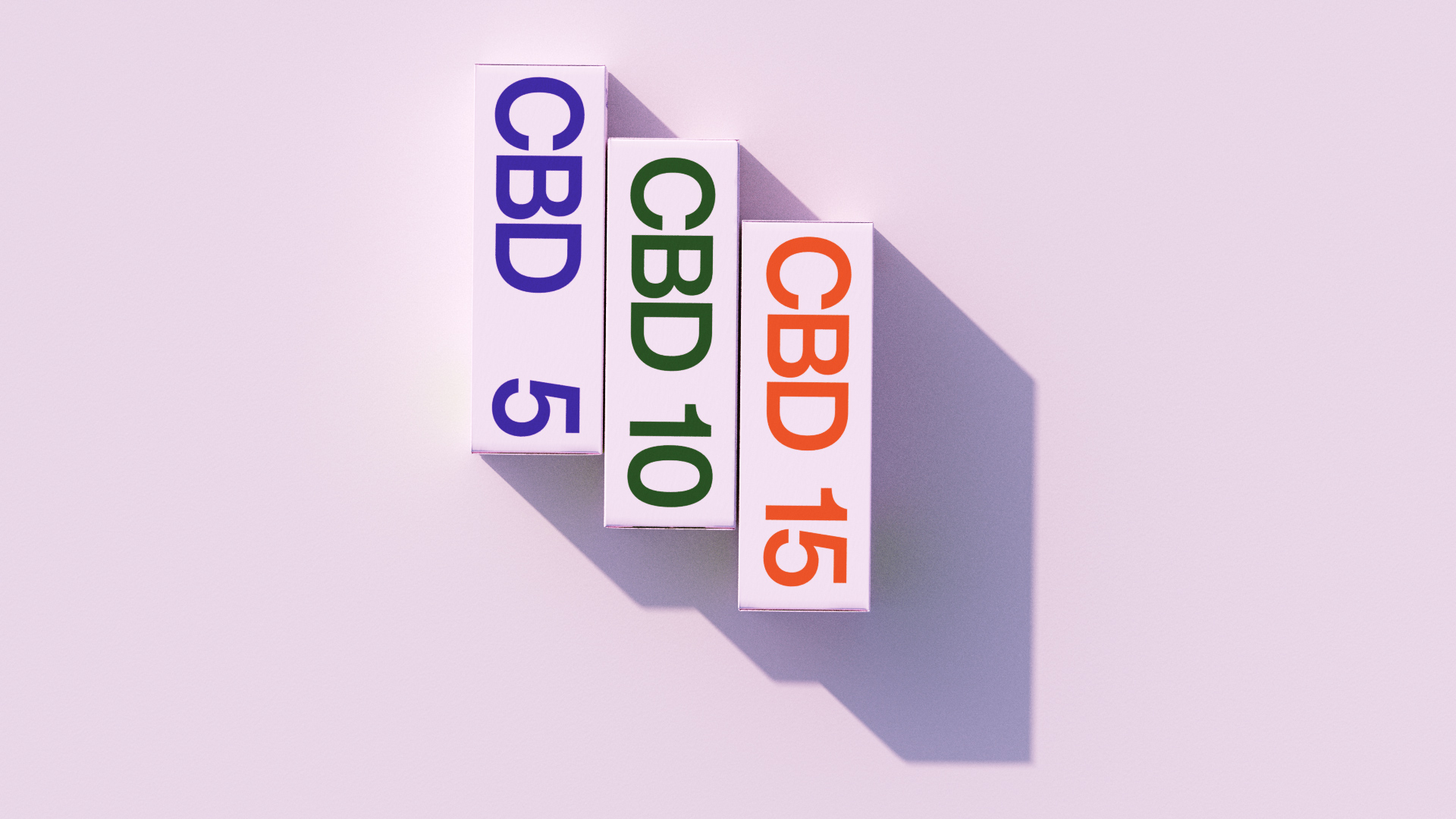
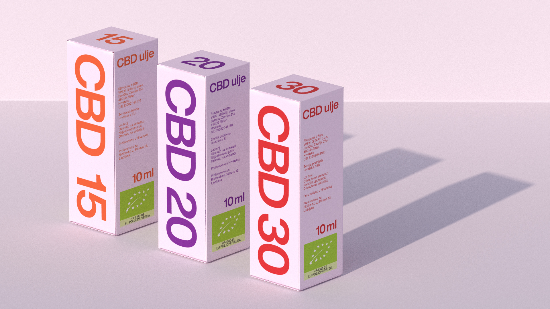
We designed a visual identity and packaging for a CBD oil product line, a new player in a new category at the time. To emphasize the product name and spark interest among consumers, we took a functional approach to design. Grotesque sans serif typography provides maximum readability, which is distinctive and helps shoppers quickly determine the level of active CBD in product variations. The color palette gives the packaging a positive character that symbolizes the product’s promise: to improve the consumers’ condition. The functional role of the colors is to serve as identifying code for different product variations.


Modernism in motion
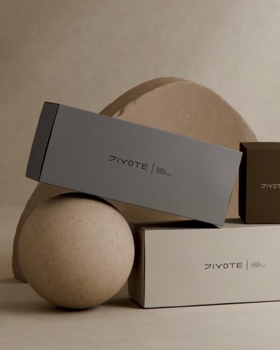
Clean Korean cosmetics
Red hot type animations

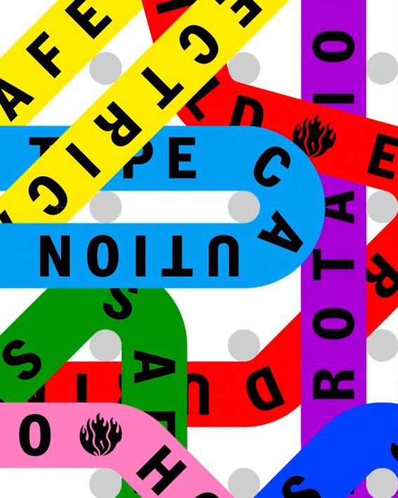
Web3 risks in real time

Sensible media monitoring
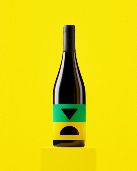
Iconic wine blend
Future starts today
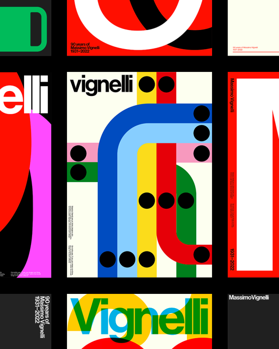
Paying tribute to Massimo
Trip for your taste buds
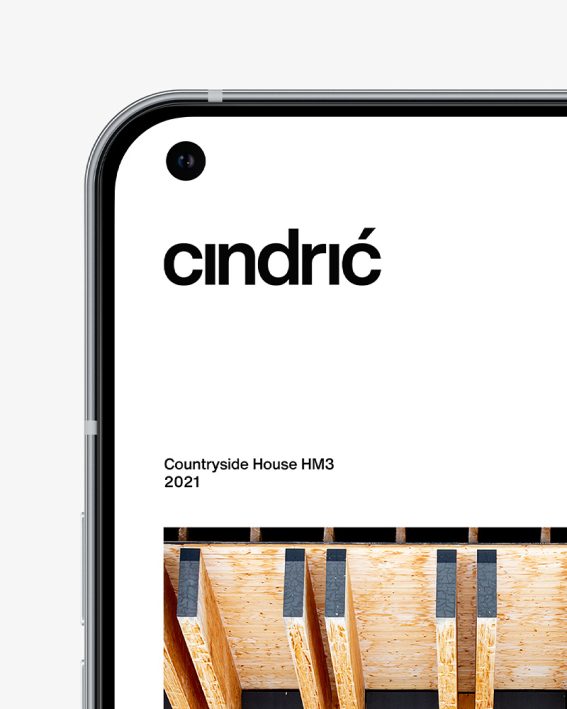
Minimal arhitecture
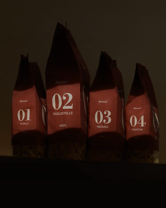
Coined pasta
Awesome motion templates
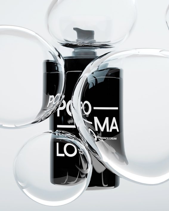
Laid-back skincare