Divote
Client
Divote
Services
Branding, Motion, Website

Client
Divote
Services
Branding, Motion, Website
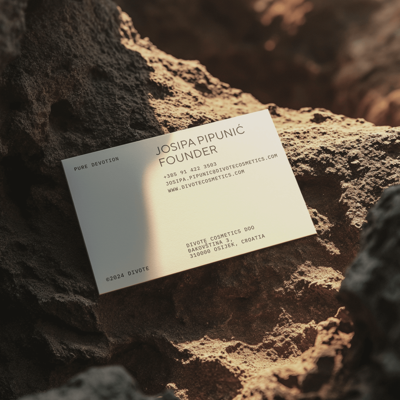
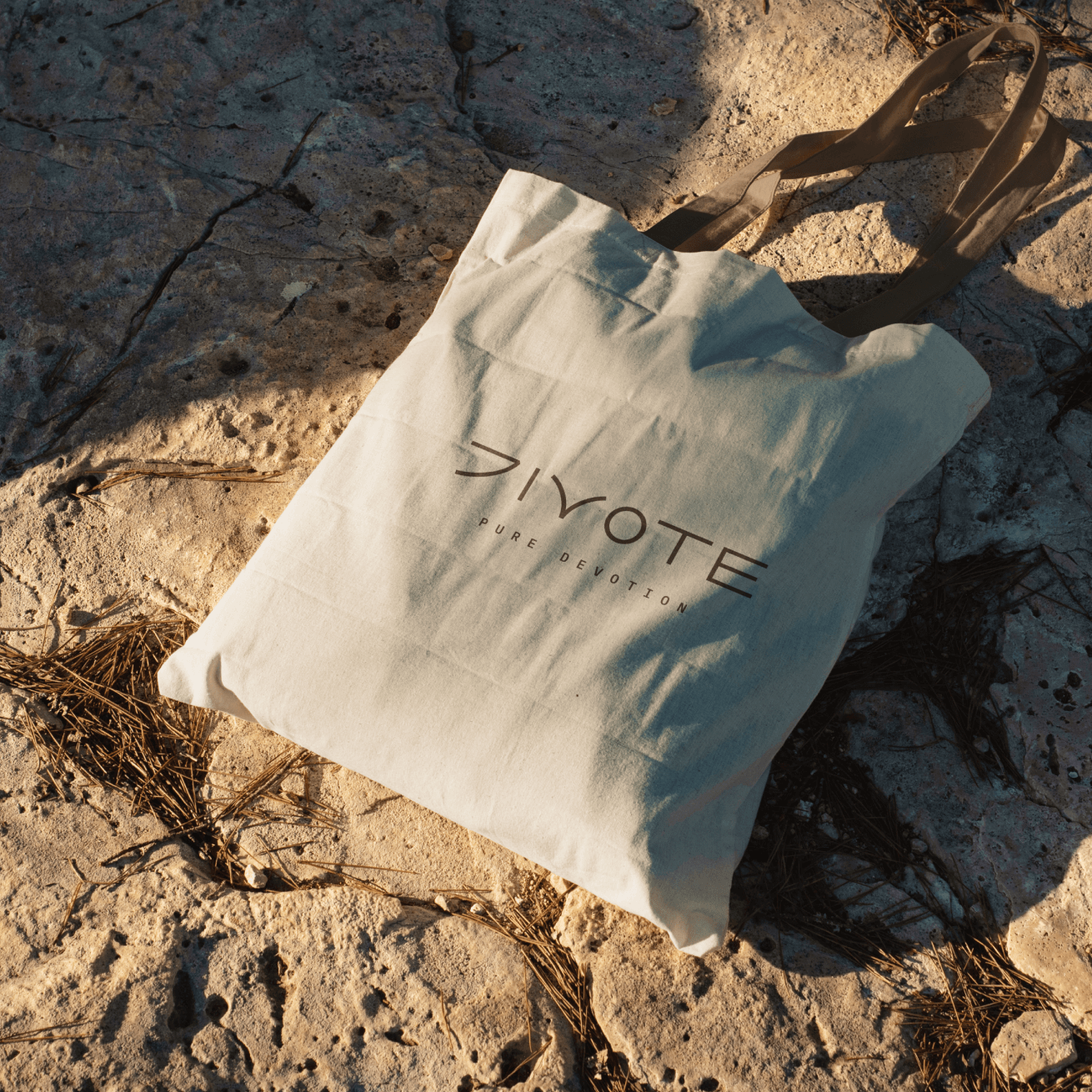
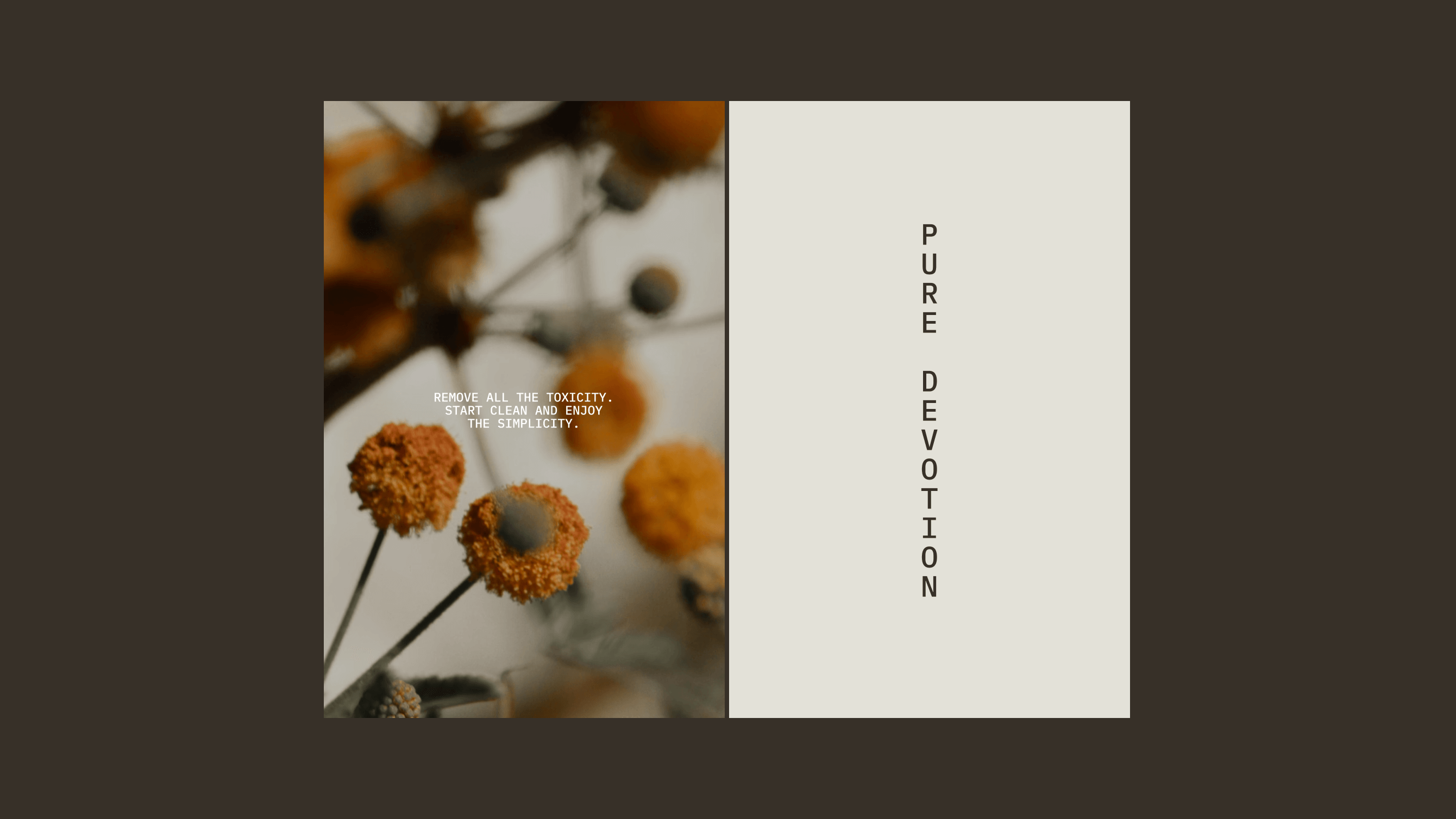
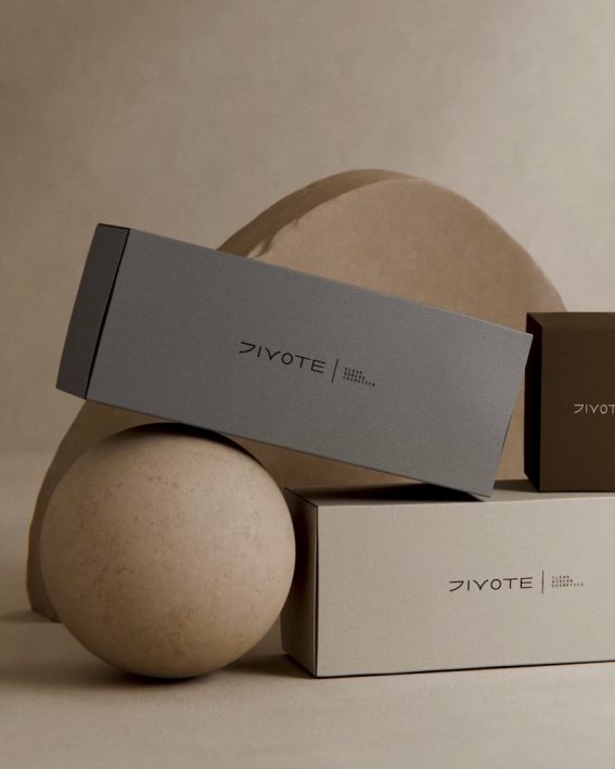
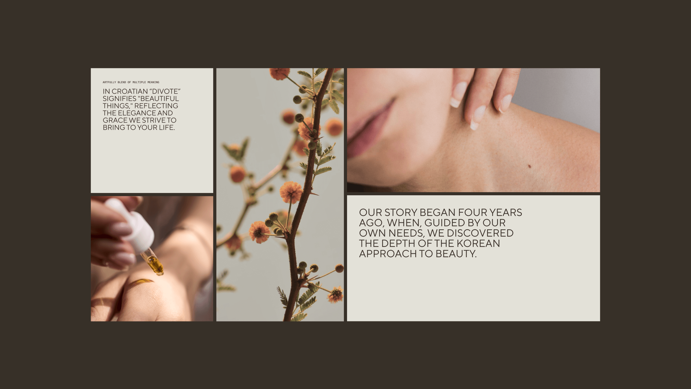
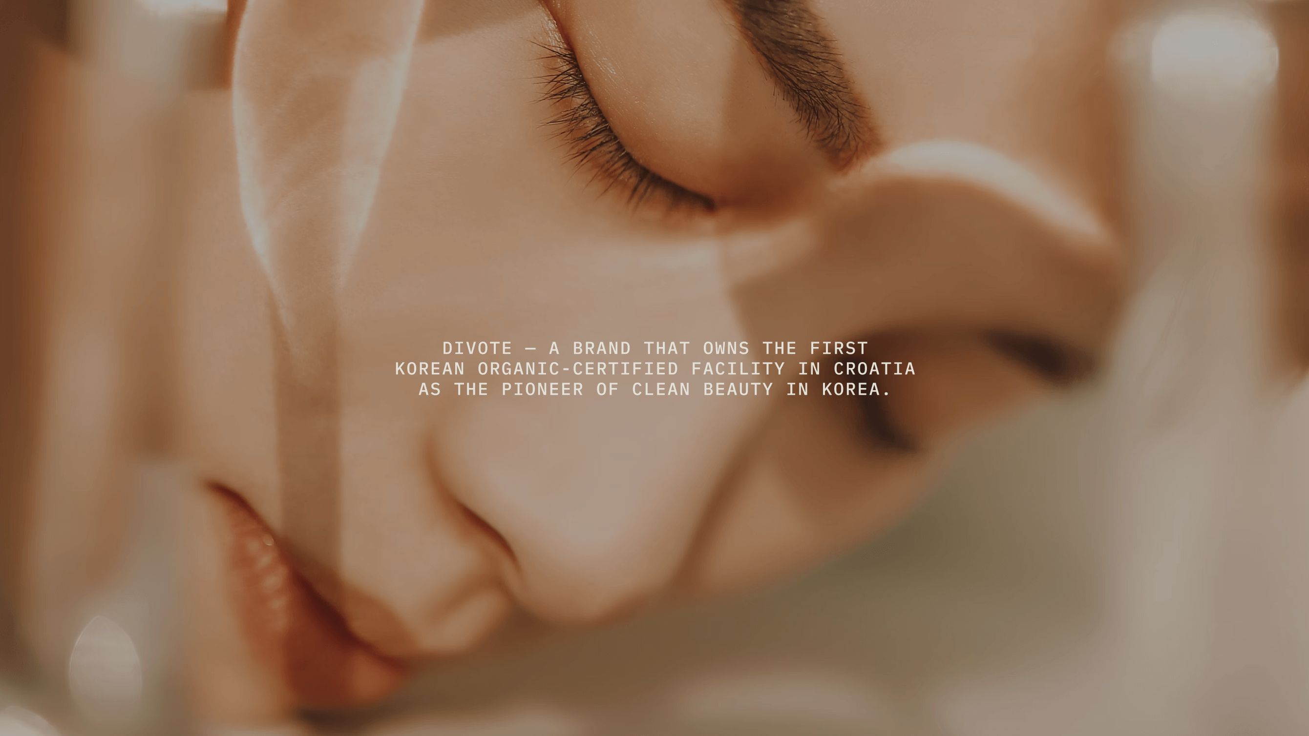
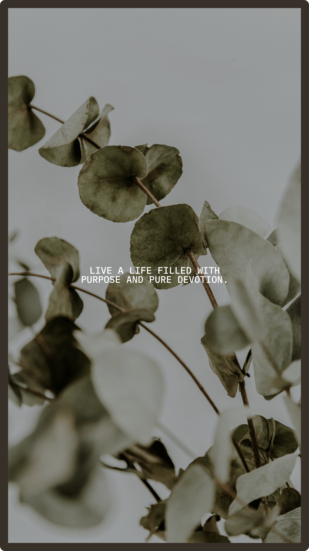
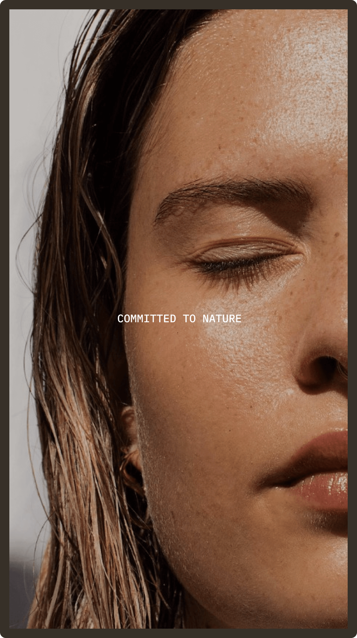
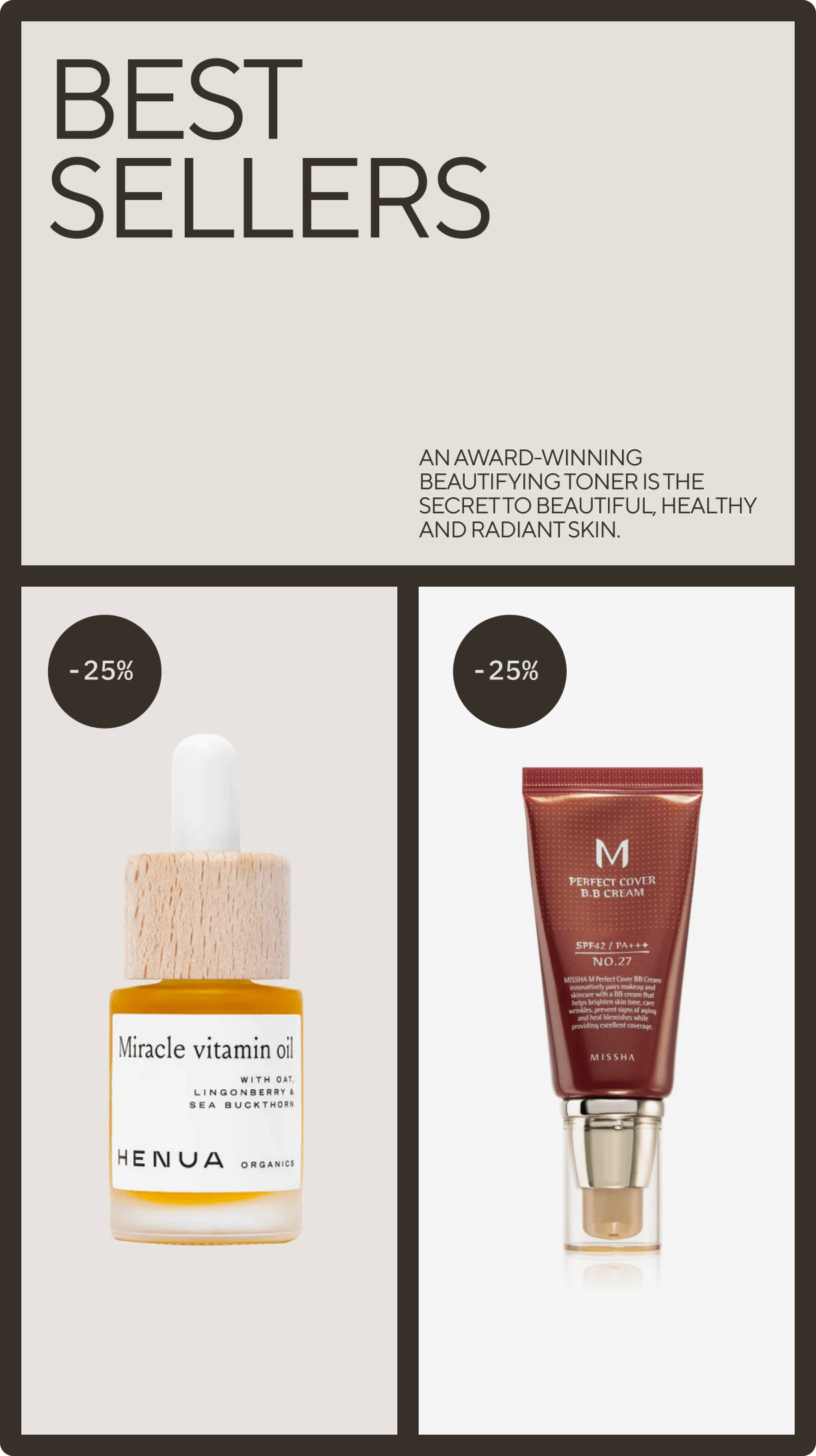
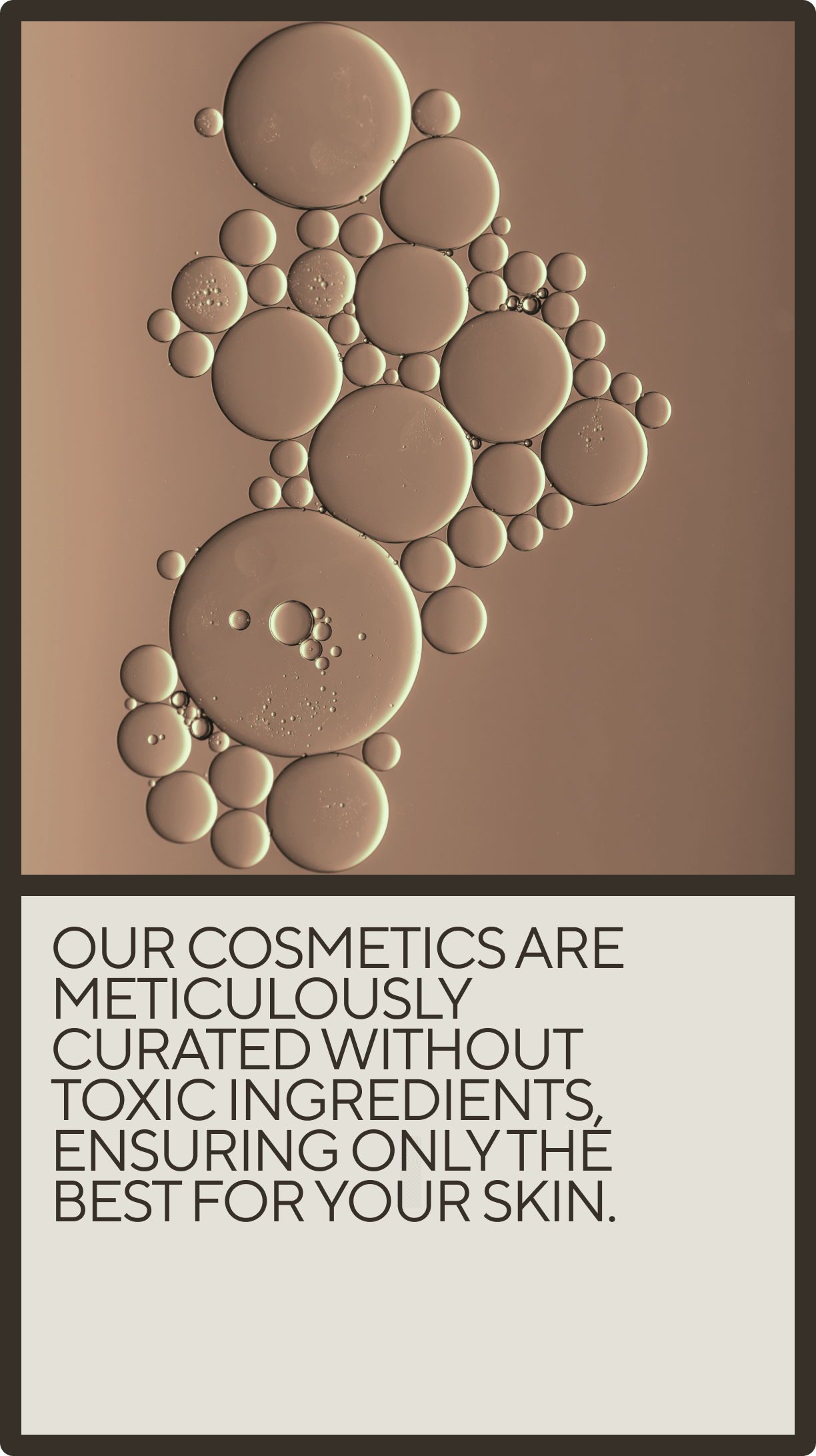
Studio Size created the brand identity for Divote, a brand dedicated to bringing the best of Korean clean cosmetics to Europe. The name “Divote” originates from the Croatian word for “beauty” and also reflects the brand’s devotion to curating only the finest products. The visual identity draws inspiration from Korean culture. The logotype pays homage to Hangul, the Korean writing system, while the layout and grid system are influenced by the traditional Hanok-style doors found in Korean architecture. The color palette is natural, clean, and calming, reflecting the purity of Korean clean cosmetics. The project scope included naming, brand strategy, visual identity, motion branding, and web design for the Divote digital store.
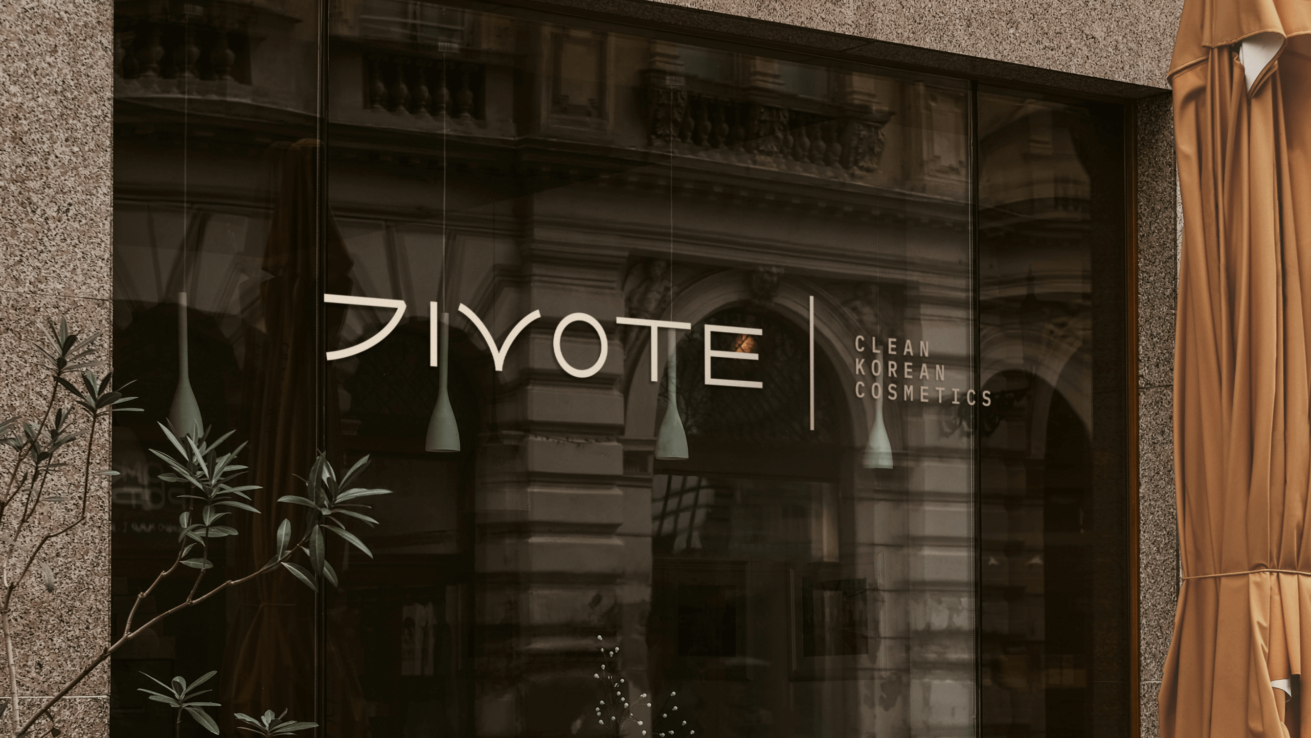
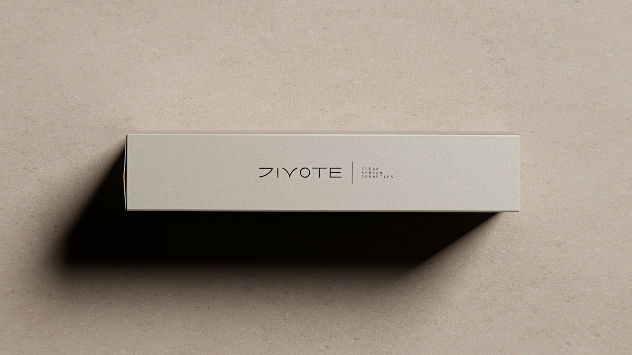
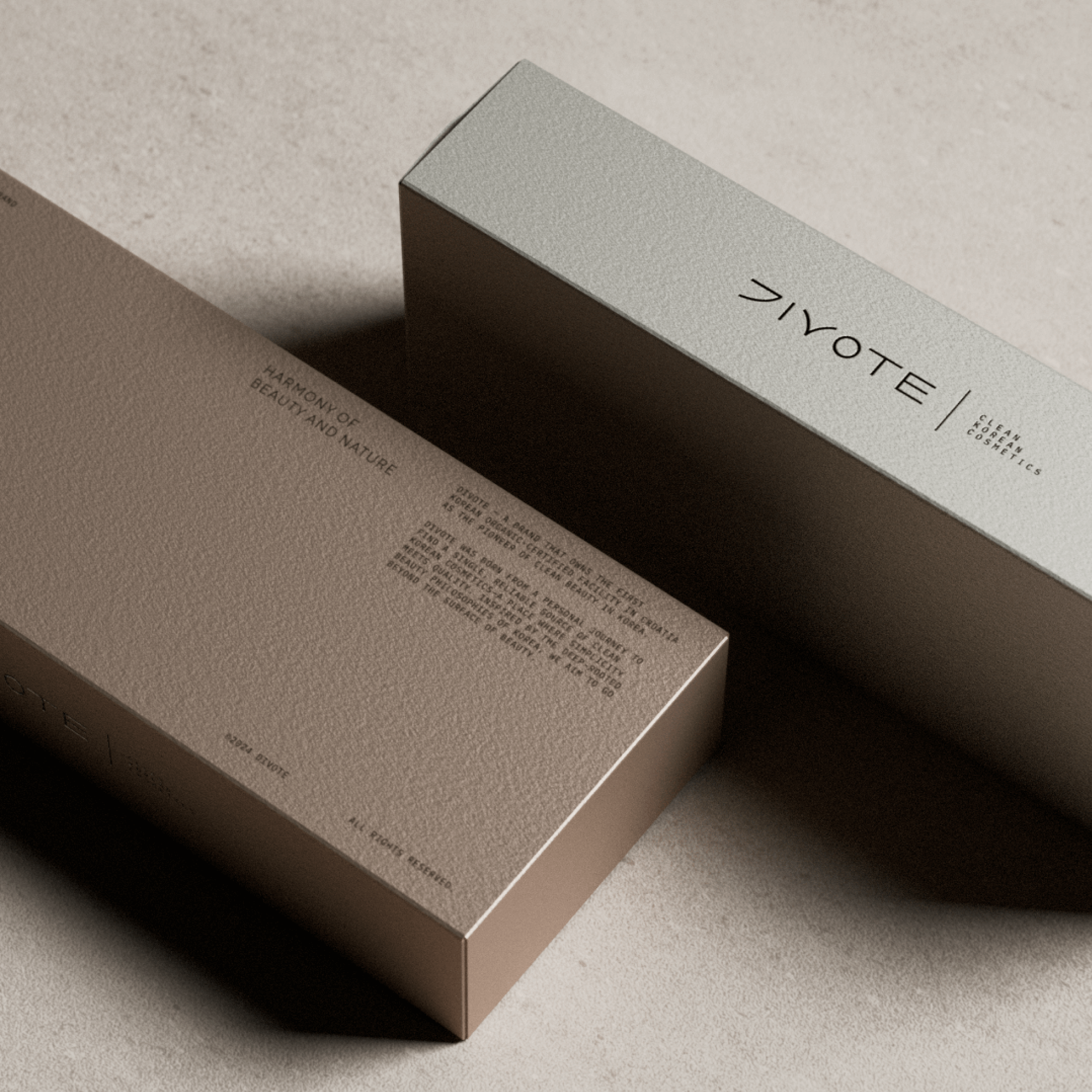
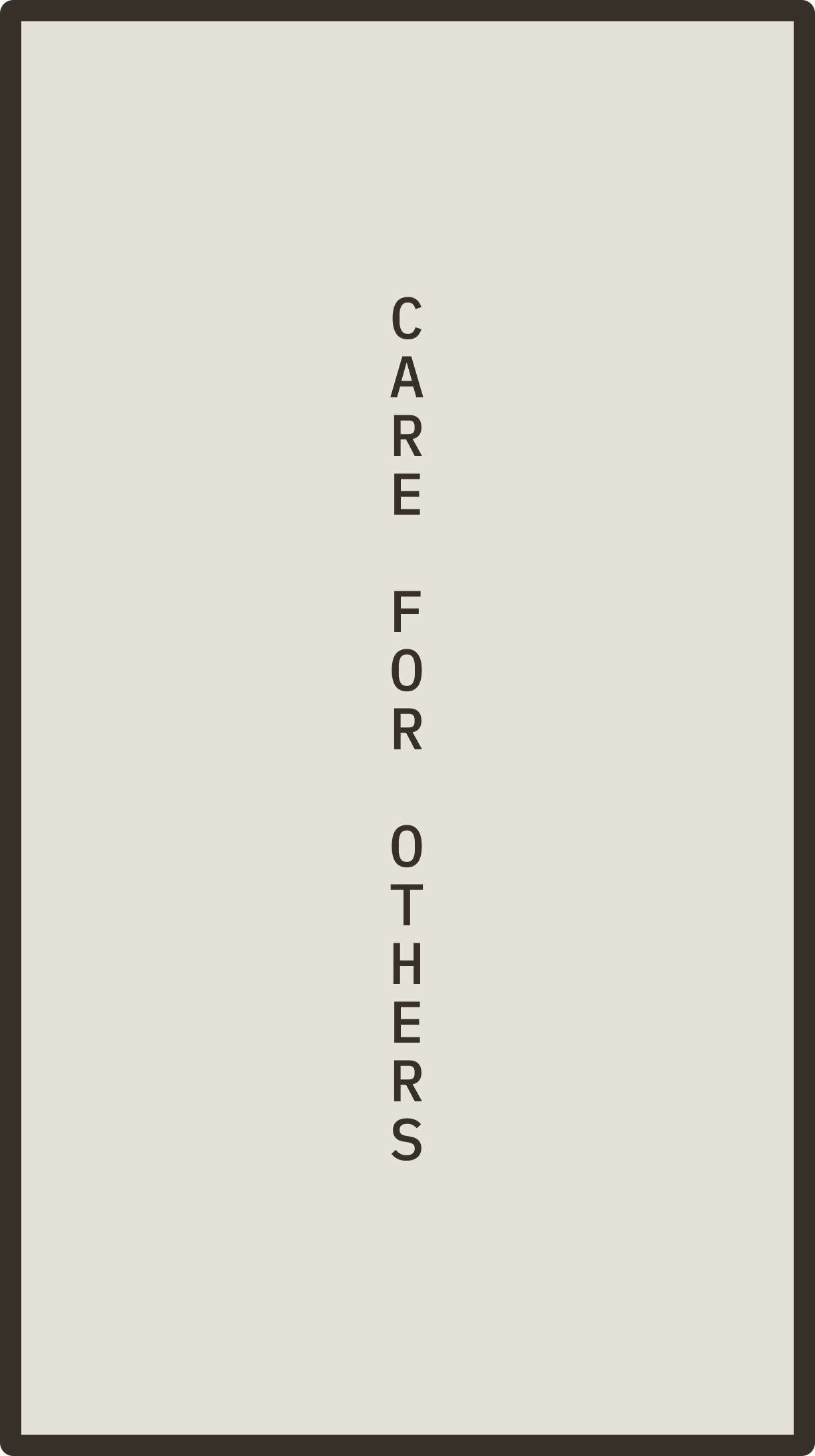
The logotype is inspired by Hangul, the original native script of Korea, with its design and construction rooted in the principles of this writing system.


Brand system
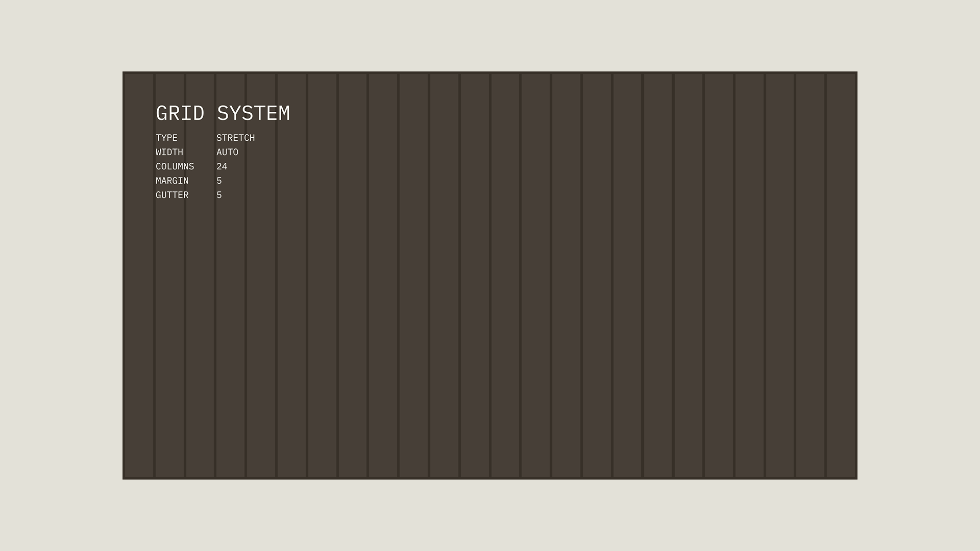
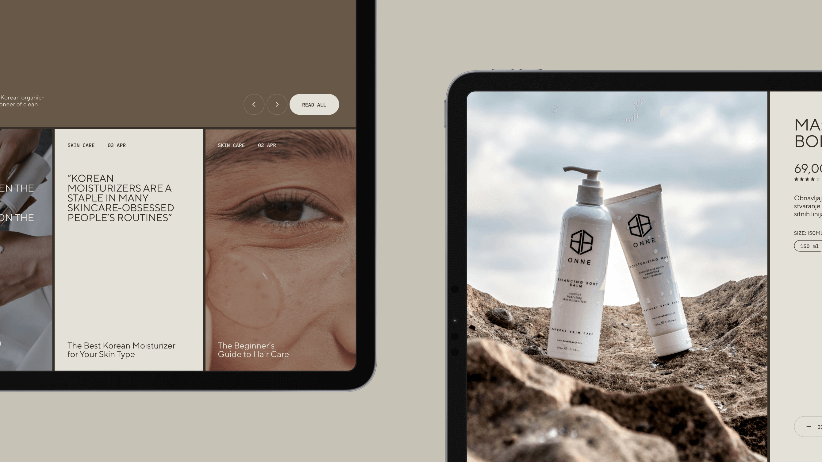
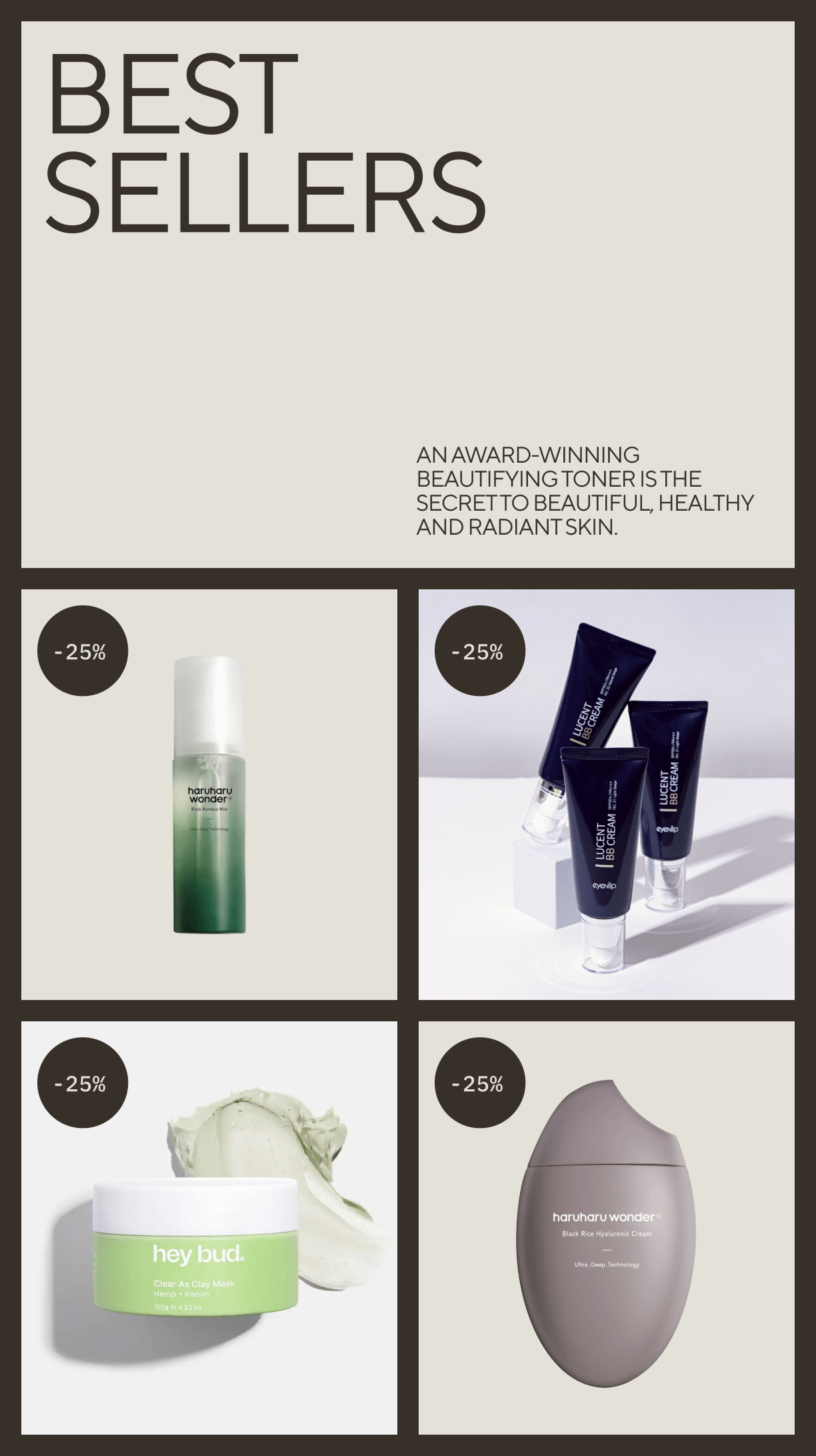
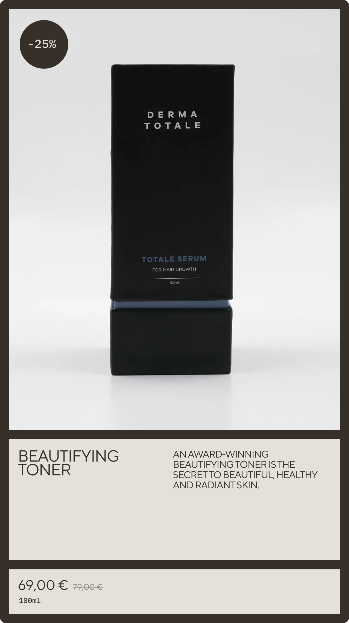
The flexibility of the brand grid system is evident in the website design, allowing us to easily create all necessary modules for both consumer education and sales conversion.
Divote navigation is clean and transparent, just like the products. Clarity is essential for enhancing user satisfaction, conversions, accessibility, and SEO performance.