Showreel
01:20
Client
Materra
Services
Branding, Motion
Client
Materra
Services
Branding, Motion
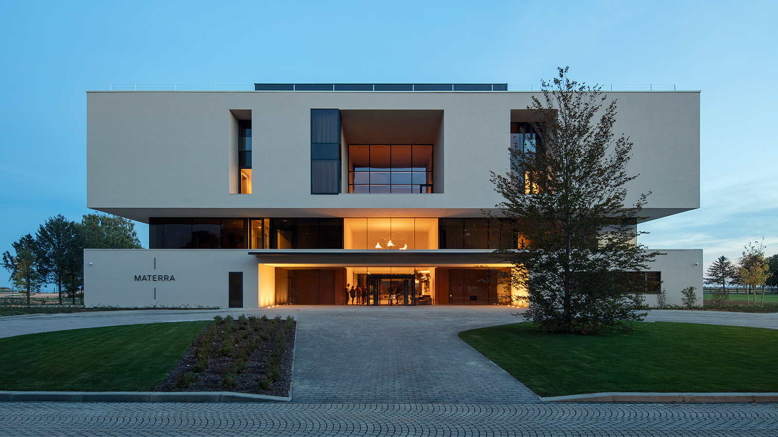
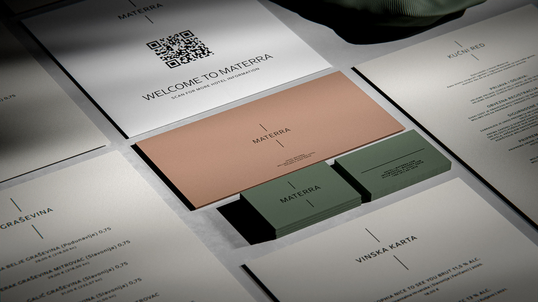
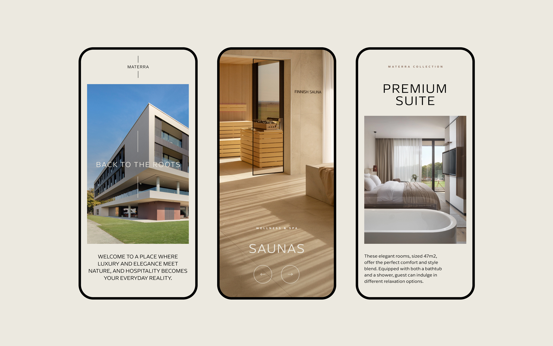
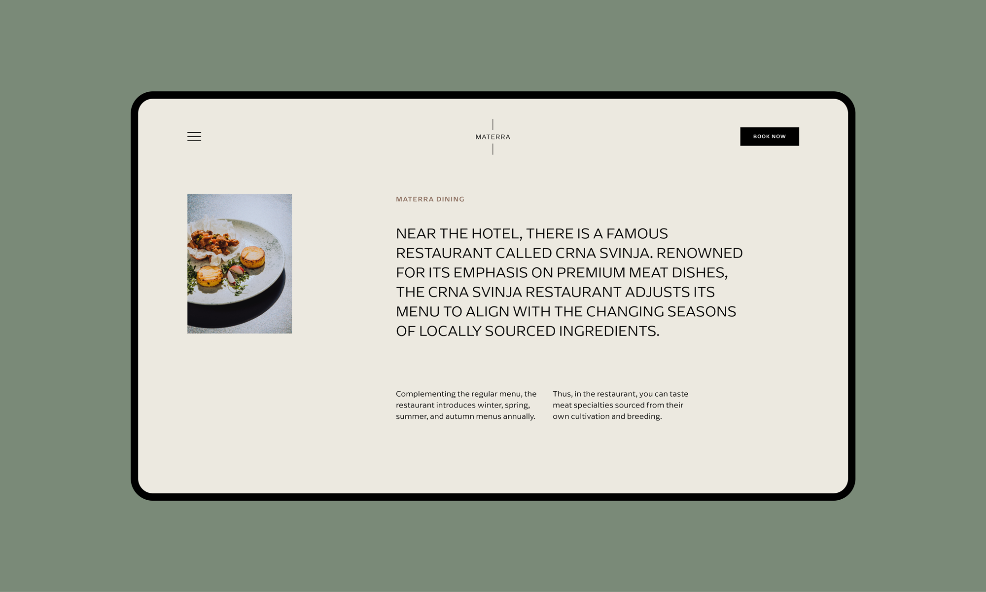
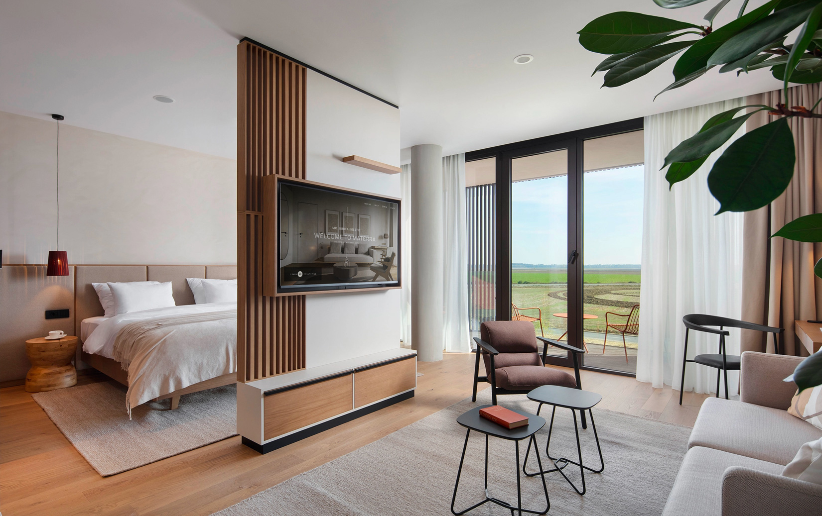
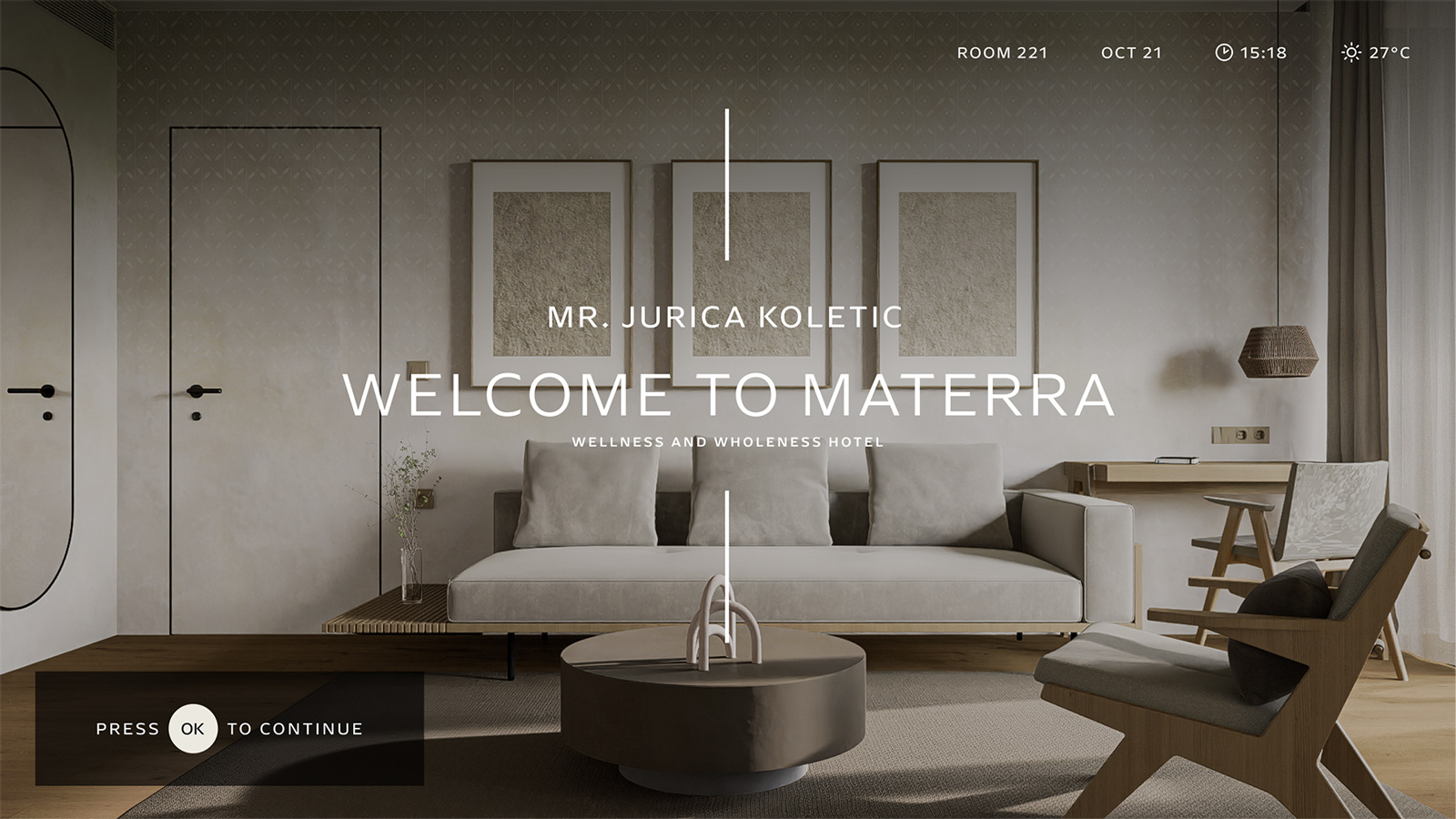
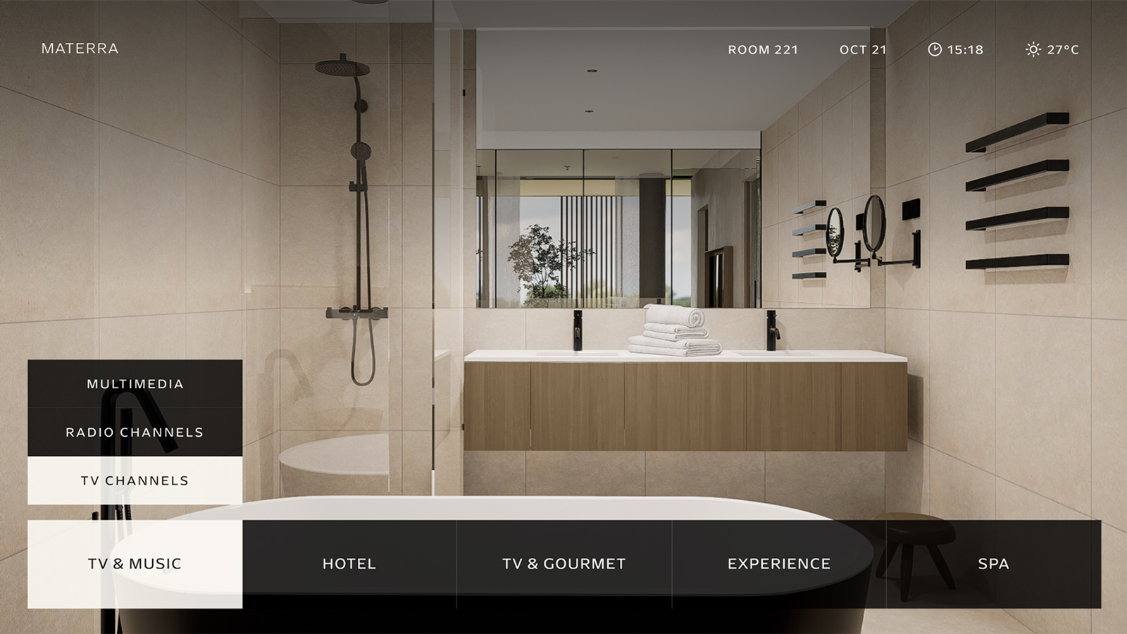
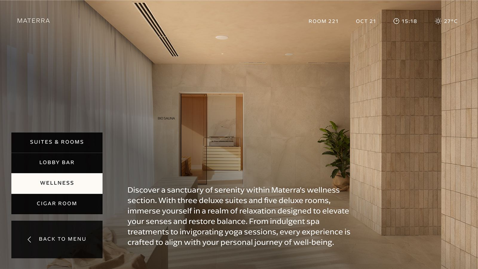
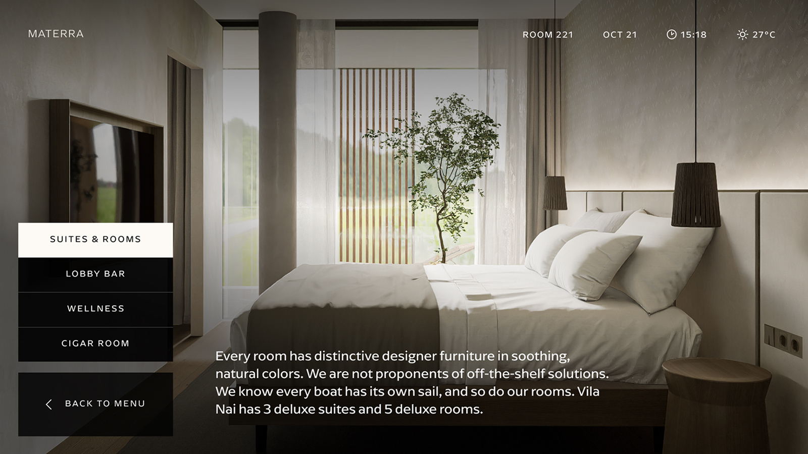
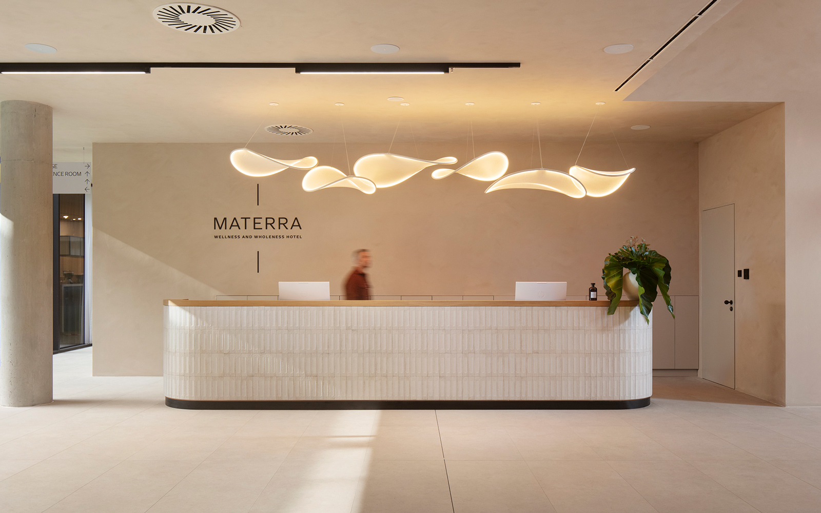
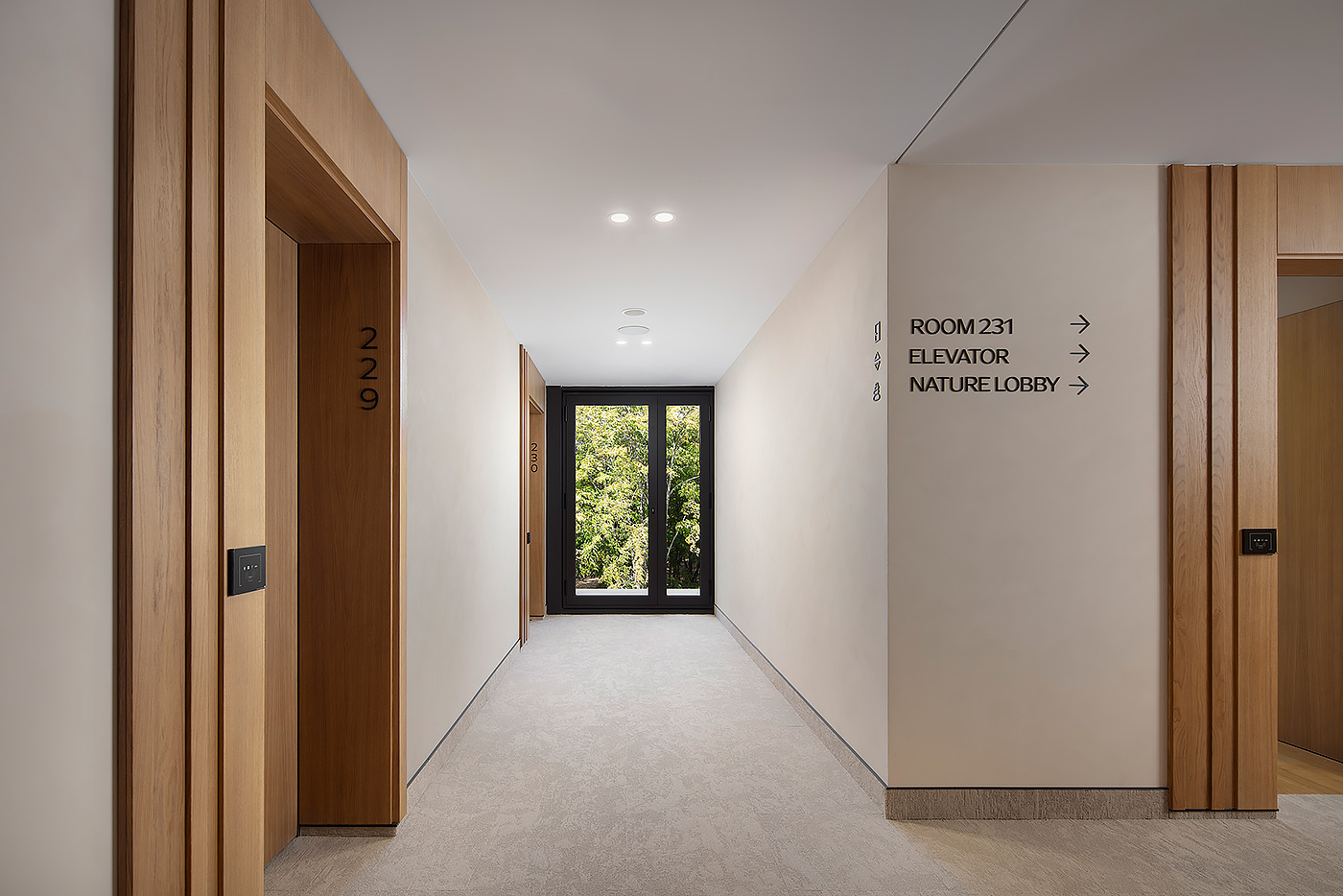
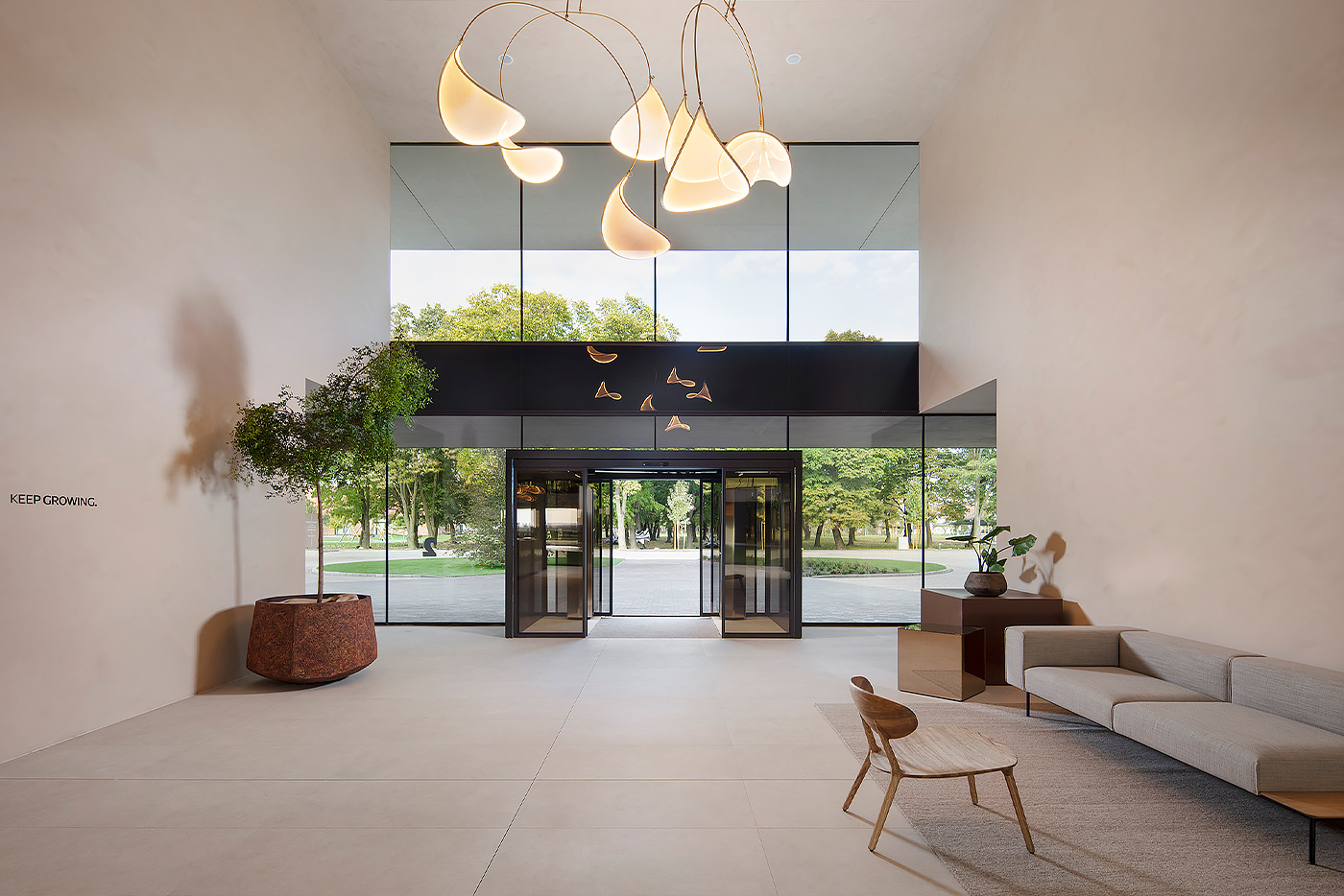
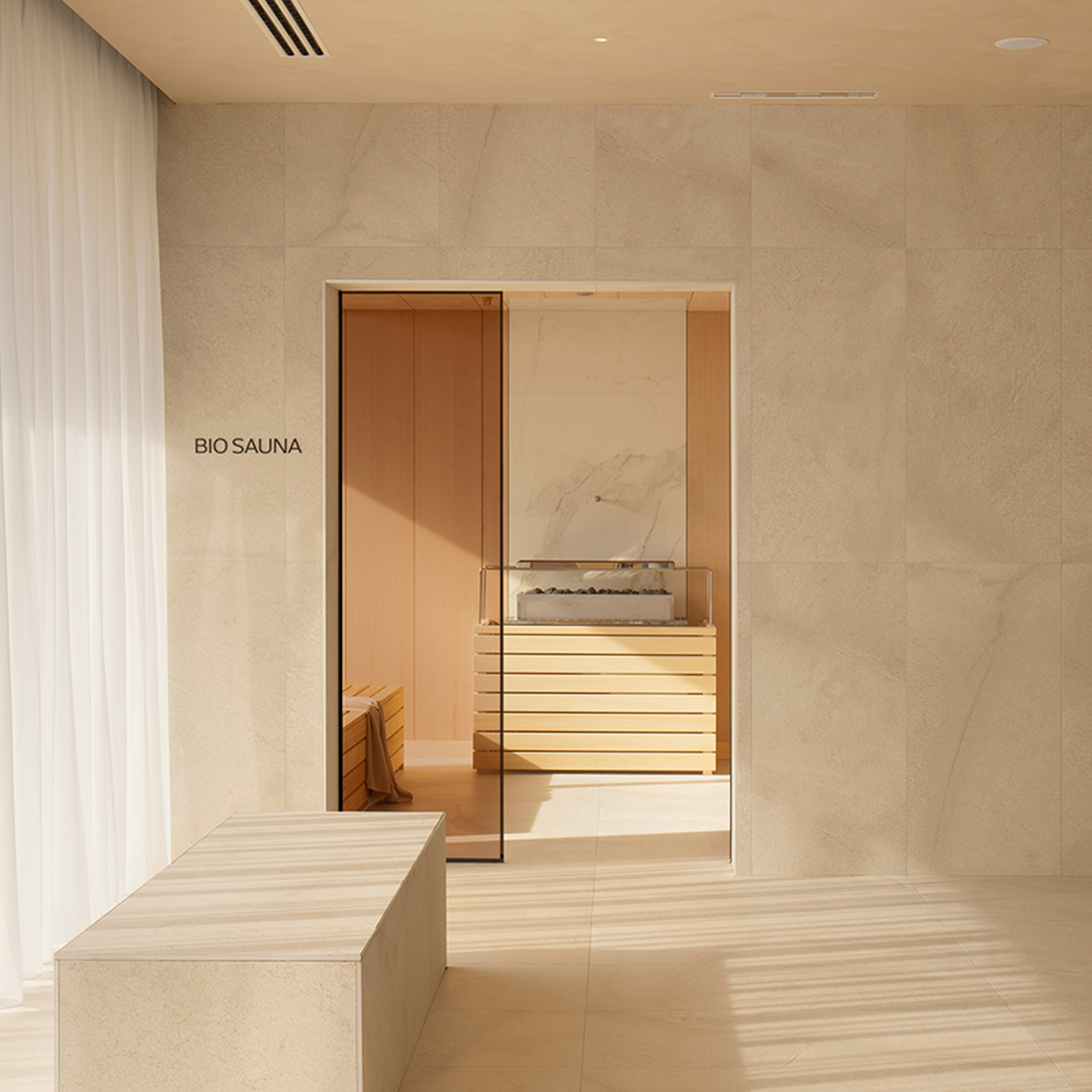
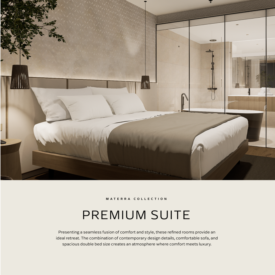
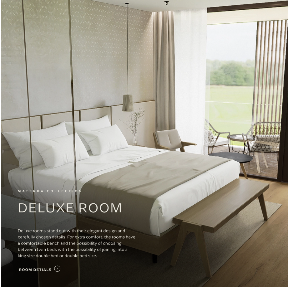
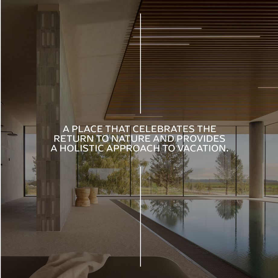
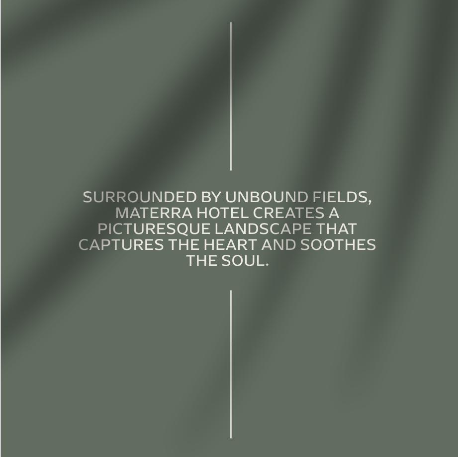
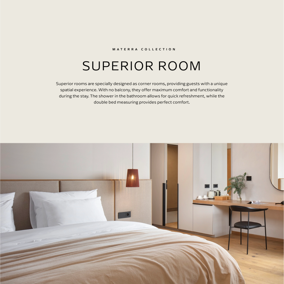
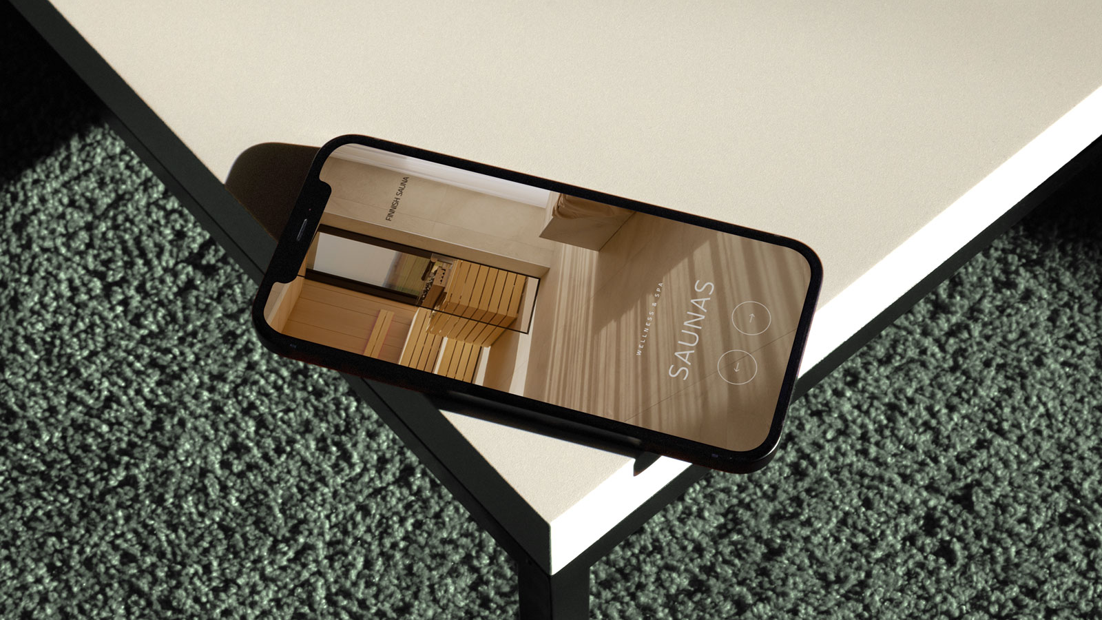
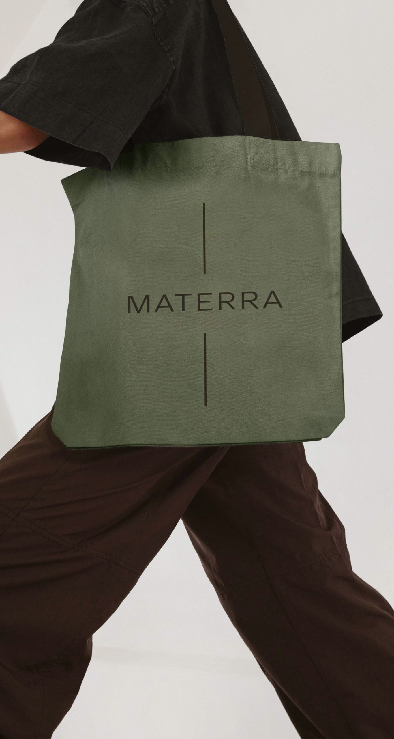
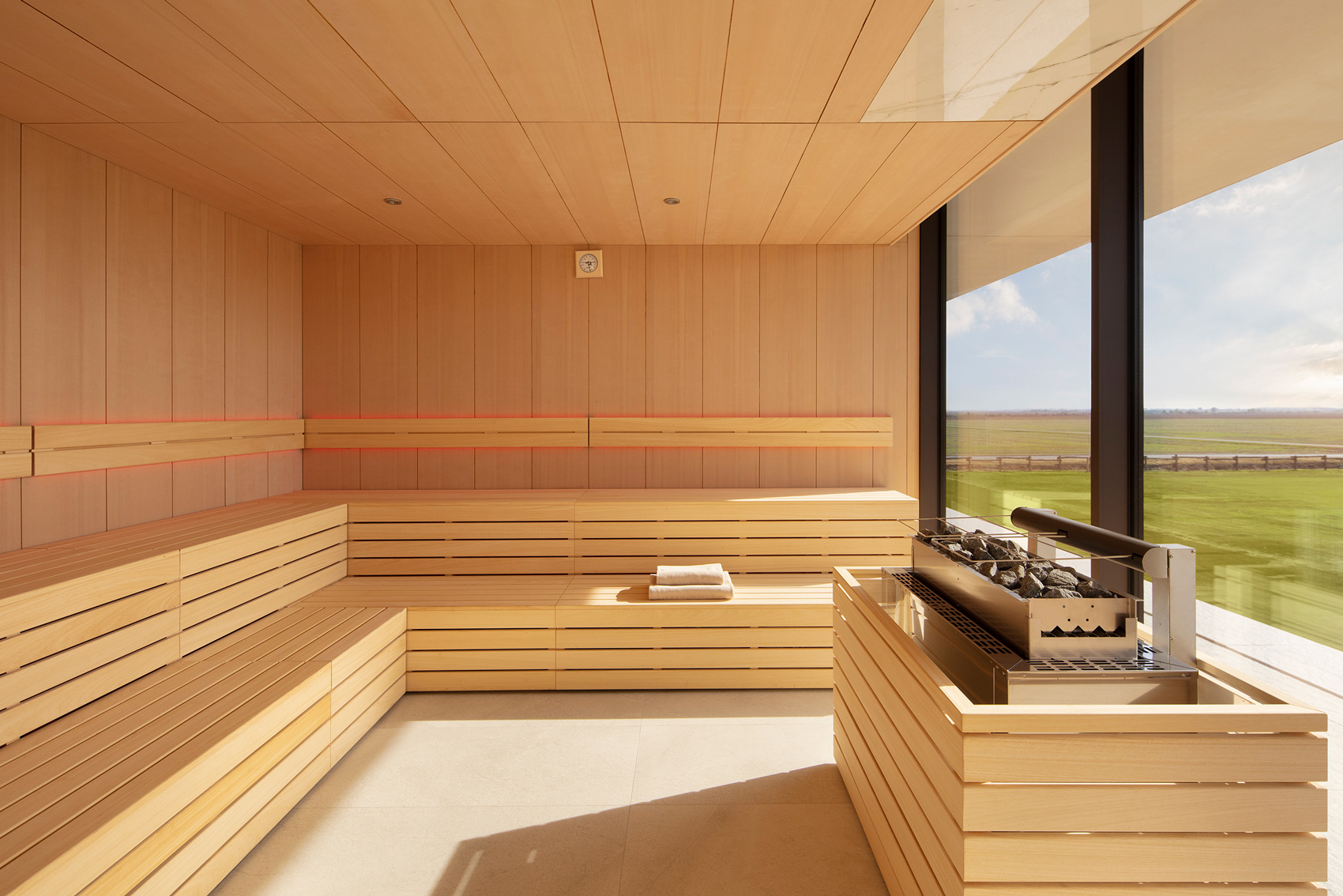
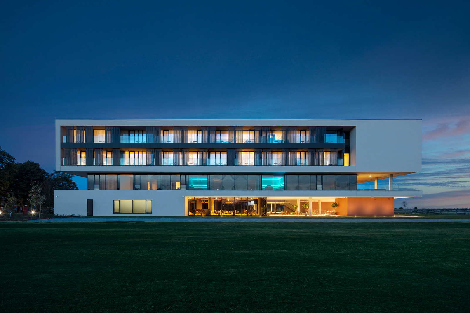
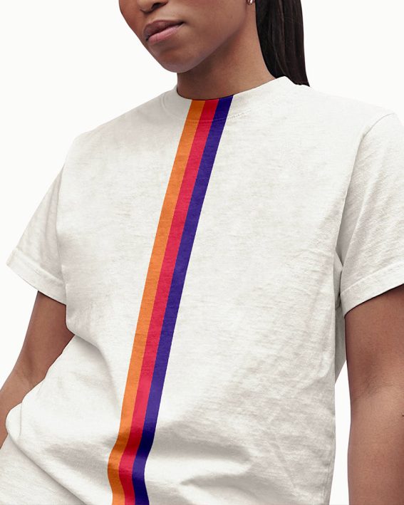
Studio Size designed the Materra brand for a wellness & wholeness hotel nestled in the vast plains of a rural area. The name Materra, a blend of ‘Mater’ (mother in Croatian) and ‘Terra’ (Latin for soil), symbolizes a nurturing sanctuary deeply rooted in the healing essence of nature. This countryside retreat stands out with a wide range of wellness activities inspired by Eastern traditions to help guests become more self-aware, resilient, and rejuvenated. Our branding emphasizes minimalism and balance to ensure the visual identity harmonizes with the hotel’s natural surroundings, architecture, and interior design, avoiding sensory overload.


Modernism in motion
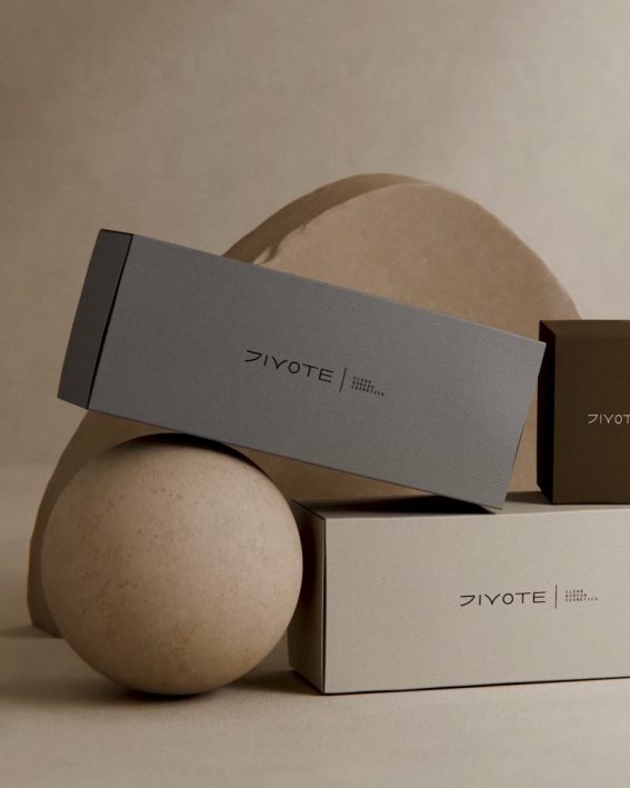
Clean Korean cosmetics
Red hot type animations

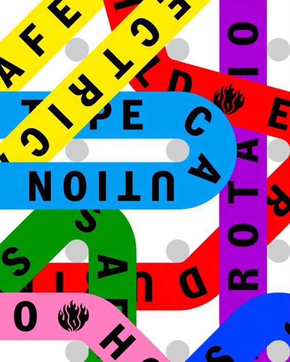
Web3 risks in real time

Sensible media monitoring
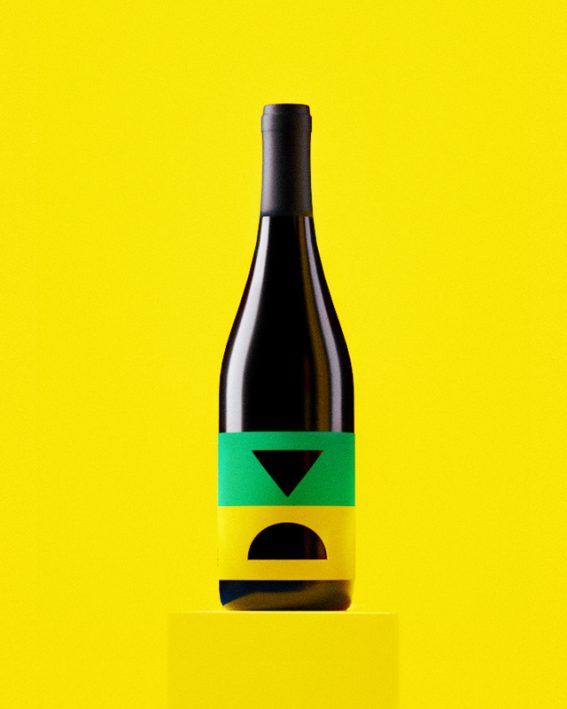
Iconic wine blend
Future starts today
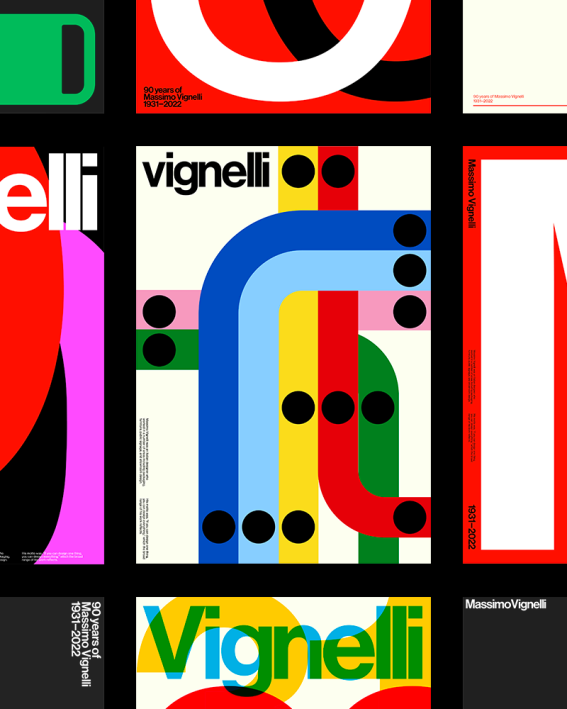
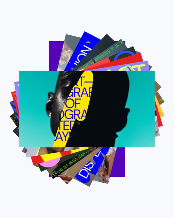
Paying tribute to Massimo
Trip for your taste buds
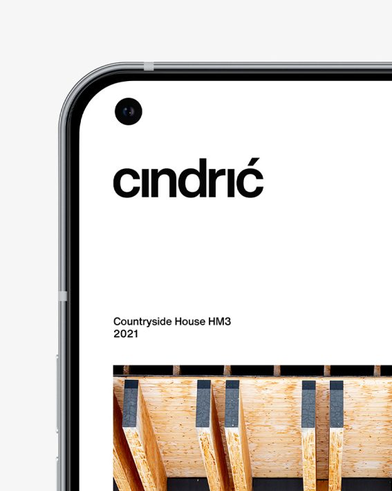
Minimal arhitecture
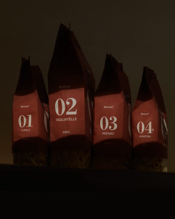
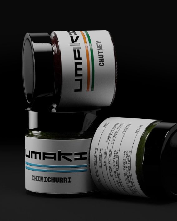
Coined pasta
Awesome motion templates
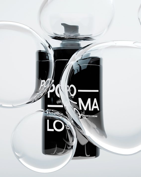
Laid-back skincare