Moslavina
Client
Moslavina
Services
Branding, Motion
Client
Moslavina
Services
Branding, Motion
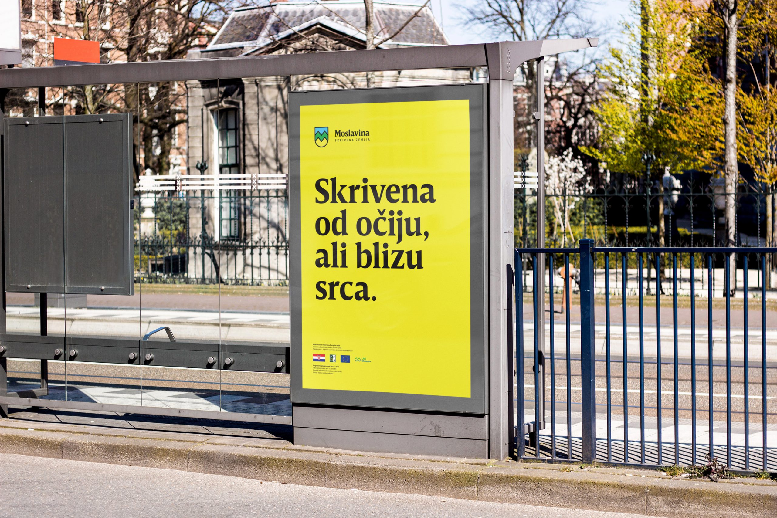
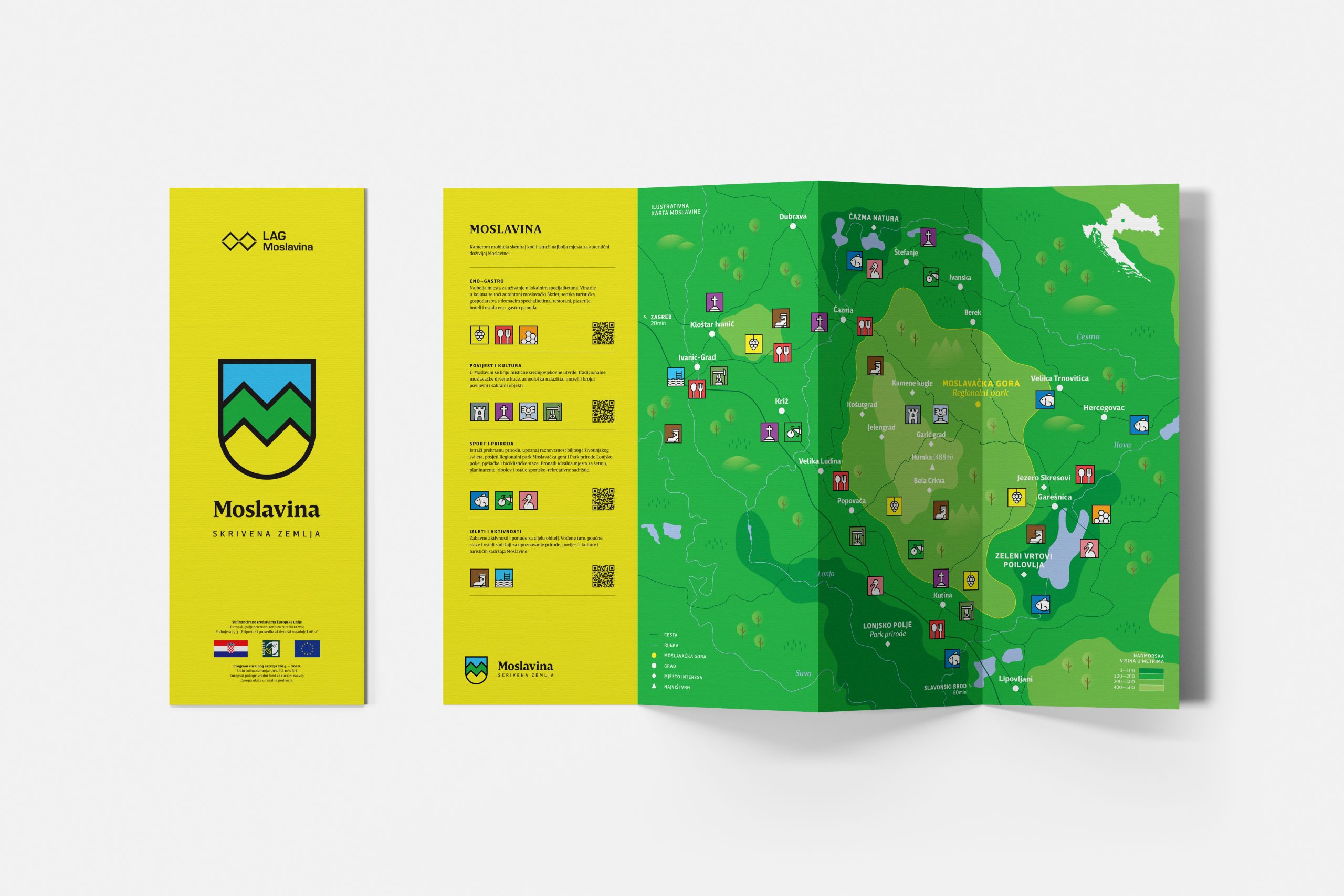
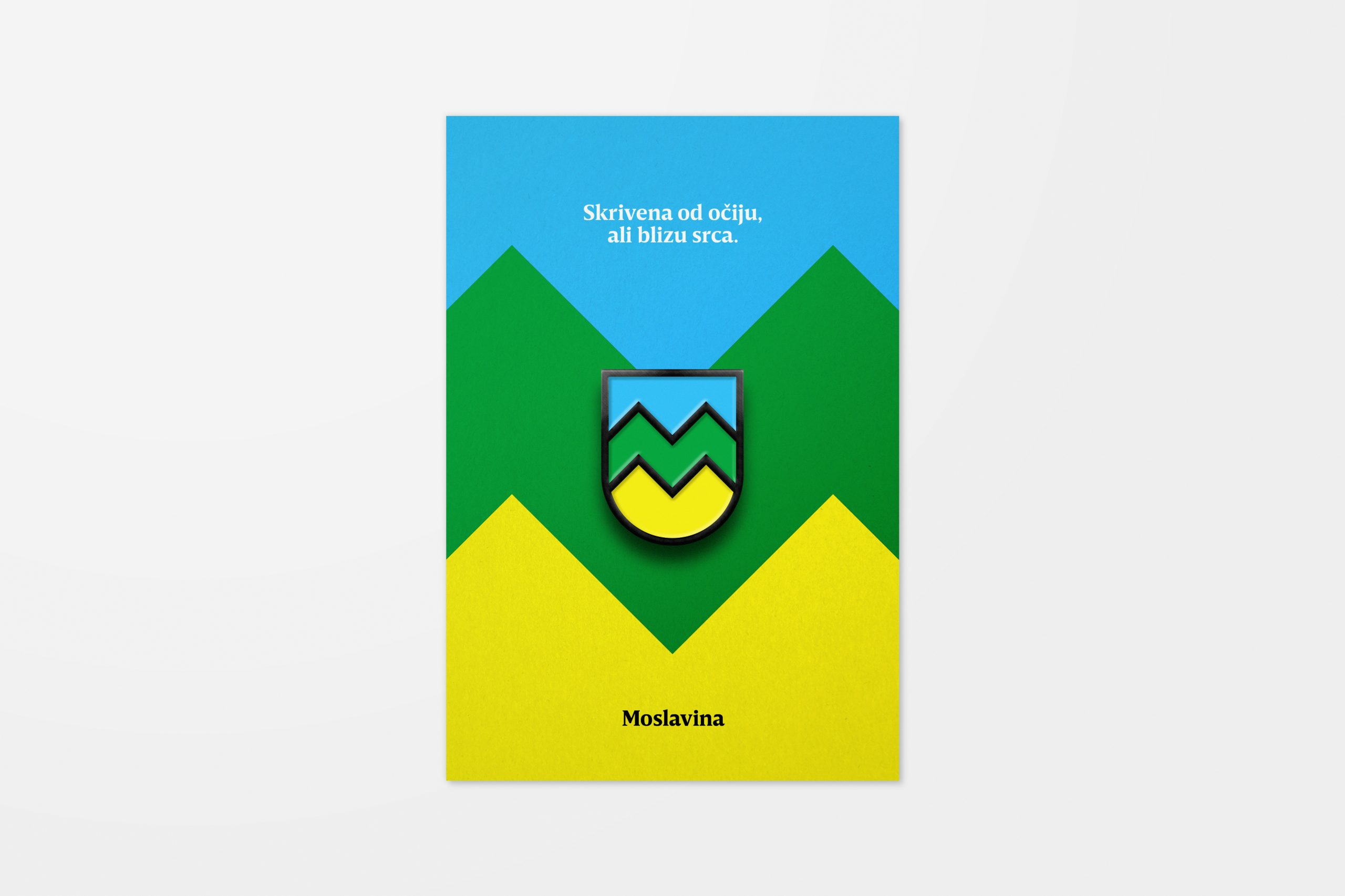
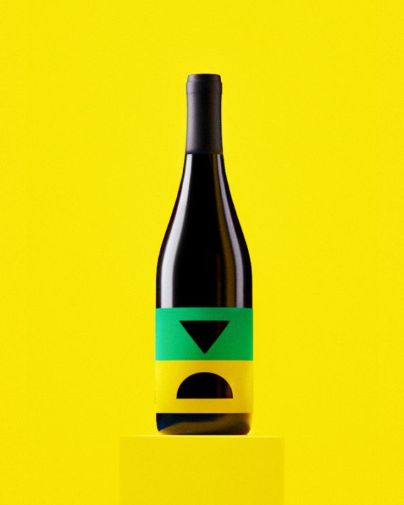
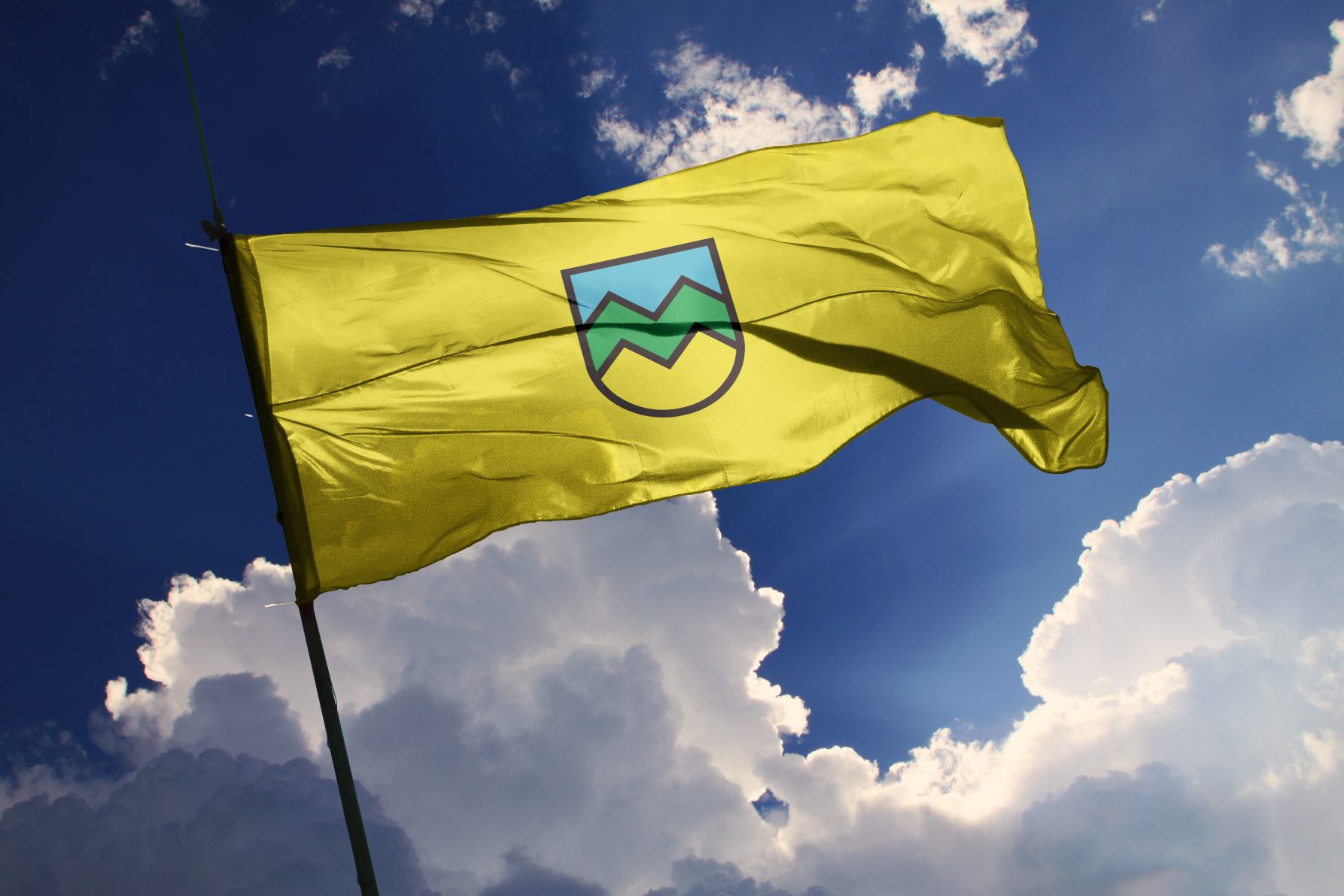
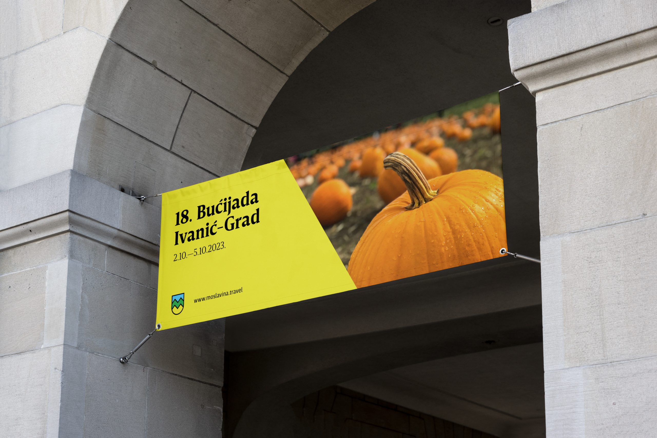
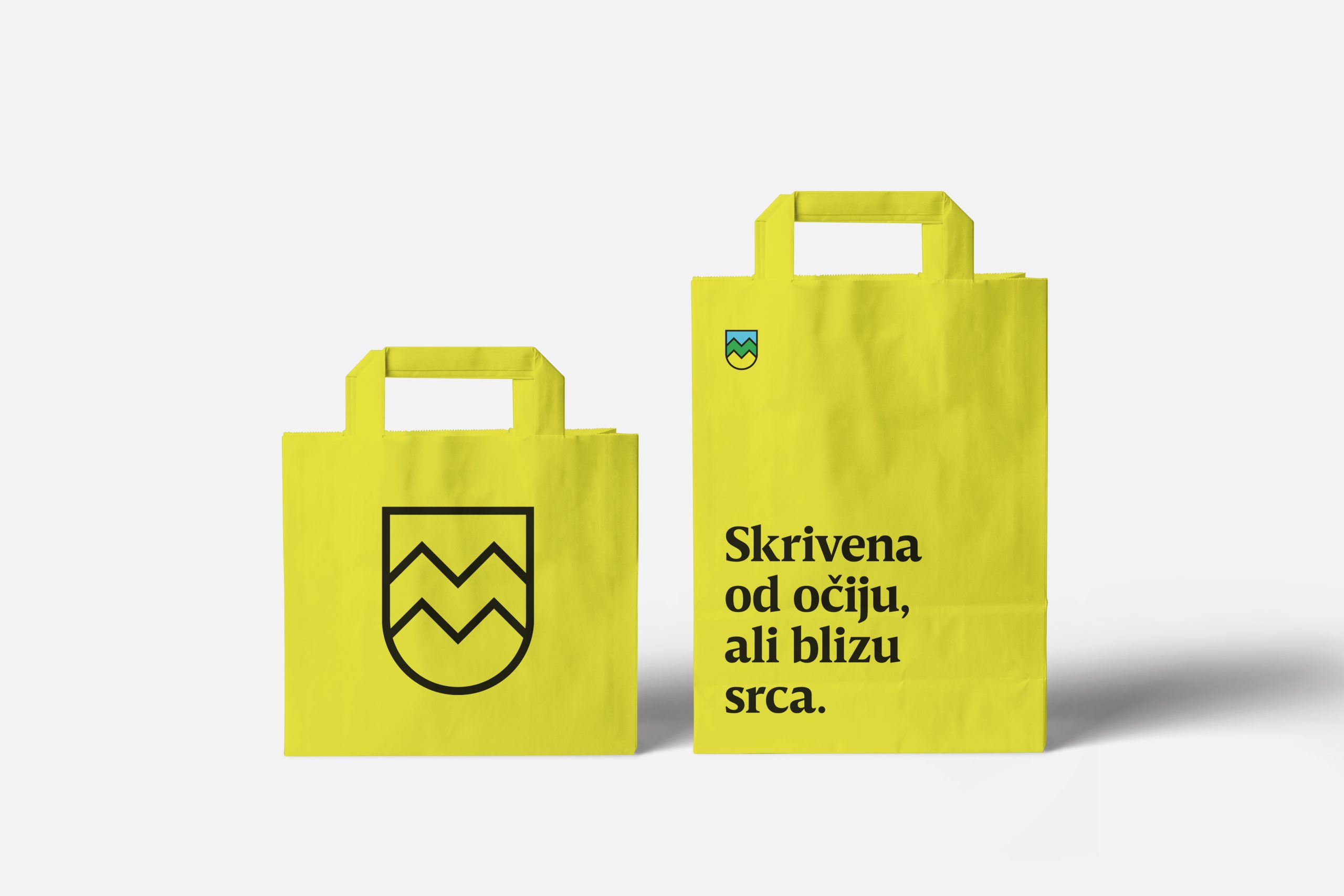
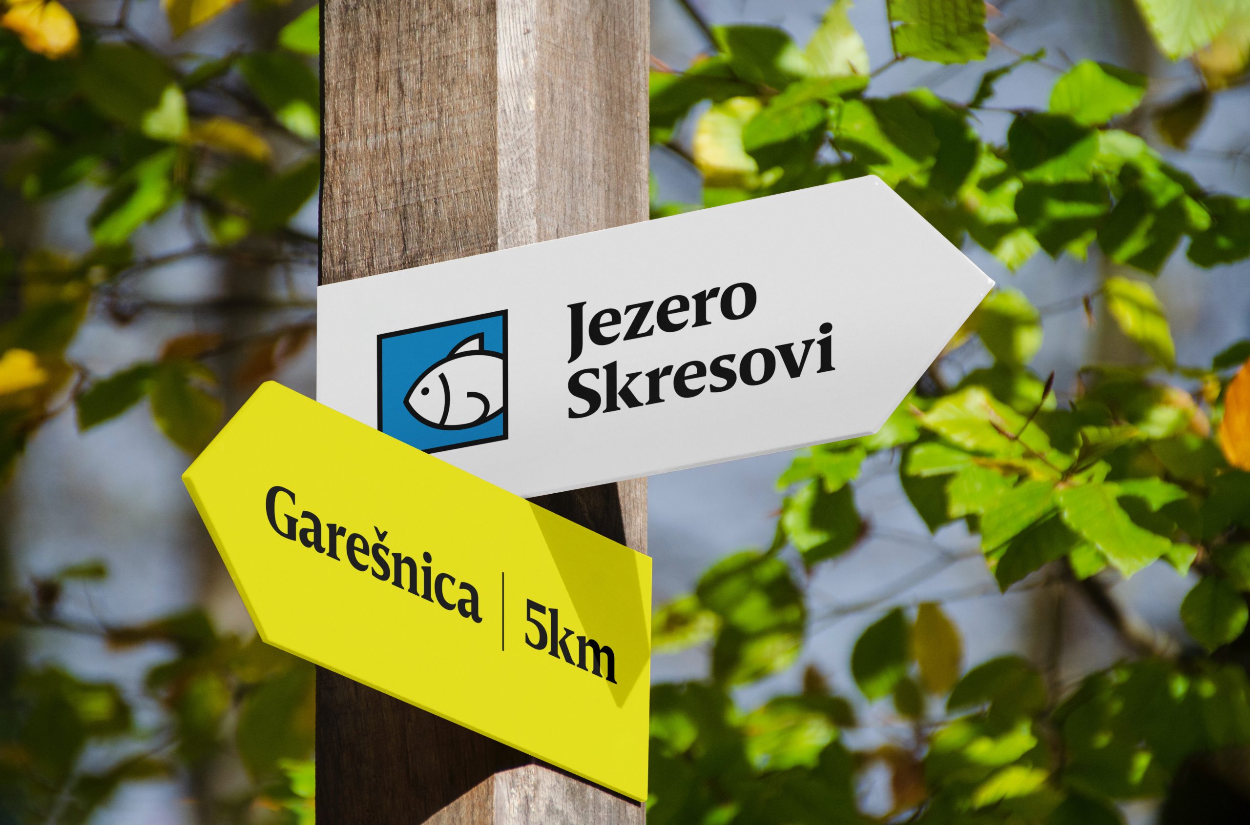
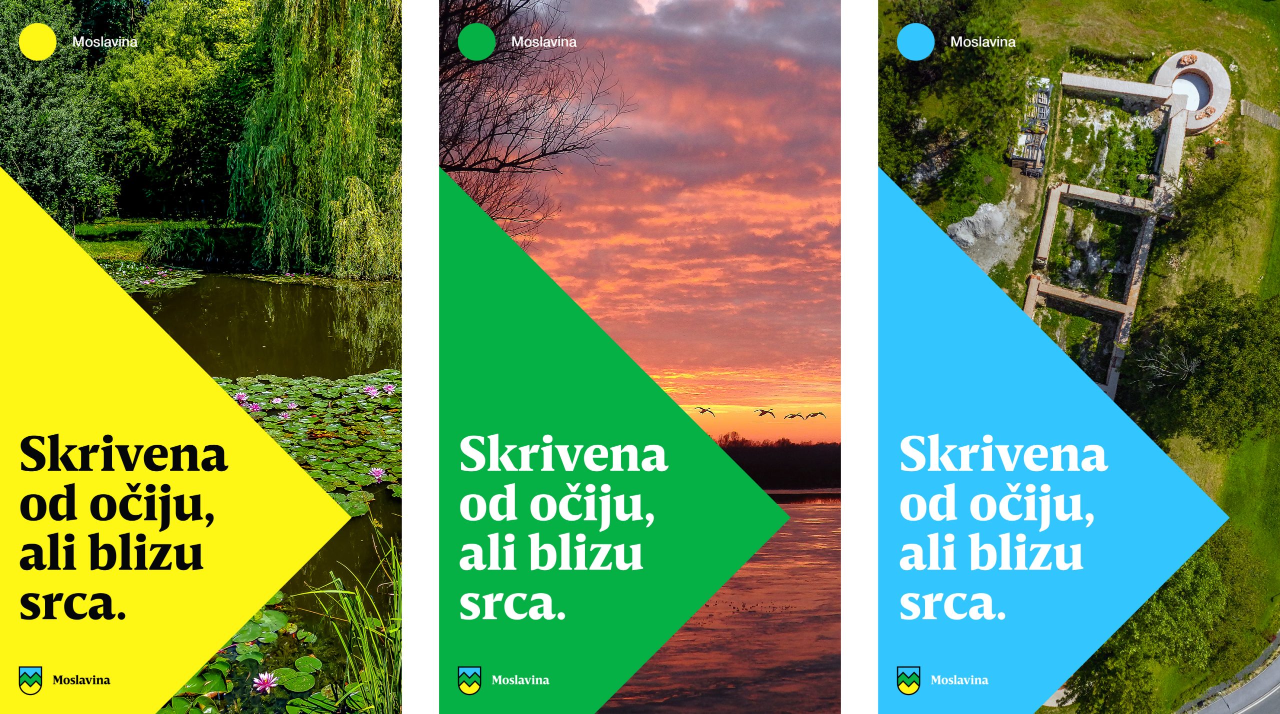
Moslavina is a micro-region that people have somewhat forgotten about. Placed in continental Croatia, the region is broken into three administrative counties, which has weakened Moslavina’s identity and sense of familiarity with tourists. We designed a new destination branding and strategy to rejuvenate their community and attract prospective visitors. First, we identified the region’s most appealing assets and crafted a story that differentiates the destination from its competitors. The slogan Hidden land is a curtain-raiser for a narrative about a place full of hidden gems and fascinating experiences: Natural parks and wildlife, the Moslavina Mountain, a native wine grape called Škrlet, medieval mystic history, and oil reservoirs hidden under the ground. Finally, we designed a visual identity that captures the natural character of Moslavina, the yellow color of Škrlet, and the heraldic aesthetic of medieval times. The new identity had to be authentic and reawaken a sense of belongingness and pride in the local people. So we created a coat of arms, a flag, an anthem, and a slogan that determines Moslavina as a “land” that might have been hidden but never forgotten.
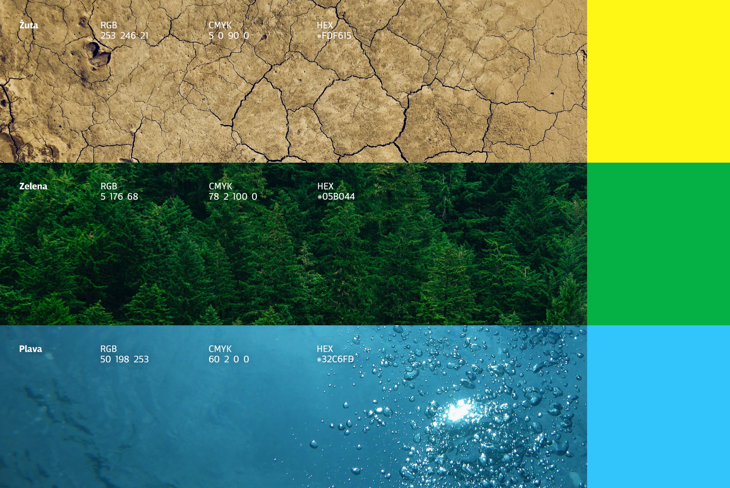
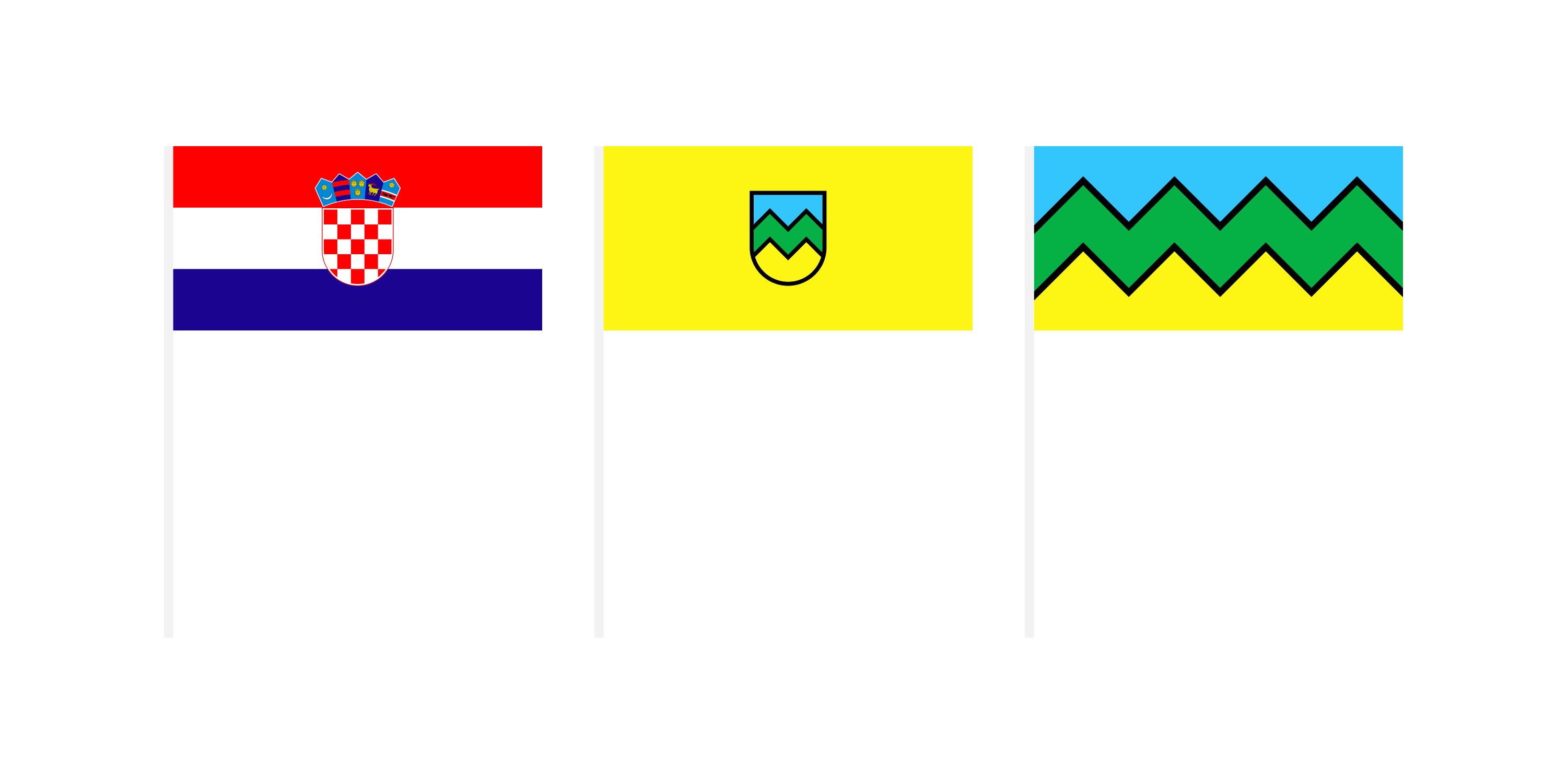


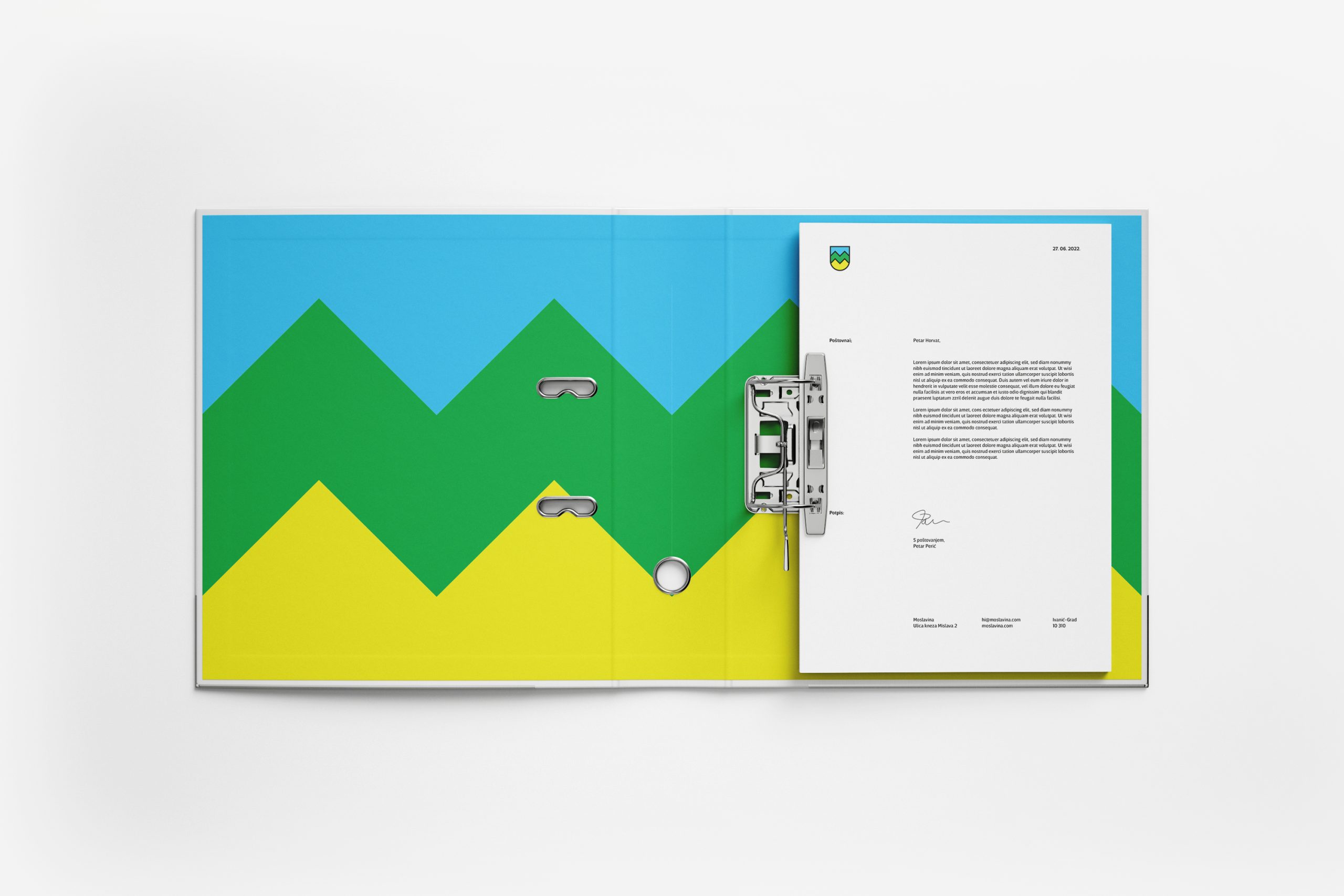
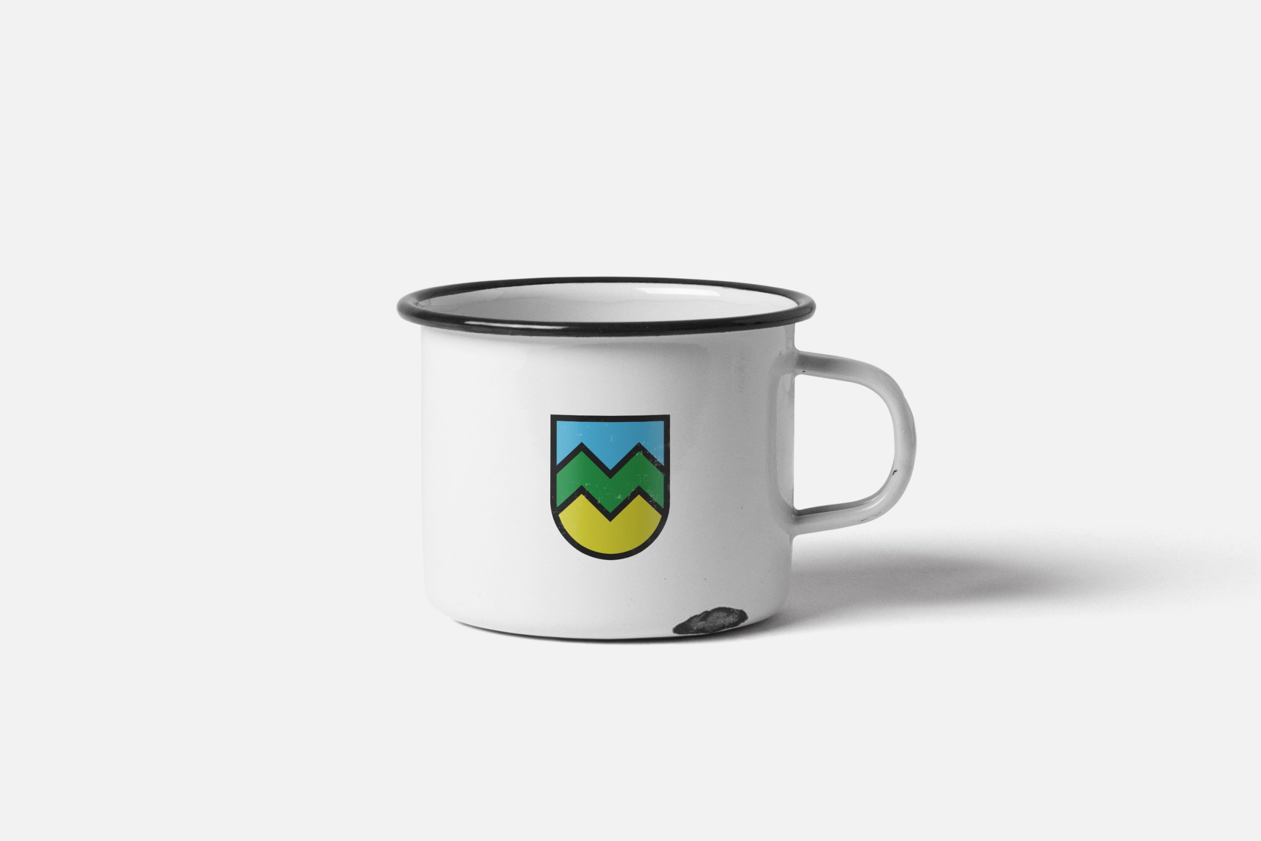

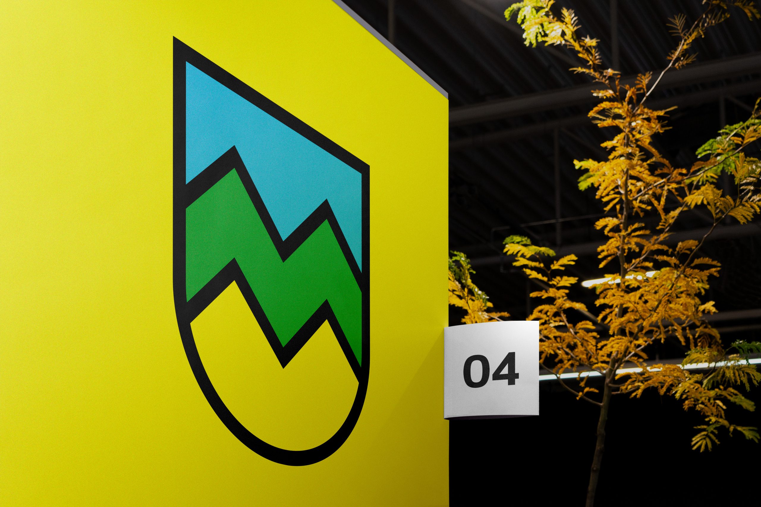


The logo is a coat of arms inspired by the letter “M”, the Moslavina Mountain, three rivers, forests, and specific soil.