Exat
Modernism in motion
Client
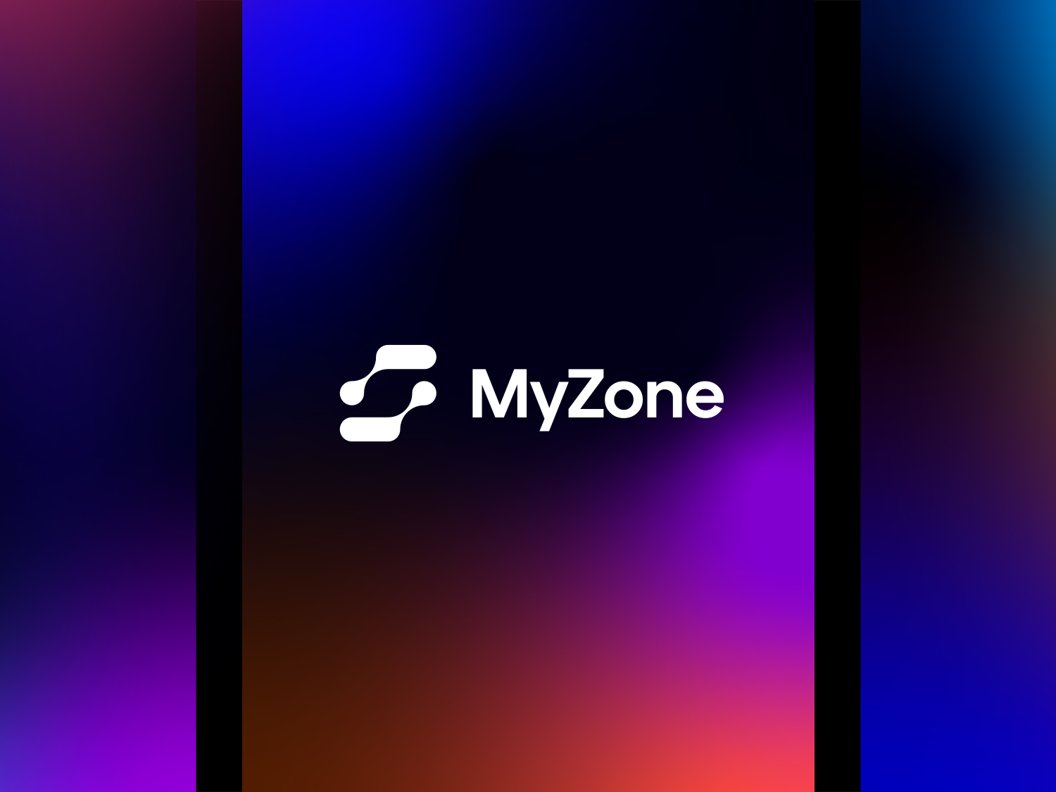
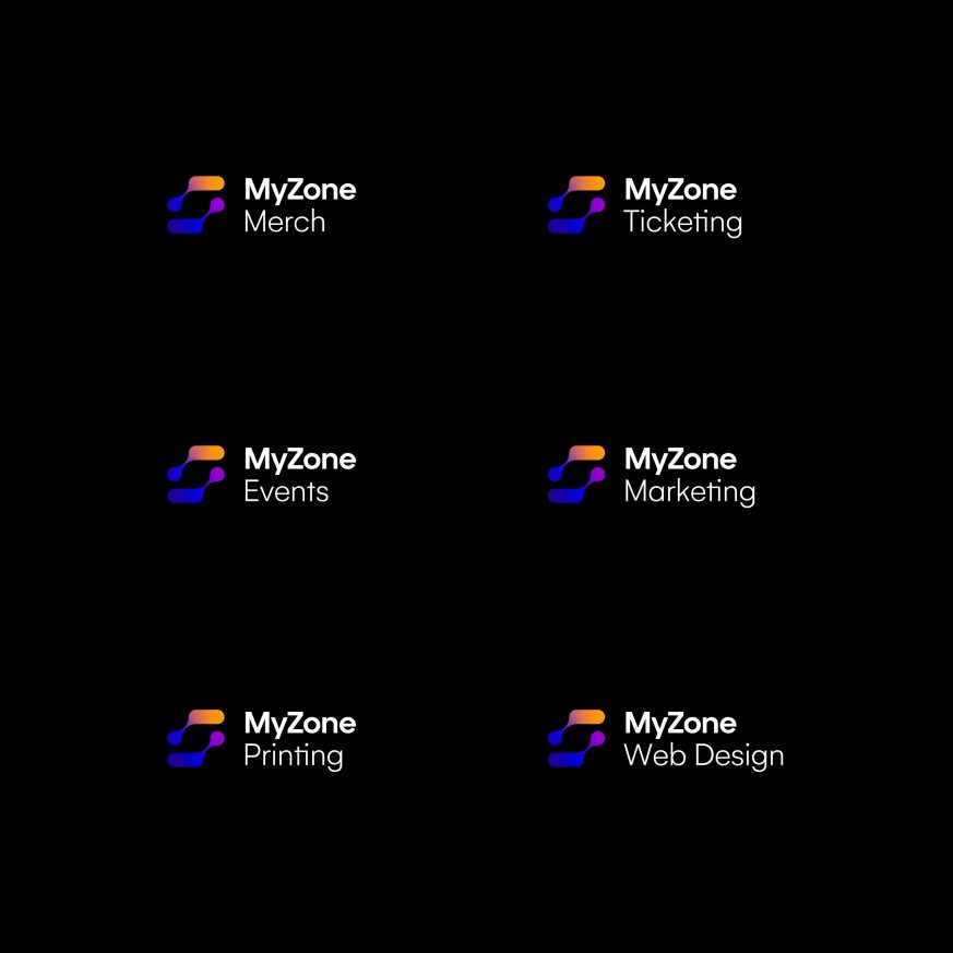
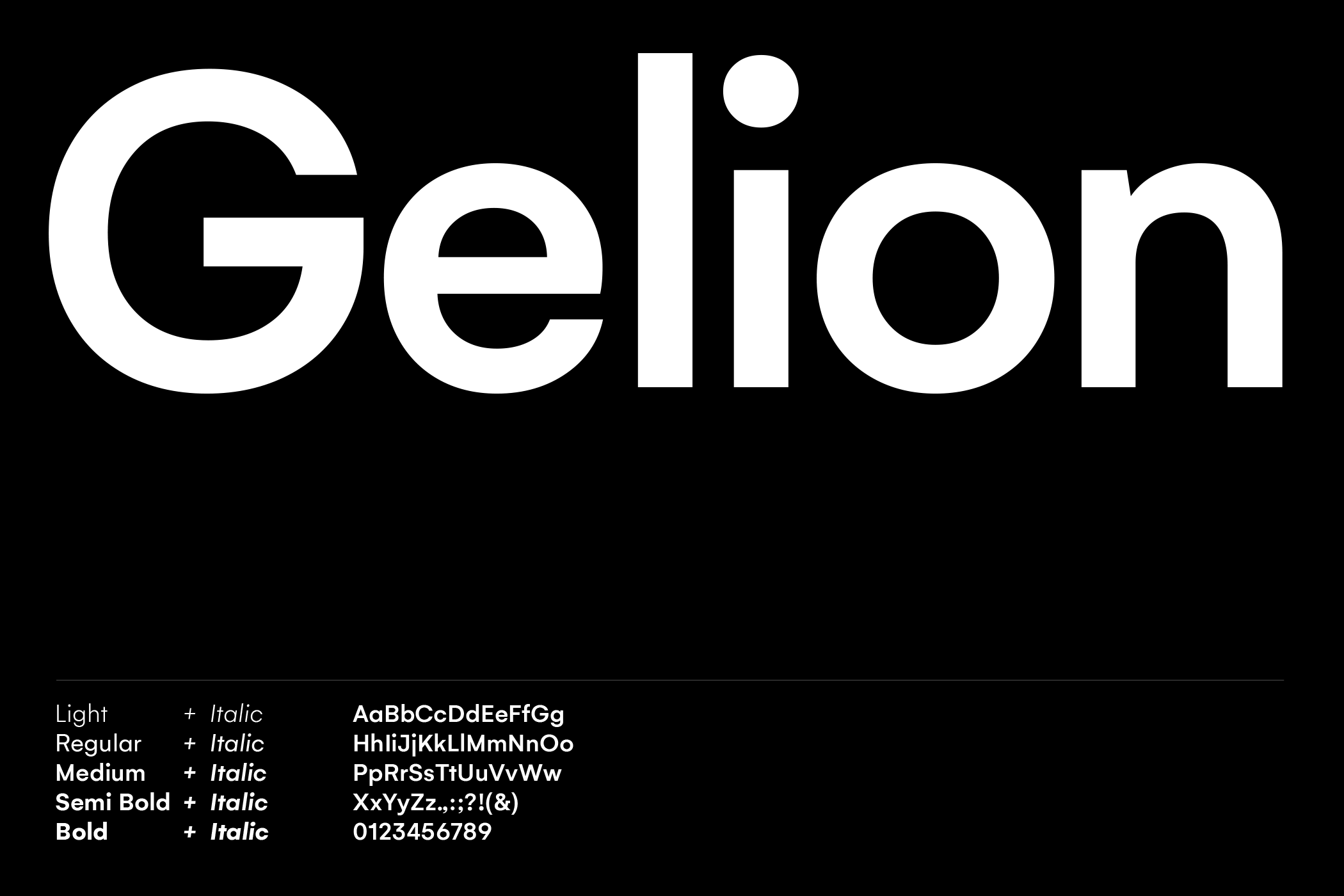
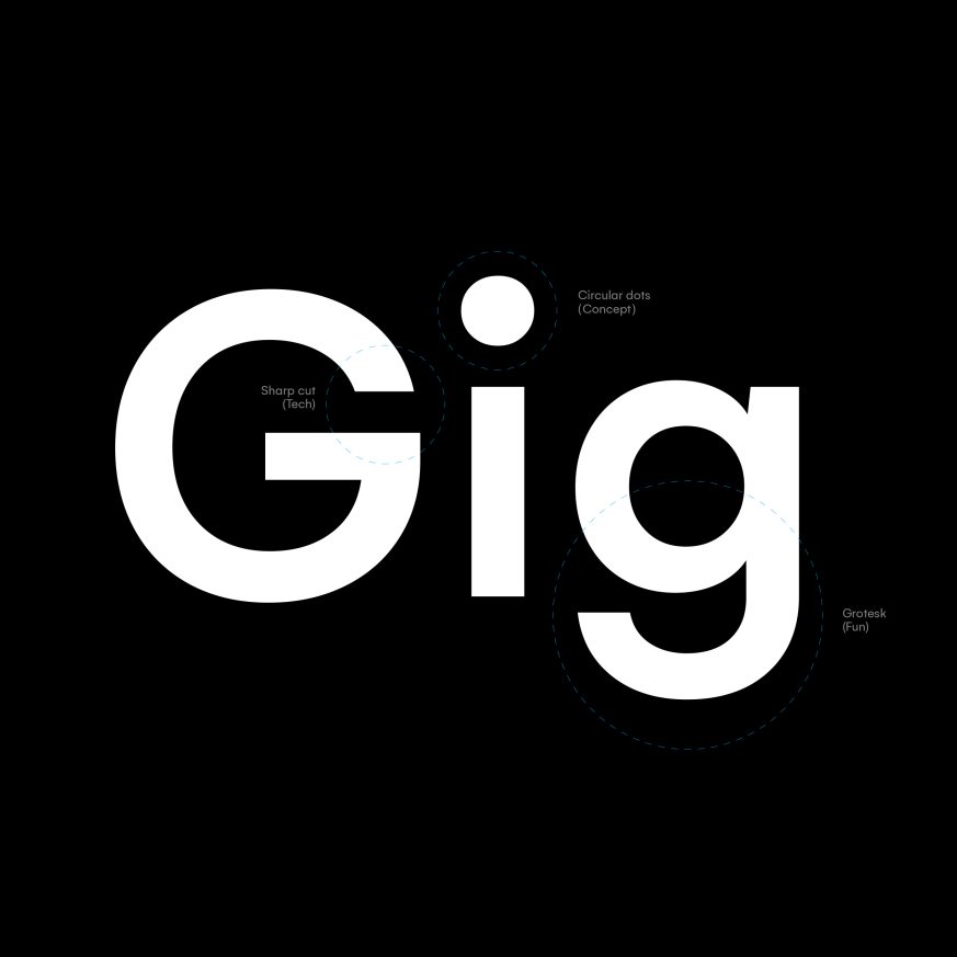
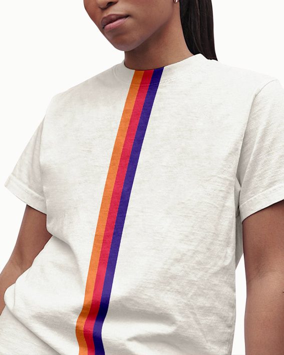
MyZone
Services
Branding, Motion
Client
MyZone
Services
Branding
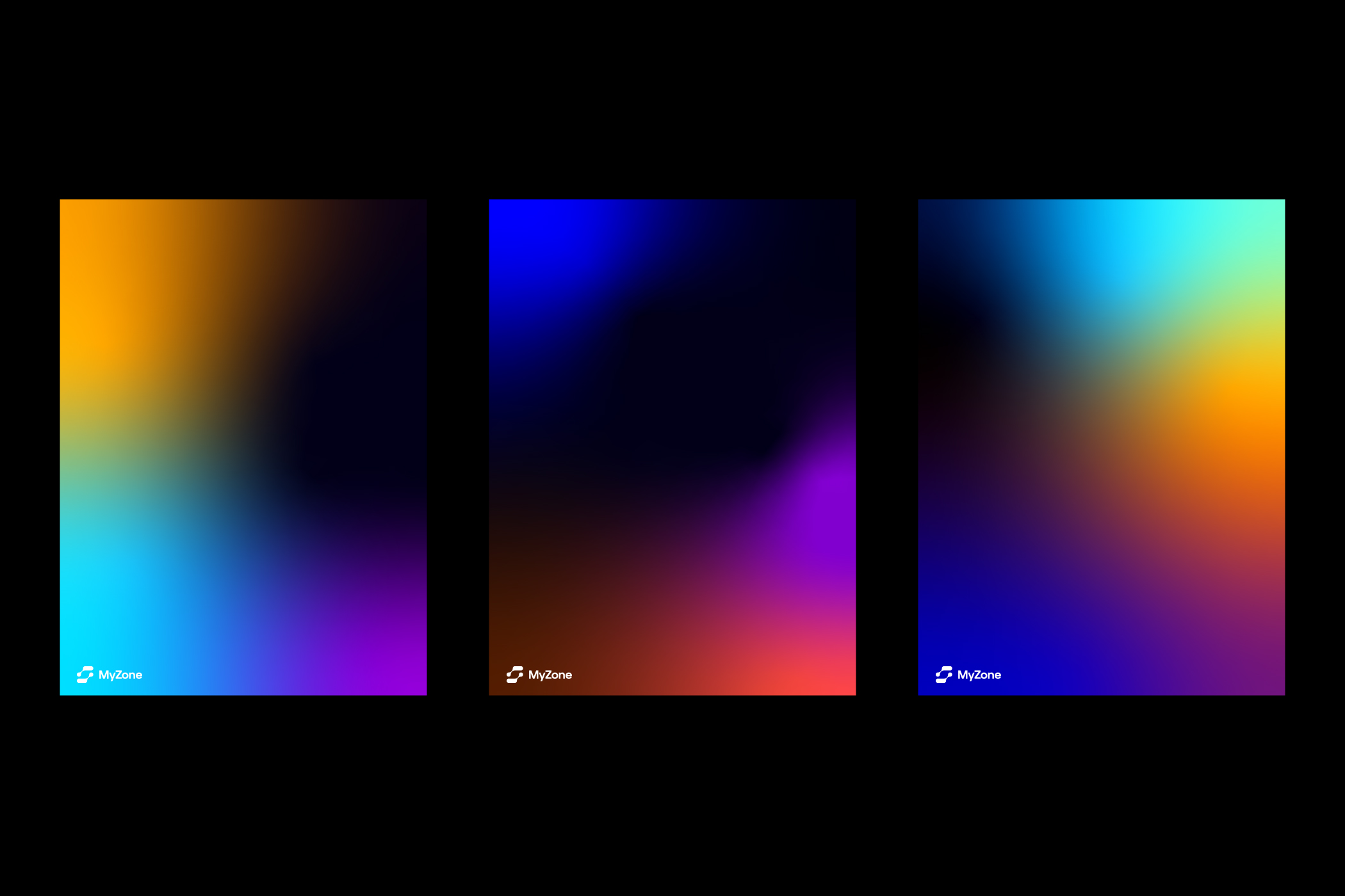
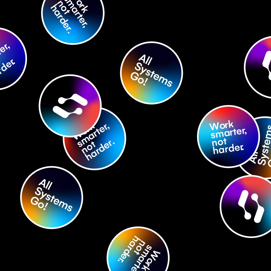
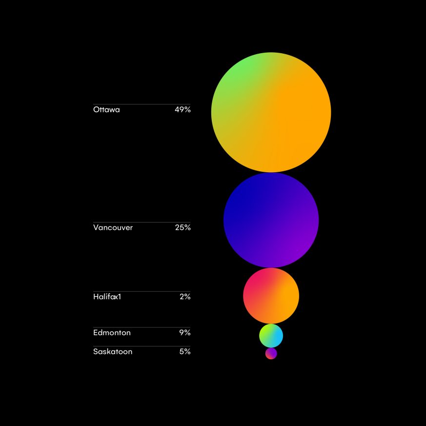
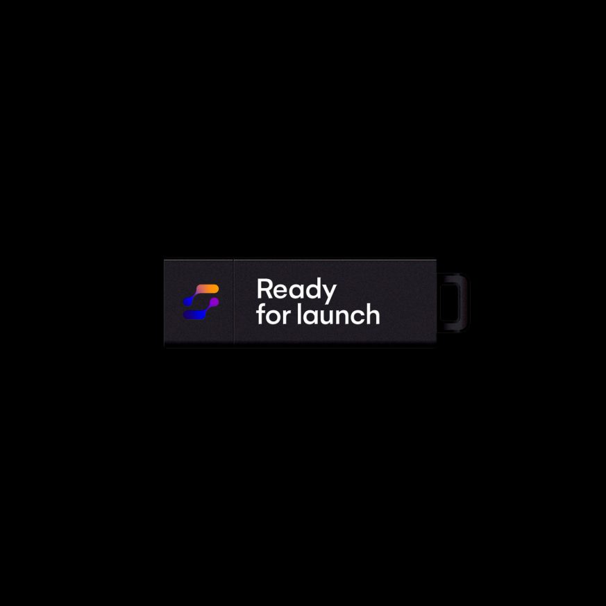
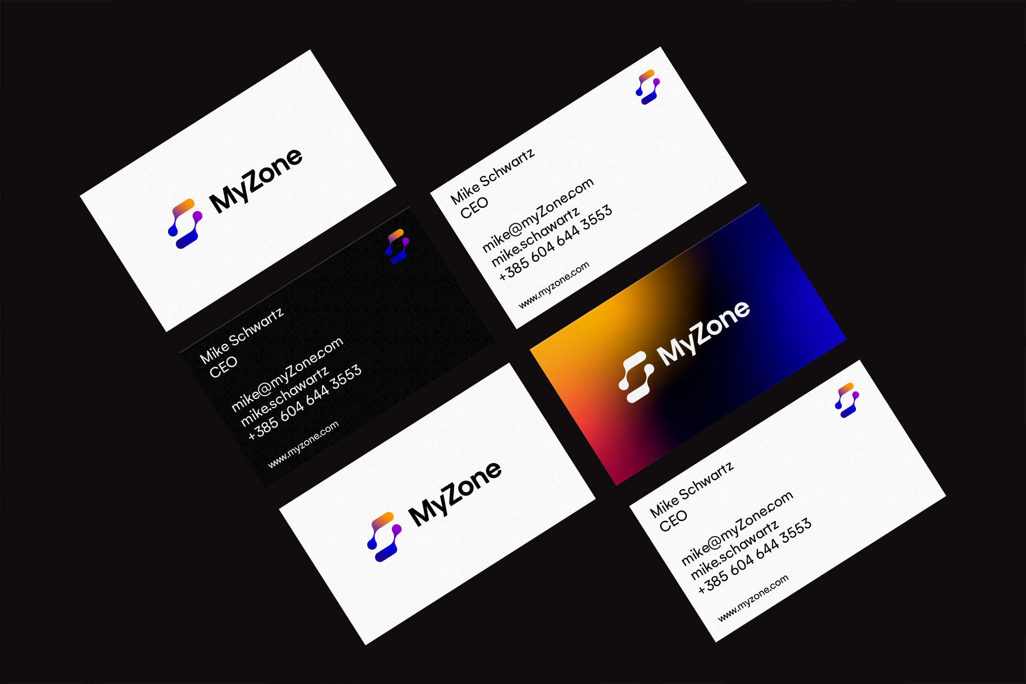
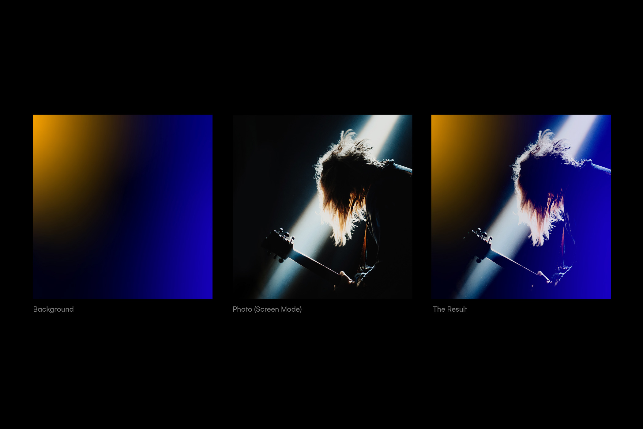
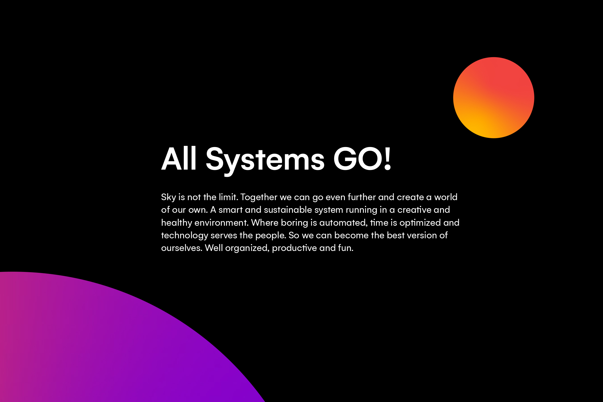
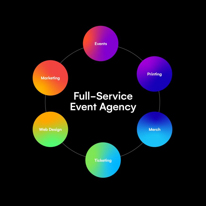
MyZone is a technology-driven event agency with a mission to transform the events industry. Combining traditional know-how and software development, they build innovative tools for event professionals. We redesigned their brand identity, including new brand architecture, positioning, values, and visual identity.


Modernism in motion
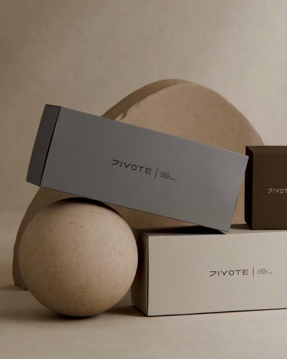
Clean Korean cosmetics
Red hot type animations
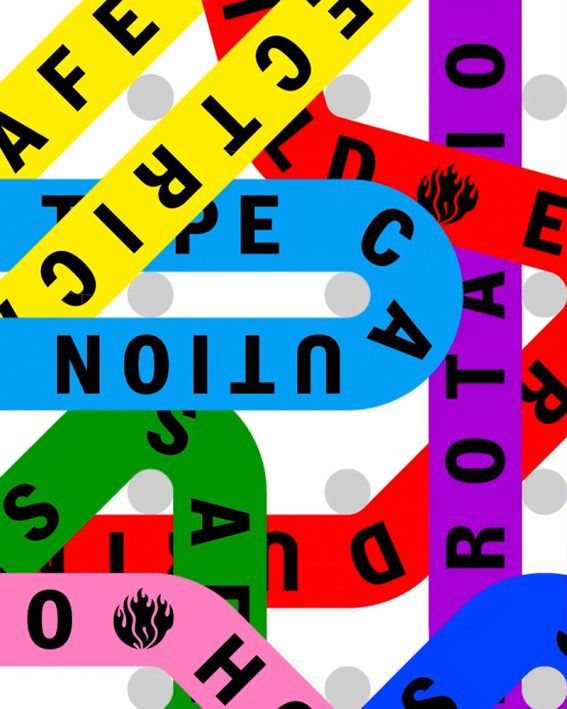
Web3 risks in real time

Sensible media monitoring
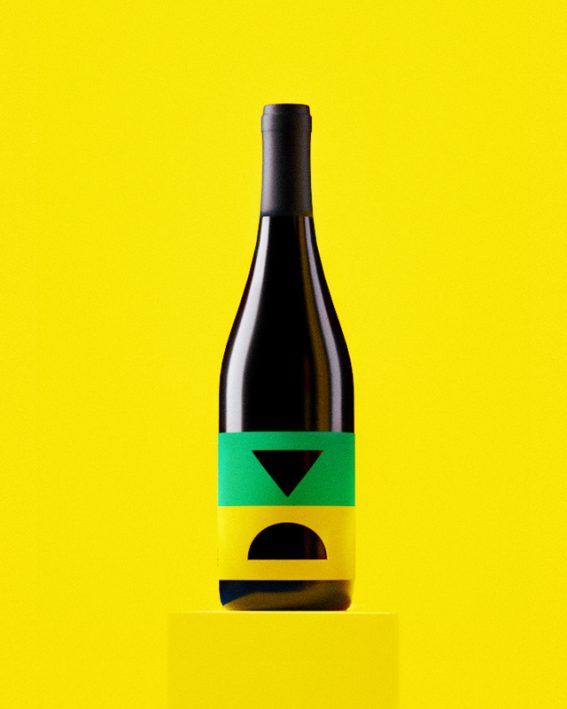
Iconic wine blend
Future starts today
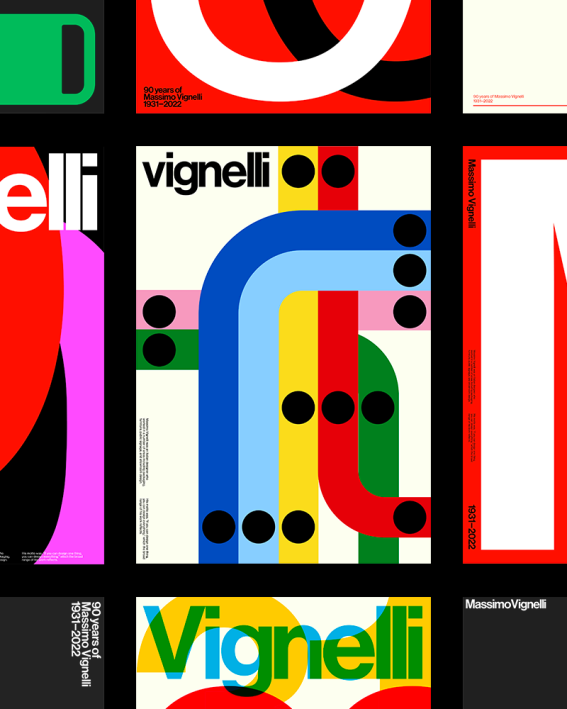
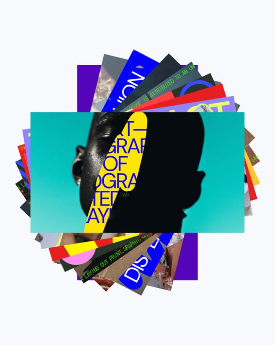
Paying tribute to Massimo
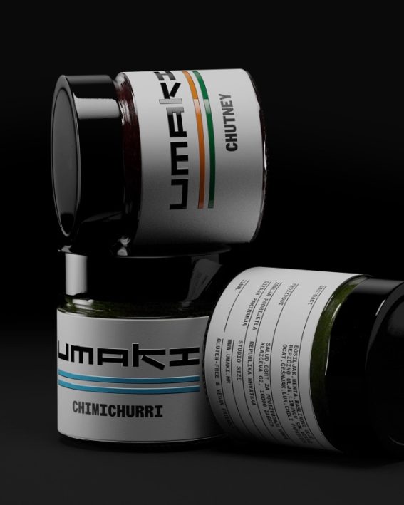
Trip for your taste buds
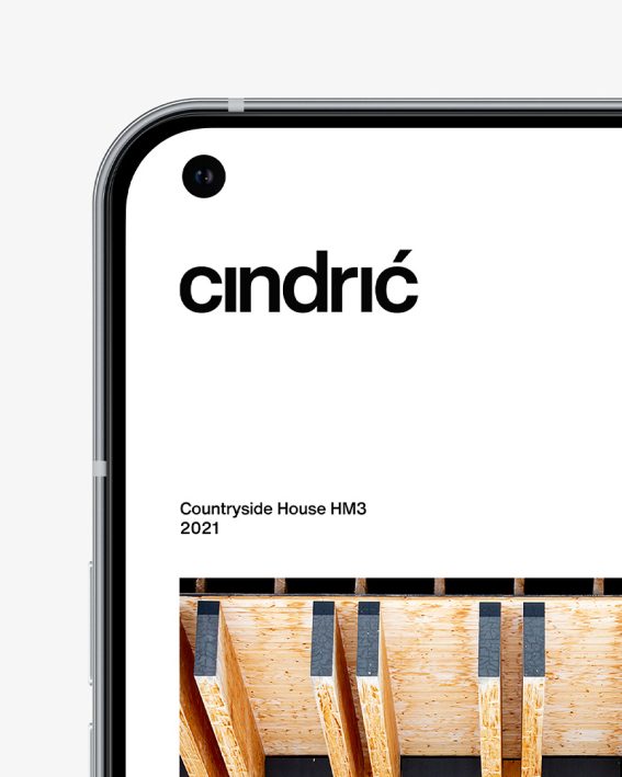
Minimal arhitecture
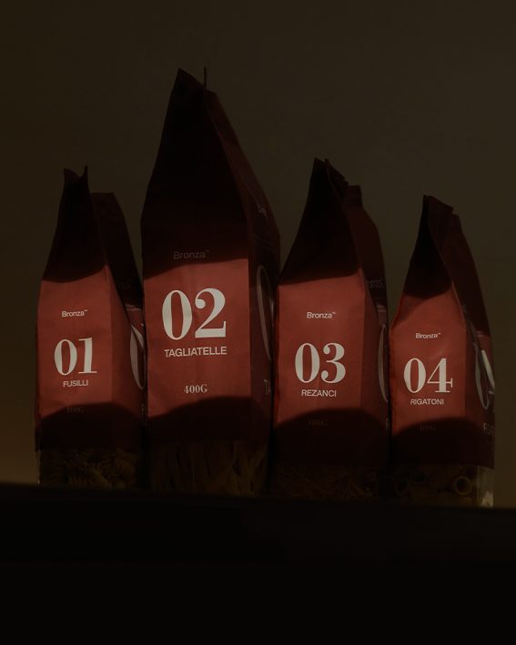
Coined pasta
Awesome motion templates
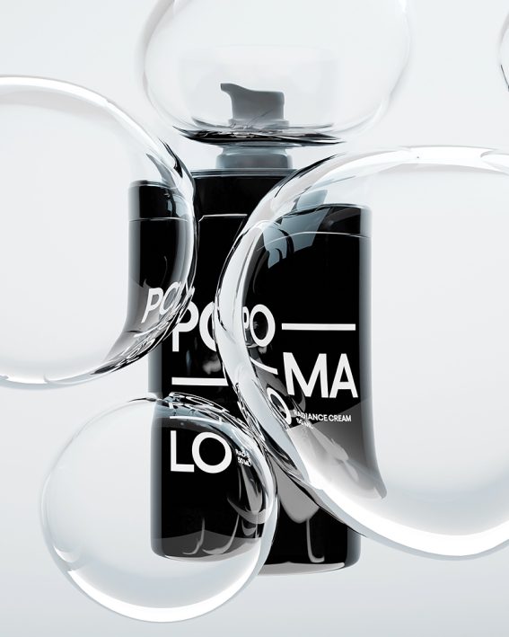
Laid-back skincare