Nuts
Client
Nuts
Services
Branding, Motion
Client
Nuts
Services
Branding, Packaging, Motion
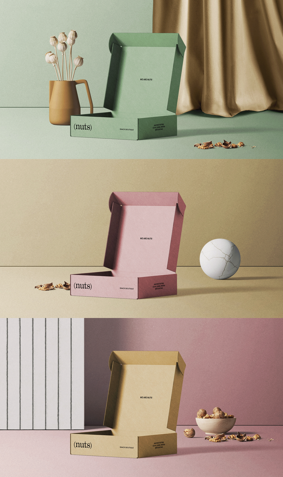
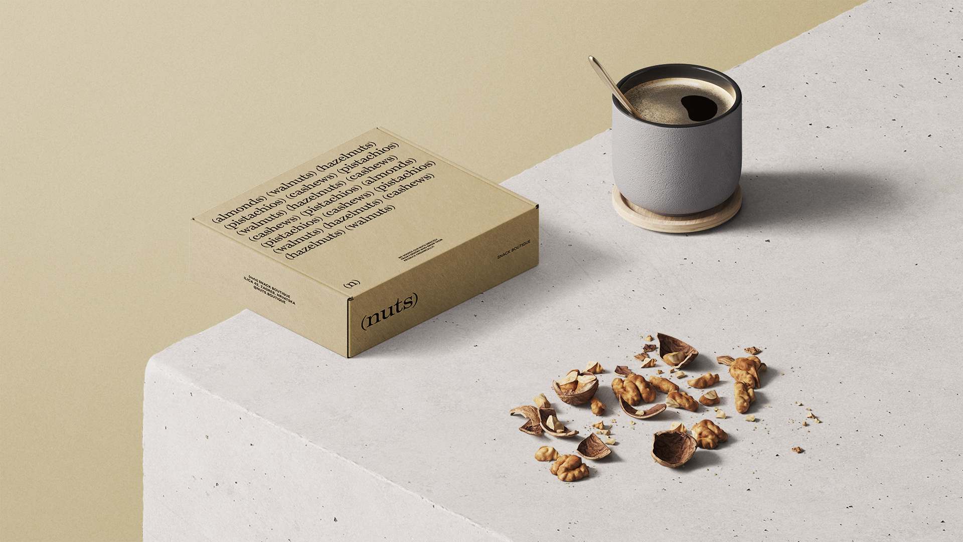
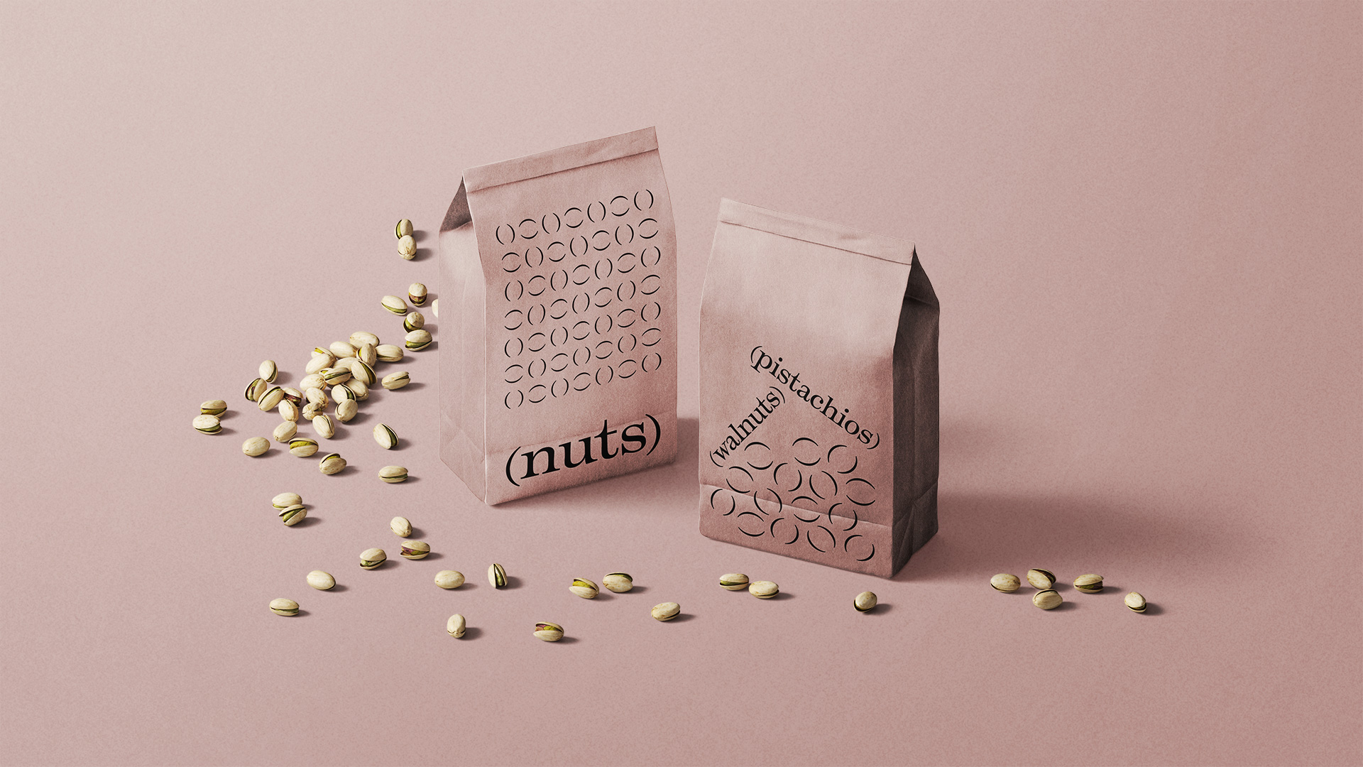
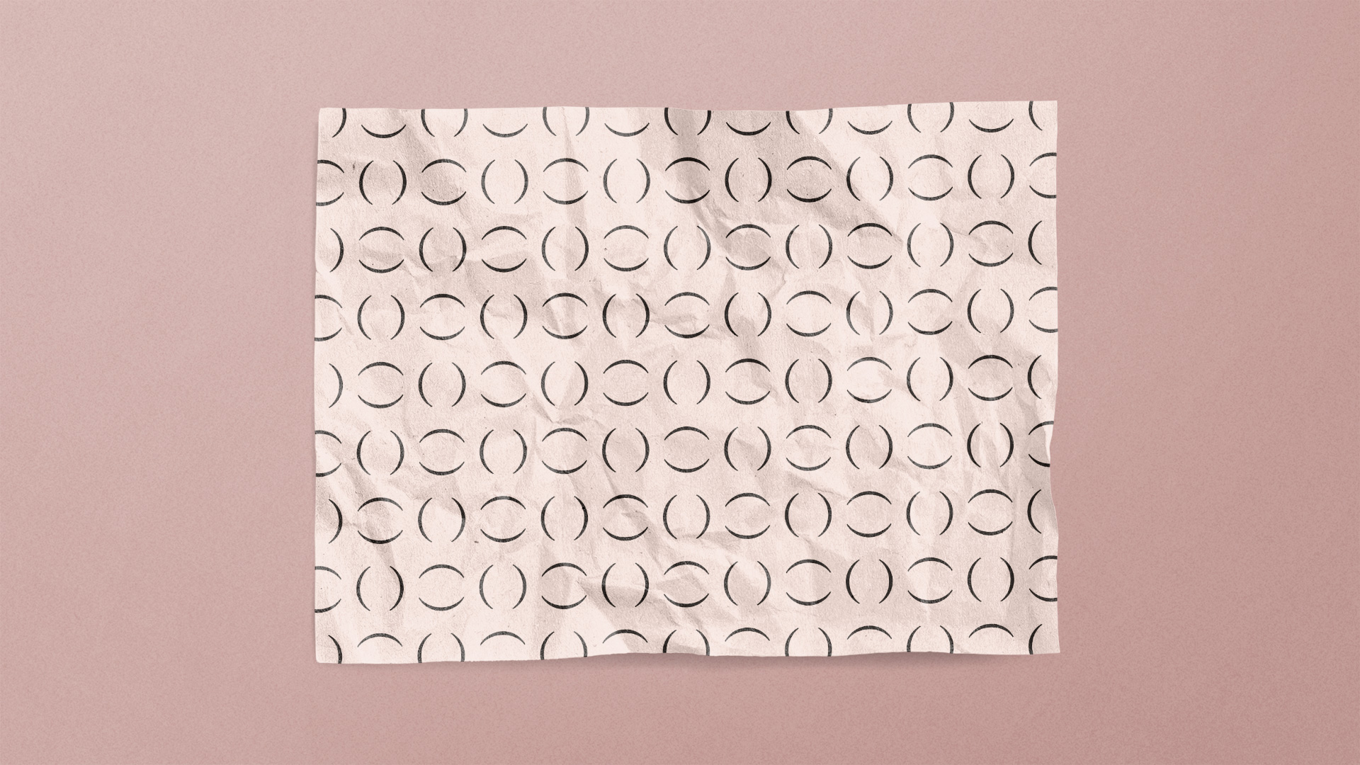
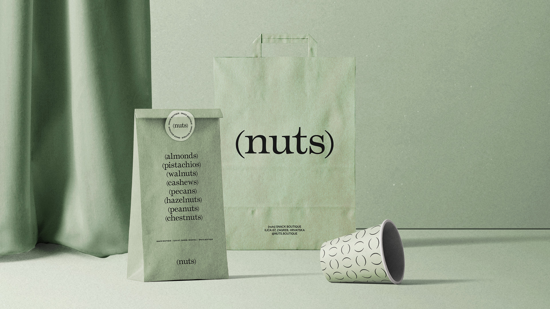
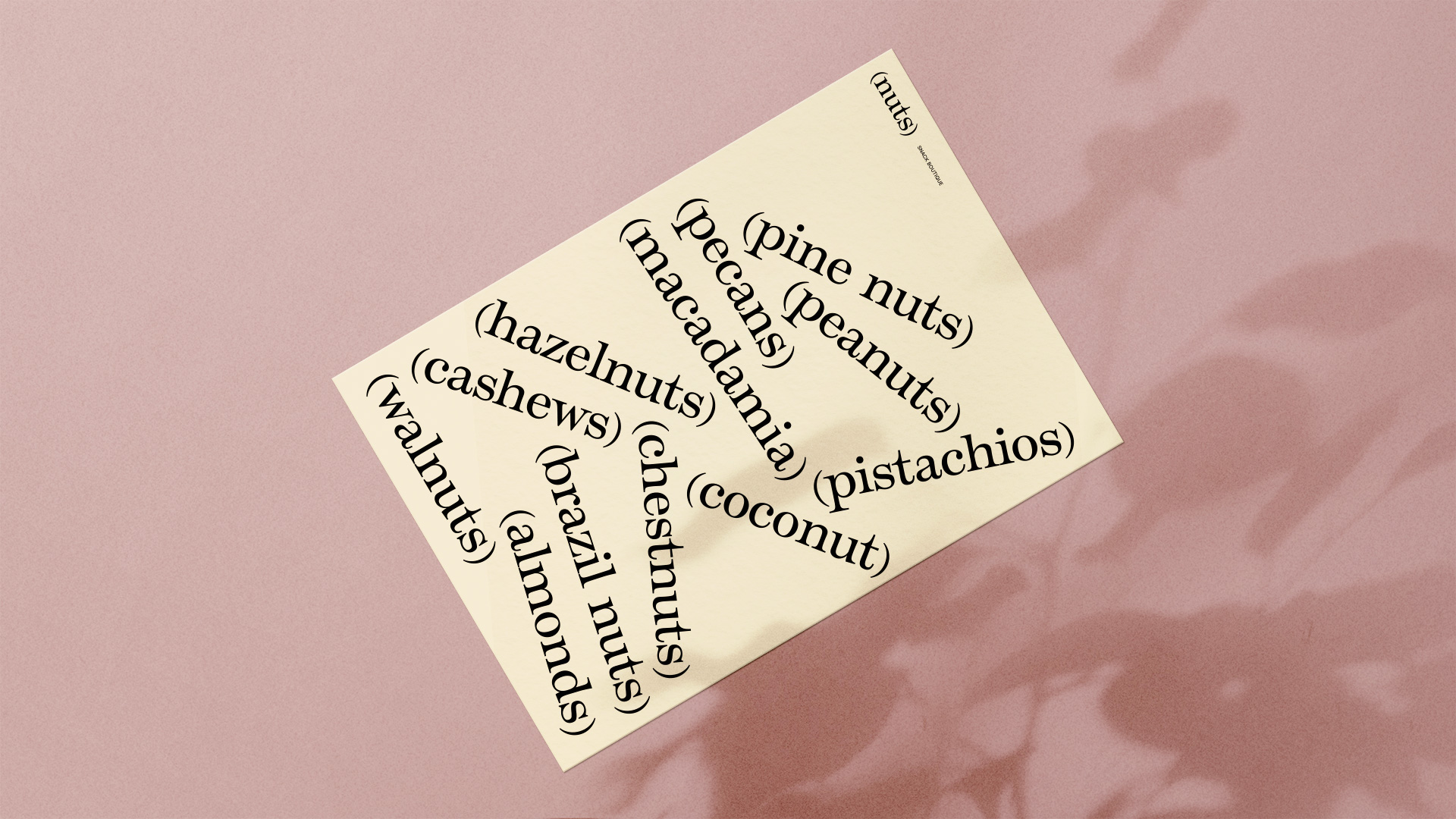
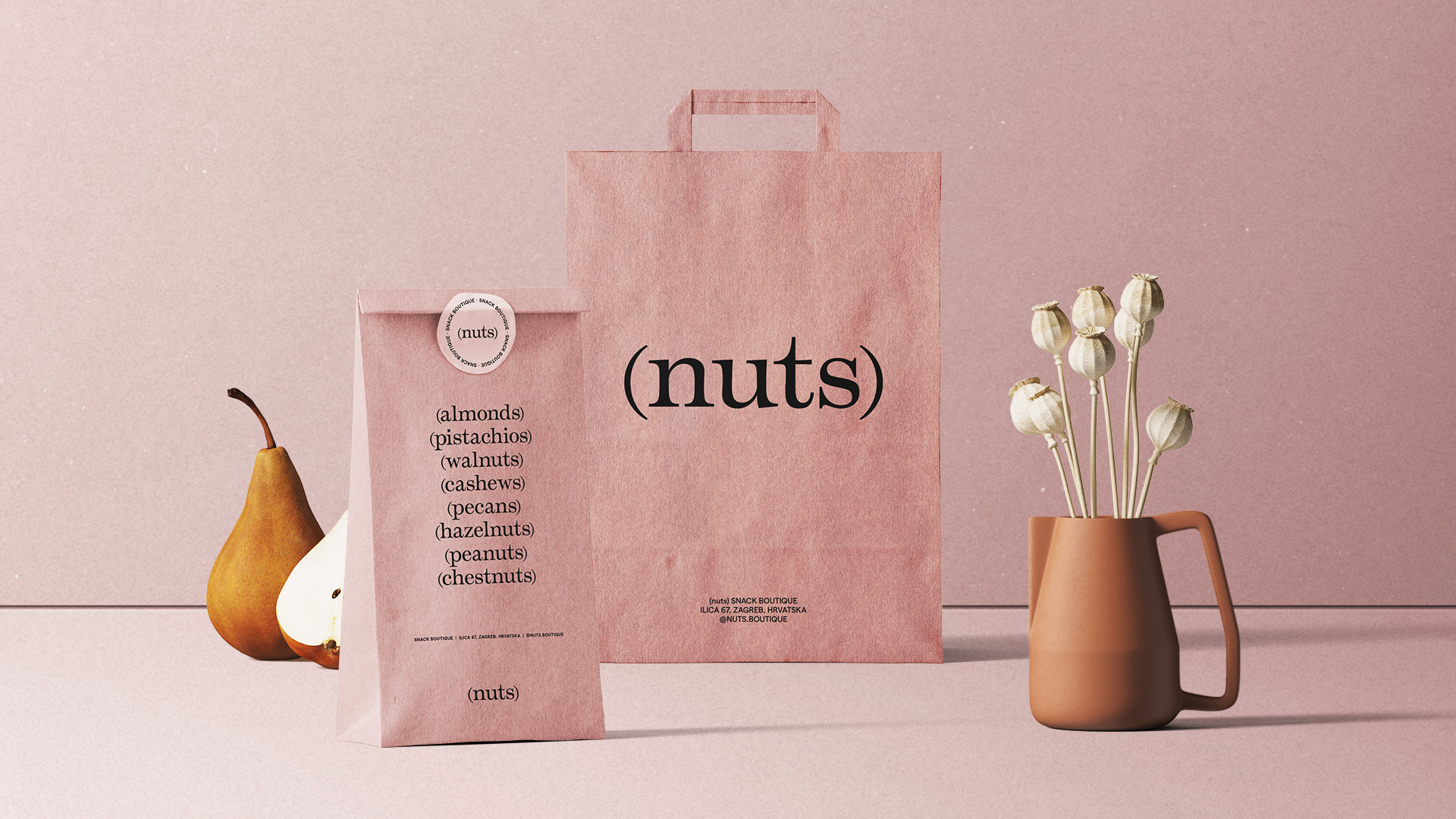
Studio Size created branding and packaging design for Nuts, a boutique snack store offering premium nuts. The idea for the visual identity came from a reductionist view of the product and design style. We cracked the brand name and found nutshells as a universally recognizable component of nuts. The nutshells are symbolized by round brackets, which are the primary building block of the design system. Even though we used only typography and color, the solution is visually distinctive and pragmatic. The brand can easily extend its product range, requiring no new illustrations or photos.
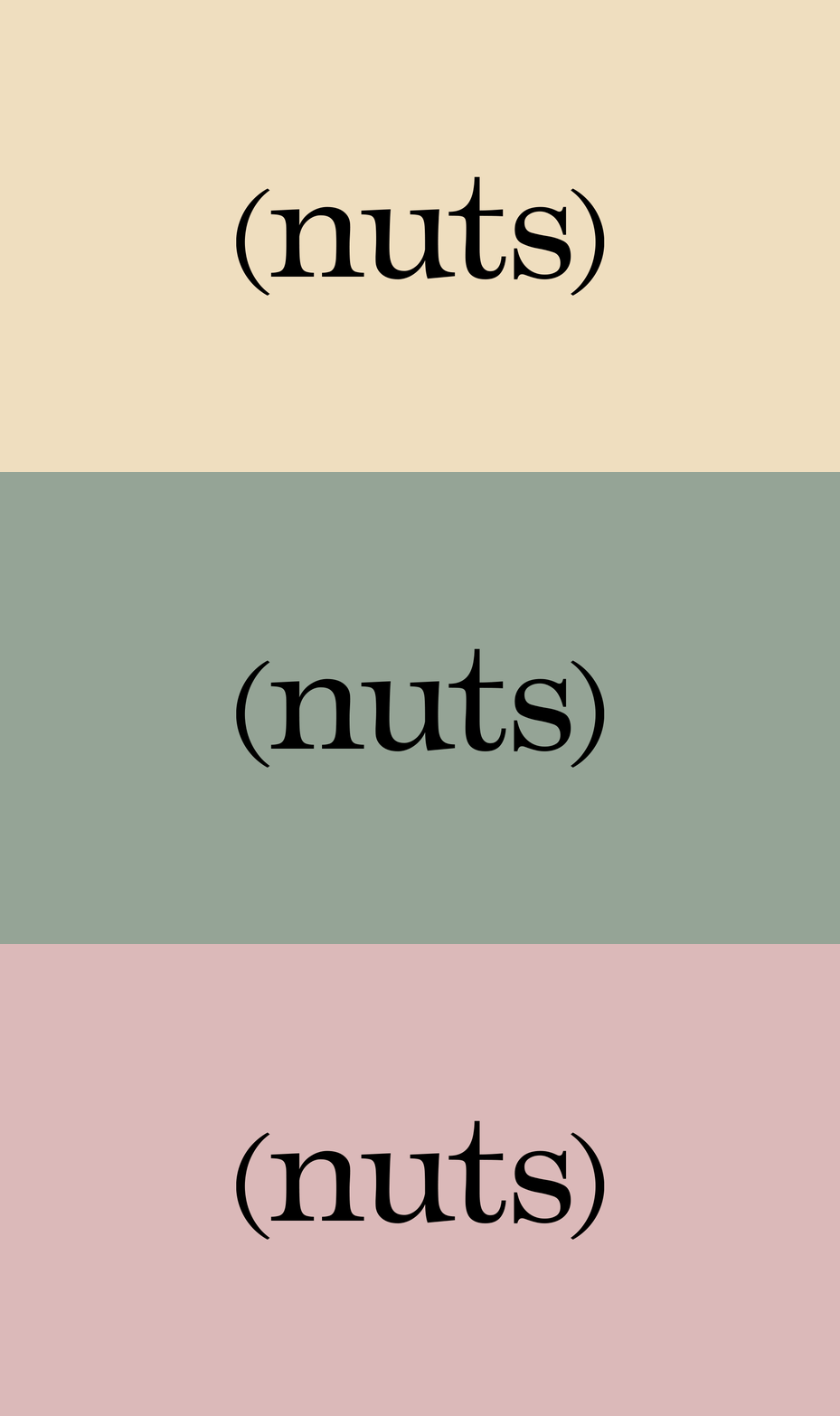
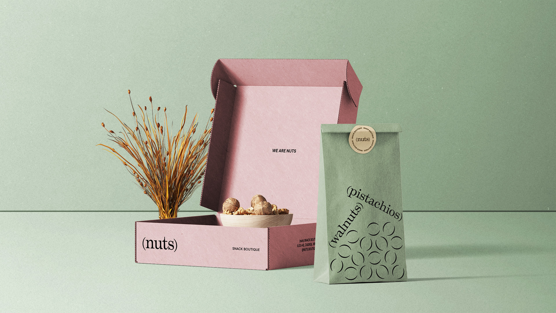
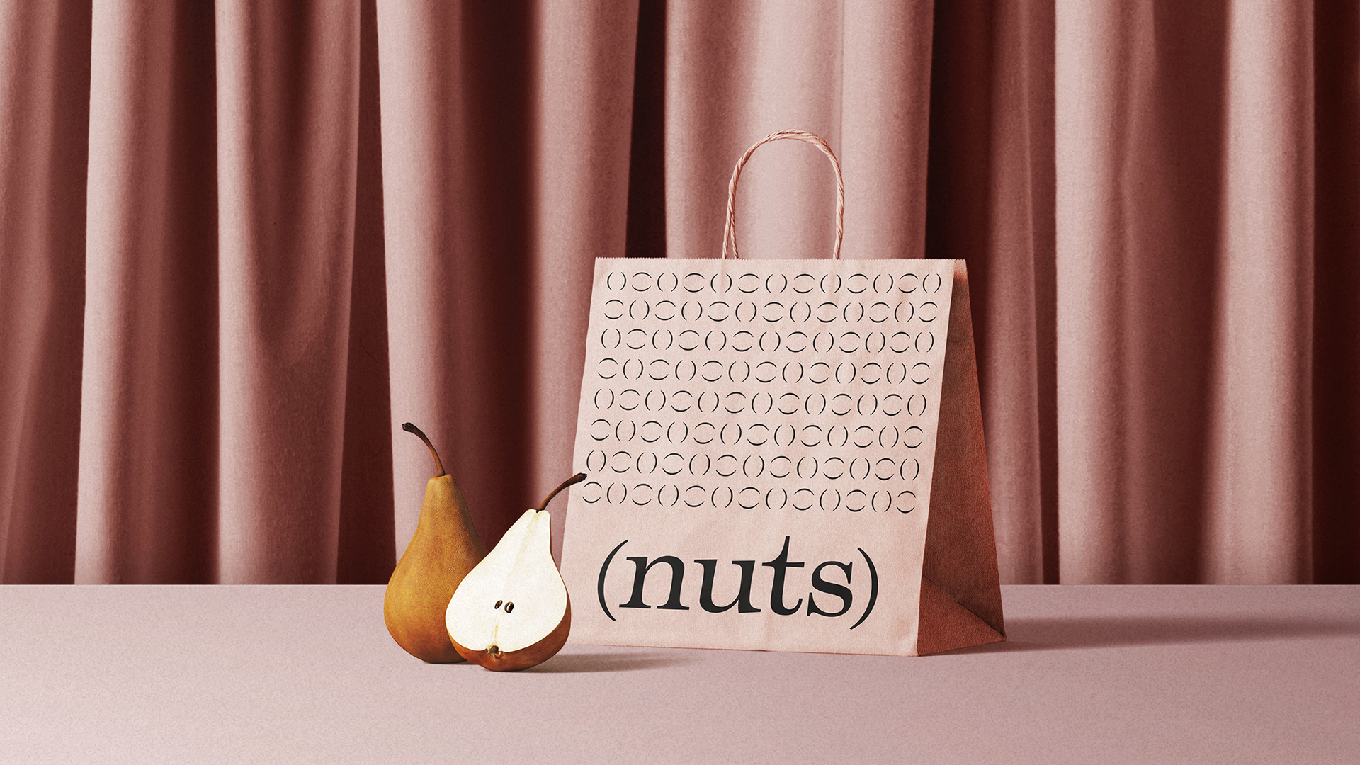
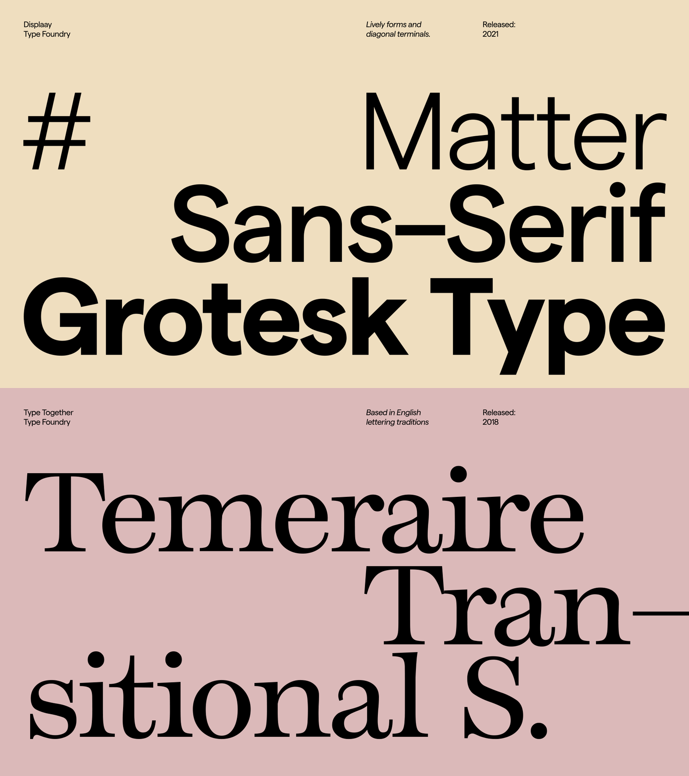
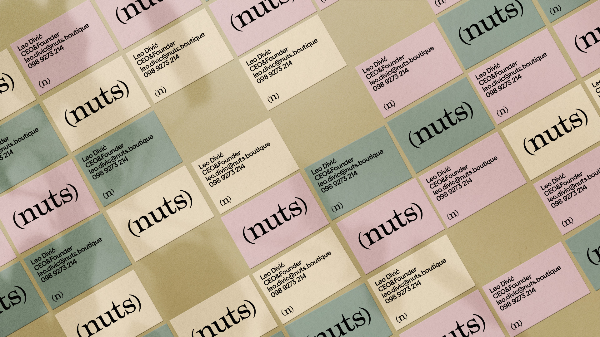
The Temeraire typeface gives the brand an organic and elegant character with its expansive contrast and humanist details. The secondary typeface Matter is used for better legibility in smaller point sizes and creates a pleasant contrast to the primary font.
